| Image |
Comment |
| 08/11/2005 06:04:51 PM |
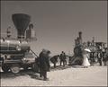
1869 - The Golden Spike by jrtoddComment: A bit bright, but good content and decent composition.
Standing back and using a long telelens would compress the scene more, it would give less of a distant look. |
 Photographer found comment helpful. Photographer found comment helpful. |
| 08/11/2005 06:02:46 PM |
|
| Photographer found comment helpful. |
| 08/10/2005 05:48:19 PM |
"1984"by tmorninglory96Comment: The idea is good, very Madonna.
The background spoils it a bit, sloppy and dirty grey while the subject is exposed hot (near overexposure). Some work on the background (pastel tint to fit the time) without creases and more balanced light on the girl would make it work better.
The border would work better with hard straight lines, the eighties favoured that presentation. |
| Photographer found comment helpful. |
| 08/10/2005 05:44:38 PM |
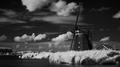
1788by labudsComment: Interesting B&W conversion, heavy read filtering (negative blue in the channel mixer)? Almost near infrared on the greens. Great sky, I've been searching for that sky for four days but the crappy weather in our country didn't cooperate. :(
The mood is a bit dark, but I like it a lot. Would have liked to see some sails on the wings, it would bring out the windmill a lot better agains the sky. |
| 08/10/2005 05:40:16 PM |
|
| Photographer found comment helpful. |
| 08/10/2005 05:39:26 PM |
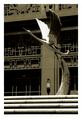
1930by amberComment: The end of the best time in architecture?
Great composition, the tone fits the ambiance of the time. |
| Photographer found comment helpful. |
| 08/10/2005 05:38:30 PM |
1977by aimee_skittlesComment: Contrast and exposure/light works magically here. Who cares about the blown highligjts it's all about the subject hanging out of the window. Good job. |
| Photographer found comment helpful. |
| 08/10/2005 05:37:06 PM |
What America Was Built On = Factory Era 1942by JunieMoonComment: I don't think America was built on industry, but more on a determination, confidence and believe in themselves.
The bright yellow toning and contrast is interesting. The compotion works well, apart from the fact that the lines lead me to the bottem middle of the frame and shows nothing special there. 7 |
| 08/10/2005 05:34:32 PM |
3000 B.C.by anthonyczajaComment: The subject and presentation is very interesting, but I don't see how the warm orange tone works with it. 7 |
| Photographer found comment helpful. |
| 08/10/2005 05:30:00 PM |
The Battle for Stalingrad 19 August 1942 - 2 February 1943by FalcComment: All the telling elements are present, the top of the standard tells even more then the flag does. It is a bit bright, what doesn't correspond with such a hard battle (where one thinks of dark hard contrast exposures). Nevertheless a great shot, one of three nines in this challenge and therefore a tie for third place imo. |
| Photographer found comment helpful. |
Home -
Challenges -
Community -
League -
Photos -
Cameras -
Lenses -
Learn -
Help -
Terms of Use -
Privacy -
Top ^
DPChallenge, and website content and design, Copyright © 2001-2026 Challenging Technologies, LLC.
All digital photo copyrights belong to the photographers and may not be used without permission.
Current Server Time: 06/21/2026 07:14:24 AM EDT.