| Image |
Comment |
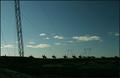
| 08/29/2005 02:48:03 PM |
Dark & lightby StructorComment: Wow, power lines that work as great leading lines. They add so much depth to the photo, one of the few times where they are actually functional in a photograph. :) |
 Photographer found comment helpful. Photographer found comment helpful. |
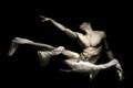
| 08/27/2005 07:46:01 PM |
Jane Doeby NazgulComment: Nice pose, I like the way her body is highlighted from the shadows. The tone is great as well, I think it is not pure B&W because it has some purple elements.
The lighting reminds of Grigrigirls "Serenity". |
| Photographer found comment helpful. |
| 08/27/2005 07:40:05 PM |
dangerous curvesby DrJOnesComment: I sense DrJones....
What I like is the pose and the exposure (highlight on her buttock, lower leg and wrist excluded), the way her eyes are excluded from the shadow on the lower part of her face. It is just that the tone is to even, too much of the same and I'm a little bit unsure about the position of the left leg. 8 |
| Photographer found comment helpful. |
| 08/27/2005 07:34:35 PM |
Body Artby SonifoComment: Great photograph. Love the pose, B&W, composition and technical use of negative space and near high key lighting. It just lacks the bit of emotion or drama that my other top pics have. Got to make my personal distinctions, 8. |
| Photographer found comment helpful. |
| 08/27/2005 07:31:32 PM |
Mom, Get Out!by kyeboshComment: I like the pose, the composition, the tone, how the person seems to float in the air and the humor. The only thing I dislike is the flatness of the tone, wich might be enhanced by the border (I'm not sure). 9 |
| Photographer found comment helpful. |
| 08/27/2005 07:29:57 PM |
Quasi una fantasia by nico_blueComment: It's great how the light, pose and negative space work here. A classic pose with classic lighting, the only thing that makes it look like a photo is the detail and sharpness. Perhaps a little bit softer might work even better. 10 anyway, one of two. |
| Photographer found comment helpful. |
| 08/27/2005 07:27:25 PM |
Evolve by grigrigirlComment: One of my two tens in this challenge. What can I say, it is pretty much a perfect photo. I love the Rembrand colors/toning and shadows vs light. The use of the fabric with prints over your model adds a certain mistique ambiance. The expression on her face is also something you normally see in paintings. The face draws me in more than the nudity.
Please take it at as a compliment when I say "looks like a Julia Bailey photograph", because either you are Julia or you are just as good.
|
| Photographer found comment helpful. |
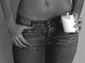
| 08/26/2005 06:32:45 PM |
Early morning summer breakfastby mmusicanteComment: The background does weird things. :)
The lighting isn't perfect, too dark and too bright in certain places, it needs a better balance.
The composition is ok. The milk in the glass looks to warm compared to the milk in the bottle.
7 |
| Photographer found comment helpful. |
| 08/26/2005 06:31:07 PM |
|
| Photographer found comment helpful. |
| 08/26/2005 06:30:46 PM |
|
| Photographer found comment helpful. |
Home -
Challenges -
Community -
League -
Photos -
Cameras -
Lenses -
Learn -
Help -
Terms of Use -
Privacy -
Top ^
DPChallenge, and website content and design, Copyright © 2001-2026 Challenging Technologies, LLC.
All digital photo copyrights belong to the photographers and may not be used without permission.
Current Server Time: 06/21/2026 01:31:54 PM EDT.