| Image |
Comment |
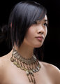
| 05/20/2009 01:52:01 PM |
The Necklace by lovethelightComment: This is nice overall, however it feels like the necklace is stealing the show. It's the most prominent part of the image and has the prime focal point. Beautiful model. Don't make her secondary. |
 Photographer found comment helpful. Photographer found comment helpful. |
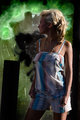
| 05/20/2009 01:50:35 PM |
Returnby CutterComment: I lke most of this. The outfit is nice (except that she appears to have a bandaged finger). The lighting is certainly dramatic and has potential. Some backlighting on her face is needed IMO (reflector to bounce back would be ideal). Would like to also see more of her face, rather than the extreme turned away angle. And WHAT is that black rectangle in front of her? |
| 05/20/2009 01:48:00 PM |
A winning smileby mkothareComment: Did you know this photo is only 42kb? You have 200 for advanced editing. If this wasn't all pixelated it could stand a chance of doing well. Looks like a nice photo, just can't really see it. :-/ |
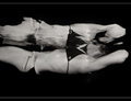
| 05/20/2009 01:46:12 PM |
Reflectby MotekComment: A unique photo. Not getting the glamour connection, especially considering that the face has melted into the water (which feels a bit bizarre). Could be slightly underexposed also. |
| Photographer found comment helpful. |
| 05/20/2009 01:43:59 PM |
the next positionby ralphComment: It's ok. When you lose eye contact then it becomes less personal. I find myself roaming around this image looking for a place to settle. The upper part of this is well focused (hairline, scarf, eyebrows) but fades away at the bottom. Without having her eyes as a focal point the mouth becomes more important, and that's falling outside the focal plane. Did you consider a severe crop removing the top third or so? I scrolled down to see what it felt like without the upper left creamy washout...kind of liked it. Anyway, I'm just thinking out loud. Good luck in the challenge. |
| 05/20/2009 01:39:29 PM |
|
| 05/20/2009 01:38:24 PM |
Cooling offby VpphotoComment: With the way she appears to be plastic and the clothing more emphasized (sharp), it seems strange. Her face and hair are so soft and smoothed out (lost detail) that she seems OOF in comparison to the clothing and water. |
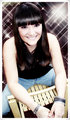
| 05/20/2009 01:35:05 PM |
Glamorous Smileby MarikaComment: Yes, a very pretty smile. The starburst pattern in the background is interesting. I can't help but wonder how this would have done more dressed up (using this bg) instead of jeans and a wooden chair, using slacks or tights and a chrome chair. Just thinking out loud. Anyway, good luck. |
| Photographer found comment helpful. |
| 05/20/2009 01:32:39 PM |
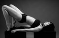
Bojanaby abrakatebraComment: Not sure if this is more like yoga or sexually provocative? I do know that it seems to be more about the human form than the individual. Maybe I'm missing something...is this pose supposed to be glamourous? |
| 05/20/2009 01:20:22 PM |
|
Home -
Challenges -
Community -
League -
Photos -
Cameras -
Lenses -
Learn -
Help -
Terms of Use -
Privacy -
Top ^
DPChallenge, and website content and design, Copyright © 2001-2026 Challenging Technologies, LLC.
All digital photo copyrights belong to the photographers and may not be used without permission.
Current Server Time: 05/20/2026 08:15:59 AM EDT.