| Image |
Comment |
| 04/27/2005 12:06:40 PM |
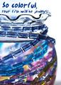
Kid Stuffby pcodyComment: Cute and colorful. Nice use of lighting and a fun composition. Almost could use a lttle bit more water on the bowl. Should do well. Good luck. |
 Photographer found comment helpful. Photographer found comment helpful. |
| 04/27/2005 12:05:25 PM |
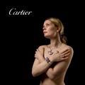
Defining Beautyby arnitComment: Yes, sex sells and you grabbed my attention with the well exposed lady (pun on words intentional). Very good lighting and details. The jewelry pieces look interesting but can't see enough of them to appreciate... |
| 04/27/2005 12:02:05 PM |
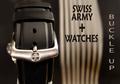
Swiss Army Watchesby TommyMoe21Comment: This is interesting. I wish you hadn't used two font styles for your text. The watchband has character with the buckle and I can understand why you did this. Looks like the band is not quite straight up and down... |
| Photographer found comment helpful. |
| 04/27/2005 11:59:59 AM |
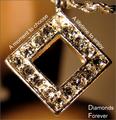
Diamonds Foreverby kevrobertsonComment: Neat idea wrapping the text arond the object. The jewelry piece itself is a bit bright and the detail of the stones is lost. Good luck in the challenge. |
| Photographer found comment helpful. |
| 04/27/2005 11:49:03 AM |
Suggestiveby mrmorrisComment: Cute idea. Where's the eggs? ;^) The lighting seems a bit hot on the main jewelry piece. |
| Photographer found comment helpful. |
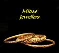
| 04/27/2005 11:46:48 AM |
midas jewellersby naomikComment: The pieces of jewelry you selected have nice character to them. Well lit and presented in a professional manner. The text color choice I don't agree with and it looks funny (to me) centered as it is. Maybe if it had been on one line instead of two? Good luck in the challenge. |
| Photographer found comment helpful. |
| 04/27/2005 11:45:05 AM |
Ocean's Mystery Braceletby SondaComment: I like the way you've lit this. Very creative use of lighting. The text in the bottom left could be cleaner. Overall, nice job. Good luck. |
| Photographer found comment helpful. |
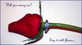
| 04/27/2005 11:43:39 AM |
Diamonds are Foreverby slingshotComment: Nice concept. Lighting seems a little hot on the ring and flower stem. Multiple light sources may help with this. I like the style of text you used. Overall, nice job. |
| Photographer found comment helpful. |
| 04/27/2005 11:30:49 AM |
|
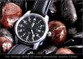
| 04/27/2005 11:30:40 AM |
History In The Makingby RedOakComment: Wow! That watch face just jumps right out at you. Great use of the rocks and water...is this Lara? Lighting is great, focus is out of this world. Only negative I have, and it's hard to avoid, is I'm seeing some jaggies in the watch numbers, date border and watch hands. Nitpicky, I know. Hope you ribbon with this. Good luck. |
| Photographer found comment helpful. |
Home -
Challenges -
Community -
League -
Photos -
Cameras -
Lenses -
Learn -
Help -
Terms of Use -
Privacy -
Top ^
DPChallenge, and website content and design, Copyright © 2001-2026 Challenging Technologies, LLC.
All digital photo copyrights belong to the photographers and may not be used without permission.
Current Server Time: 06/19/2026 01:34:34 PM EDT.