| Image |
Comment |
| 08/09/2006 12:06:40 PM |
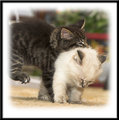
Say Ahhhby BradComment: ;^) I'm just sitting here with a big smile on my face. Soooo cute! Being in that chair/sofa, makes it look like a studio shot. |
 Photographer found comment helpful. Photographer found comment helpful. |
| 08/09/2006 11:32:30 AM |
IMG_6473-01.jpgby dwterryComment: This image is adorable! Actually I like all of the ones you've posted in this thread, but thought I'd just comment on this one. ;^) |
| Photographer found comment helpful. |
| 08/09/2006 10:47:59 AM |
Diveby SJCarterComment: Oh yeah baby! I like this one! Very nice catch. I know you're going to hate hearing this...but ;^) should have used this one for the challenge IMO. He-he.
Smile and keep having fun! |
| Photographer found comment helpful. |
| 08/09/2006 08:55:00 AM |
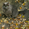
Enjoying the Fresh Autumn Airby RebeccaComment: Adorable cat, and a nice photo as well. I like the leaves on the deck. There are a ton of stock photos out there with cats, but this one would probably do well if you could get it accepted.
Take care. |
| Photographer found comment helpful. |
| 08/09/2006 08:37:10 AM |
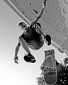
stand on itby SkipComment: Originally posted by glad2badad:
I like the perspective you have here. Fun to look at. Looks like you could have gone up a notch or two yet on shutter speed to totally freeze the action. B/W was a good decision to keep the viewer on topic. Good luck in the challenge. |
Hey Skip - Congrats on a nice finish with this image. Many times after a challenge I'll go back thru some of the comments I made and see what others said to kind of get an idea if I was on track, etc... I'm scratching my head a bit as to why I said a higher shutter speed could have been used. I think I had 'Stopped Motion' on the brain at the time. The way you've shown just a little blur actually helps convey the action in this shot. Looks like you had fun getting it also (as usual). ;^)
Anyway - Smile and keep having fun!
Barry |
| Photographer found comment helpful. |
| 08/08/2006 01:45:36 PM |
|
| Photographer found comment helpful. |
| 08/08/2006 01:43:48 PM |
Frosen Fireby GunnsiComment: It's so hard to portray fire as being in a stopped motion state. It probably is, but since there aren't any hard edges it's kind of hard to tell. Hope that makes sense. Nice job of getting the correct exposure. Good luck in the challenge. |
| Photographer found comment helpful. |
| 08/08/2006 01:41:22 PM |
Bubblesby freakin_hilariousComment: These are stopped on the rise? Are these outdoors? If outdoors, how come the sky is green? This was a tricky one to attempt. Looks like you needed a little higher shutter speed to totally stop the motion, especially the bottom third area. Great idea. Good luck. |
| Photographer found comment helpful. |
| 08/08/2006 01:34:12 PM |
Beating the Heat!by susiComment: Wonderful processing job on this. Has an oldtime feel to it. Looks like the noise reduction was a little strong, but hard to tell with water. So, if I can't really tell for sure...good job! ;^) The background on this works great. Good luck in the challenge. |
| 08/08/2006 01:32:23 PM |
UH OH!by QartComment: Ok. How'd you do that? ;^) This is fun to look at. Appears that motion has been stopped - hard to tell without anything to use for context. Nonetheless, you should do well with this. Good luck. |
Home -
Challenges -
Community -
League -
Photos -
Cameras -
Lenses -
Learn -
Help -
Terms of Use -
Privacy -
Top ^
DPChallenge, and website content and design, Copyright © 2001-2026 Challenging Technologies, LLC.
All digital photo copyrights belong to the photographers and may not be used without permission.
Current Server Time: 05/09/2026 10:17:58 PM EDT.