|
|
|
Showing 111 - 120 of ~794 |
| Image |
Comment |
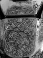
| 09/30/2002 09:56:00 AM | A tree on a Harleyby dimitriiComment: This is most odd. I think seeing the whole vehicle would have been a lot better because as it stands, it looks a little too much like ordinary mirrors, only B&W. |
| 10/02/2002 09:05:00 AM | Reach for the Starsby onthegomamaComment: This is just so weird… Is that a reflection of the stars? I really like the surrealistic nature of the shot; it works really well. But, I can't decide how this has been done, the reflection looks more like a shadow, or the figure in the shots transparent; if it was a reflection of the sky, I wouldn't be able to see the through the person. Ohhhh, this is so wacky. I am going to have to ask you how you did this after the challenge… Whatever you've done here, I'm impressed… (10) |
| 09/30/2002 09:46:00 AM | Rose Waterby focusComment: Great image. I love the mystic feel of the shot – makes the water look a little crystal ball like. The rose is ghostly, and the bright line looks almost like an intersecting electrical energy force. Colours look great as well. Only way I think this could be improved is to perhaps crop in a bit closer so that the surrounding area doesn't draw the eye away. The DOF works well, this helps with the composition; perhaps – I'm nit picking now – cropping just a tiny fraction to left might have helped as well. (7) Good luck. |
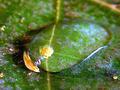
| 10/03/2002 11:32:00 AM | splashby willemComment: I love the colour in the shot, I love how it looks and I think it's a great shot… (10) I tried so hard to achieve this and failed; please, how'd you do it? |  Photographer found comment helpful. Photographer found comment helpful. |
| 10/01/2002 12:00:00 PM | Mates for lifeby snsComment: Classic idea. Classic shot with only one tiny flaw – as far as I am concerned anyway. The diagonal lines that look as though they are growing out of the ducks kill the balance within the shot; I would suggest an un-tiled floor. Try photoshopping them out and you'll see what I mean. Sorry to be negative – great idea and a great shot though… (8) |
| 09/30/2002 11:55:00 AM | Black and Greyby AndyLeeG4Comment: For me, this would have been superb but for a small – but hugely invasive – point; the diagonal wooden strut. This just drags the eye away from what is a really good idea. The shot itself, if you mask out the wooden bit, is first class; great colour, superb composition and terrific use of DOF. The other effect of the diagonal in this shot, is to remove the mood balance - rather like playing loud rock music at a chess club… Sorry to be so negative, but it's a really good shot that could have been superb… (7) |
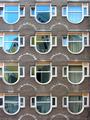
| 09/30/2002 11:14:00 AM | windowsby deanComment: This is superb. I really love the shot. Composition is absolutely first class, lighting is outstanding and the challenge element is met with aplomb. I can't fault the shot – the colours and symmetry work faultlessly and bring out the best in both the foreground and the reflection element… Classic shooting… (10) |
| 10/02/2002 04:49:00 AM | Choiceby NocturnoComment: Ohhhh, great shot… I've been playing spot the difference for the last twenty minutes. I can't fault the composition, but I can fault it in one area. The focus is slightly off. But, that doesn't mean the shot isn't first class… Any shot that can hold the attention for twenty minutes has to get a good score… Great idea, worth ten for the idea alone, I really like the ' at first glance it's a blooming mirror' effect… Then you start to spot the subtle changes made between the two subjects… Keep this up, it's inventive shots like this that make DPC a special place. (10+++) |
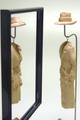
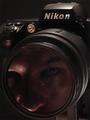
| 10/03/2002 05:46:00 AM | Ghost in the Machineby jmsetzlerComment: Great idea, superbly done… Just the right level of lighting to give the shot a really spooky appearance. The only improvement I could possibly suggest here relates to the word Nikon. Because it also reflects the background, it does detract from the within notion - but I haven't a clue as to how you could have prevented that. Aside from the really trivial point, it's a great shot… (9) |
| 10/01/2002 10:26:00 AM | The Truth Is Out Thereby ManicComment: Great idea and not a bad shot considering the degradation the image must have suffered to get it. No lake – great, gets another point :o) I like a lot of things here, but – and I know how hard it would be to improve it – it does lack a bit of sharpness… (8) First class idea… |
|
Showing 111 - 120 of ~794 |
Home -
Challenges -
Community -
League -
Photos -
Cameras -
Lenses -
Learn -
Help -
Terms of Use -
Privacy -
Top ^
DPChallenge, and website content and design, Copyright © 2001-2026 Challenging Technologies, LLC.
All digital photo copyrights belong to the photographers and may not be used without permission.
Current Server Time: 07/16/2026 06:22:48 AM EDT.
|