| Image |
Comment |
| 12/17/2004 09:51:33 AM |
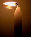
candle in the windby marlinComment: The flame looks way too stable to be caused by any kind of airflow. That takes away from the image, at least for me. (That is, as far as meeting the challenge topic). Otherwise, I like the lighting gradient. 5. |
 Photographer found comment helpful. Photographer found comment helpful. |
| 12/16/2004 11:47:34 PM |
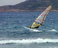
Wind Surfby ellulsComment: I like this one! nice, crisp image of the sail, perfect for the challenge. The only thing I could come up with as a constructive criticism is:
- tighter crop - removing the wave at the bottom would draw more attention (all the attention) to the surfer.
- playing with levels and hue to make the gray sky color livelier.
As is - 9. |
| Photographer found comment helpful. |
| 12/16/2004 11:30:41 PM |
the Winds of Winterby ArnarpComment: Don't see much wind here... The image also has light spots that draw too much attention. 3. |
| 12/16/2004 11:28:17 PM |
Carry me!, and show me the world.by ValdoComment: This might be too tight of a crop - seeing more of the surroundings (preferably empty sky) would better convey the sense of free flying. As is - 6. |
| 12/16/2004 11:25:32 PM |
Wind Tunnel - Aerodynamicsby saintnicholas_25Comment: Image is a bit out of focus. I wish I could clearly see the horse, but it seems like the focus is on the wipers.
Also, to meet the challenge better, a side shot (or 45 degree shot) would have been better, as the wind blows right into the viewer on this one, and that is hard to get from this image. |
| Photographer found comment helpful. |
| 12/16/2004 11:22:02 PM |
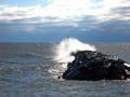
Where there are Waves there is Windby JEFFJSBComment: A tighter crop would have been better, I would suggest losing about 10% from the bottom, 15% from the top, and some amount from the right, to preserve aspect ratio. As is -solid 6. |
| Photographer found comment helpful. |
| 12/16/2004 12:05:12 AM |
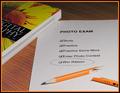
Pencil's broken...Spirit is not!by glad2badadComment: Well, it seems that the checkbox will remain unchecked after this challenge. Whenever you use a frame, it tends to polarize the audience - some love it and some hate it. I don't think that this particular image needed framing, but I kind of like the choice of the frame color. The topic corresponds to the challenge. I'd go with a 7 for this one. |
| Photographer found comment helpful. |
| 12/15/2004 11:57:38 PM |
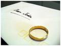
Broken Vowby thommoComment: I like the idea! (Of course, since I had a similar shot in this challenge, almost identically titled). It seems that the ring could have been more in focus. |
| Photographer found comment helpful. |
| 12/15/2004 11:39:04 PM |
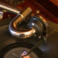
Broken Recordby mickwestComment: What puzzles me with this image is the straight line of the cut. I haven't seen a broken LP in a long time, so I can't remember if they break on such straight lines in reality, but this one seemed so unreal.
Also, I could see the tripod and you taking the picture in the reflection off of the arm... and I wish it wasn't there. |
| Photographer found comment helpful. |
| 12/15/2004 11:35:14 PM |
Broken Beautyby ccaseyComment: I like how the 'brokenness' is implied, and not shown here. Updating to 7 after going through most images. |
Home -
Challenges -
Community -
League -
Photos -
Cameras -
Lenses -
Learn -
Help -
Terms of Use -
Privacy -
Top ^
DPChallenge, and website content and design, Copyright © 2001-2026 Challenging Technologies, LLC.
All digital photo copyrights belong to the photographers and may not be used without permission.
Current Server Time: 07/16/2026 10:51:04 PM EDT.