| Author | Thread |
Comments Made During the Challenge  |
|
|
12/19/2004 08:25:56 PM |
|
I don't know if this will accomplish your mission, but personally I like it because its kind of similar to one of my really old entries : ) |
|
 Photographer found comment helpful. Photographer found comment helpful. |
|
|
12/19/2004 06:17:05 AM |
|
A little self-promotion never hurt, eh? Or is that self-motivation? |
|
| Photographer found comment helpful. |
|
|
12/19/2004 03:28:05 AM |
Very catchy presentation. :)
I like the frame. Some I suspect will comment negatively on it. Overall the lighting was a bit problematic in this shot. The light is a bit harsh, and there's quite a bit of fall-off, with resulting uneven illumination. Colors are vibrant in the foreground, but along with the light, fades away. |
|
| Photographer found comment helpful. |
|
|
12/19/2004 02:01:01 AM |
|
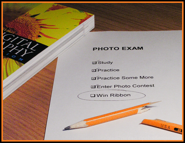
interesting idea. have seen another broken pencil so far, but not quite as many as i expected. broken pencil just seems thrown in there, and not necessarily the main focus/theme of the image. perhaps would've rotated the pencil to avoid displaying the USA (2) symbols. |
|
| Photographer found comment helpful. |
|
|
12/17/2004 08:28:36 AM |
|
| Photographer found comment helpful. |
|
|
12/16/2004 07:56:04 PM |
|
Well, I'm a real hater of this kind of border, I fear. I just don't get the point of it., and it seems to serve only to distract from the actual photograph. |
|
| Photographer found comment helpful. |
|
|
12/16/2004 12:05:12 AM |
|
Well, it seems that the checkbox will remain unchecked after this challenge. Whenever you use a frame, it tends to polarize the audience - some love it and some hate it. I don't think that this particular image needed framing, but I kind of like the choice of the frame color. The topic corresponds to the challenge. I'd go with a 7 for this one. |
|
| Photographer found comment helpful. |
|
|
12/15/2004 07:39:49 PM |
|
I didn't like the title though that doesn't hurt the score with me. The subject seems more of the winning the ribbon than the broken pencil. I thought IMHO that it should have been more on the pencil, to me the book isn't needed. 5 |
|
| Photographer found comment helpful. |
|
|
12/15/2004 02:30:46 PM |
|
A bit gimmicky, but cute. |
|
| Photographer found comment helpful. |
|
|
12/14/2004 05:46:53 AM |
|
Good idea, the lighting needs a little work op in the northwest, but nice idea, focus and composition. |
|
| Photographer found comment helpful. |
|
|
12/14/2004 04:05:40 AM |
Composition: 2, Technical: 1, Appeal: 1, Challenge: 2, Overall Score: 1 (weighted)
...I'm kidding. Just trying to break your spirit. ;-) Here's my real breakdown:
Composition: 7
Technical: 6, a little dark maybe
Appeal: 6
Challenge: 7
Overall Score: 6 (weighted) |
|
| Photographer found comment helpful. |
|
|
12/13/2004 11:02:49 AM |
|
Ahh... per chance to dream! Nicely done... congrats |
|
| Photographer found comment helpful. |
|
|
12/13/2004 04:57:21 AM |
|
Don't think so dude. But good luck ;) |
|
| Photographer found comment helpful. |
Home -
Challenges -
Community -
League -
Photos -
Cameras -
Lenses -
Learn -
Help -
Terms of Use -
Privacy -
Top ^
DPChallenge, and website content and design, Copyright © 2001-2026 Challenging Technologies, LLC.
All digital photo copyrights belong to the photographers and may not be used without permission.
Current Server Time: 07/01/2026 03:55:12 AM EDT.