| Author | Thread |
|
|
12/22/2004 07:20:27 AM |
Greetings from the Critique Club!
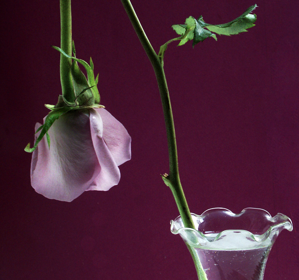
What a great image you have here. The focus is dead on, the textures on the flowers are great and it tells a story. Technically this is a spot on image which is why it scored in the midrange at the very least. The lighting of the flower itself really does make it stand out as the real focal point of the shot and it works in balance with the vase.
As a couple of people have commented, I would have really liked this in a rectangular format in which the top of the flower where the part was actually broken was in the scene. This would not only have backed up the strong meaning behind the image, but compositionally, would have made it far superior to your entry for there would be a leading line throughout the flower stem that would bring you from one side of the fame to the other; a beginning and end to a story.
Overall I like it, gave it a seven... Good luck in the future!
Lee |
|
Comments Made During the Challenge  |
|
|
12/19/2004 10:34:20 PM |
|
I like this shot. Very definative. Excellent work. |
|
|
|
12/19/2004 09:43:02 PM |
Returning for comments:
This image is just lovely with coloration so rich and tender. Bumping up. |
|
|
|
12/19/2004 09:16:06 AM |
|
Beautiful! I love that the actual break is not in the photo! |
|
|
|
12/18/2004 05:35:09 PM |
|
OOHHHH, OOHHH, Perfect Nice light excellent 10 |
|
|
|
12/17/2004 10:43:30 AM |
|
Nice composition, I like that he broken stem is not in the photo, it ads some intrigue. Since it's an advanced editing, I would have removed the vertical line on the right and the circles right under the rose. |
|
|
|
12/16/2004 07:34:00 PM |
|
good concept and composition. I like it 7 |
|
|
|
12/15/2004 11:35:14 PM |
|
I like how the 'brokenness' is implied, and not shown here. Updating to 7 after going through most images. |
|
|
|
12/14/2004 03:48:56 AM |
Composition: 4, need to see the break
Technical: 7, nice lighting and colors
Appeal: 6
Challenge: 4
Overall Score: 6 (weighted), Suggestion: shorter stem, include the break in the shot |
|
|
|
12/13/2004 10:20:36 PM |
|
Nice, fairly unique idea. Perhaps the rose could use a little more light to make it stand out from the background more... I like the way that the break isn't visible, but is implied. |
|
|
|
12/13/2004 01:49:27 PM |
|
It'd be more effective if we could see the break in the stem. |
|
|
|
12/13/2004 08:02:11 AM |
|
|
|
12/13/2004 12:39:46 AM |
|
Very nice... Makes you wish you could see the breakpoint. Very nice soft lighting. I like the backdrop, works very well with the subject. I just wish I could see the breakpoint. An another little detail, since it looks so perfect from this angle (no discoloration, dryness, rips, etc.)... The leaf! I wish I could see it tilted a bit to see more shape. Besides those two things, I think it's perfect. For me, to pay so much attention to the details of your picture, means it really striked me |
|
Home -
Challenges -
Community -
League -
Photos -
Cameras -
Lenses -
Learn -
Help -
Terms of Use -
Privacy -
Top ^
DPChallenge, and website content and design, Copyright © 2001-2026 Challenging Technologies, LLC.
All digital photo copyrights belong to the photographers and may not be used without permission.
Current Server Time: 06/29/2026 08:31:05 AM EDT.