| Image |
Comment |
| 04/19/2006 12:57:25 AM |
Valerieby loveComment: Her posture is definitively not flattering. Another point - if you wanted a softer image, then you should have focused in front of her, not behind her. This way your backdrop shows all imperfections instead of being even more blurry than her face.
Good attempt though. |
 Photographer found comment helpful. Photographer found comment helpful. |
| 04/13/2006 10:33:41 PM |
Troll Lifeby BrianRComment: where is their computer with dpc account?
Nice texture, the middle two almost look 2-d (in the same plane as the background wall.) Like the effect... 8 |
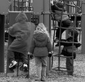
| 03/29/2006 11:06:26 PM |
Break'emby cliffjComment: I think I would have liked it better if your perspective was different - from a higher position so that the background clutter isn't there. |
| 03/29/2006 10:37:23 PM |
Weeeeee ...by samanwarComment: Nice perspective makes it different from other park snapshots. This extra effort will probably make a whole point difference in the final standings. More dynamic range would have helped - there are no significant dark areas on the photo and that makes it duller than it had to be. |
| Photographer found comment helpful. |
| 03/29/2006 10:35:46 PM |
Hey!! What happened to ladies first ??by dolphnz8Comment: I would have preferred to see more faces. Moreover, the black&white is kind of dull in this photo. It seems that the 50% of the photo is within +/- 5% of the same shade of gray. You could have played more with different color channels and selectively (color-wise) shift hues and brightness to achieve more dynamic photo. |
| Photographer found comment helpful. |
| 03/27/2006 04:19:13 PM |
Dripby pointandshootComment: The drop is too secondary to this composition and lighting. If you put more light on the drop instead of on the spout, it would have been better IMO. |
| Photographer found comment helpful. |
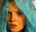
| 03/27/2006 07:23:54 AM |
Eyes by librodoby chsmithComment: The eyes do not stand out - the left one is in the (rather harsh) shade and he whites could have been dodged a bit to increase the effect. Otherwise nice expression on the model. |
| 03/27/2006 07:20:39 AM |
|
| Photographer found comment helpful. |
| 03/27/2006 03:41:47 AM |
Tribute to KarenNfldby DiComment: The Crop... you should have cropped another 10-20 pixels from the left, to achieve symmetry. This way it looks like the whole photo is leaning to the right even though it may not be.
Now, I lined it up against another window and it IS leaning to the right a bit.
I am not a straight horizon nazi, but it spoils this photo. 5. |
| Photographer found comment helpful. |
| 03/27/2006 03:37:20 AM |
It's a Wacky World!by alienhelixComment: I would expect someone or something with footprints like this to finish elsewhere:-) but an egg is just fine.
Great humorous shot! |
| Photographer found comment helpful. |
Home -
Challenges -
Community -
League -
Photos -
Cameras -
Lenses -
Learn -
Help -
Terms of Use -
Privacy -
Top ^
DPChallenge, and website content and design, Copyright © 2001-2026 Challenging Technologies, LLC.
All digital photo copyrights belong to the photographers and may not be used without permission.
Current Server Time: 07/18/2026 05:47:27 AM EDT.