|
|
|
Showing 331 - 340 of ~1004 |
| Image |
Comment |
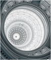
| 06/06/2006 04:19:28 PM | Orthodox Cathedralby GiorgioComment: Greetings from the Critique Club!
First impression: I like the tilted shot! Then I immediately recollected recent threads about leaning photos, and realized that this community perhaps does not enjoy tilted photos.
Second thoughts: Tilted is fine, but it is lacking in height. These cathedrals are usually taller, and your landscape orientation prevented you from showing more of its architecture.
Amanda commented on the gradient, that it should have been more prominent. However, when adding a significant gradient to a sky that did not have any to begin with is walking a thin line between legal and DQ. However, your gradient should have been parallel to the horizon and not to the photo's horizontal (or it seems to me that way).
Also, to do better in a challenge (and you probably know this by now) you need a more striking photo. Compositionally and subject-wise, this is just another church (and tilted, which polarized your audience). You received slightly below-average score for it.
I hope this helps! Please feel free to PM me if you have any questions.
-Serge |  Photographer found comment helpful. Photographer found comment helpful. |
| 06/06/2006 03:37:07 AM | Debut win for the new Seat Leon in DTCby mark8700Comment: Greetings from the Critique Club!
First impression: Great action stop-motion shot. It is worthy of most sports magazines out there dealing with auto-racing. (And others, as well).
Second thoughts: This is for the success challenge. My guess is that many DPCers thought that you are pushing this image into a challenge by careful selection of a title for your photo. Even though this racer eventually won, that's what probably brought this image down.
Other than that, the only suggestion I would have is to crop some of the bottom, the image is too centered this way.
If this was submitted to the PJ challenge, it would have taken one of the ribbons. Bad timing, sorry!
|
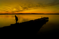
| 06/06/2006 03:06:20 AM | Couldn't catch a cold..by owenComment: Greetings from the Critique Club!
First impression: beautiful landscape with just great DOF. Then I looked at the challenge - Failure, and I've concluded that you must have gotten at least a few views where voters thought that it is the title that makes it fit into a challenge. That's something to keep in mind if you want to satisfy those DPCers. In that case, you would have needed to show an empty net, bag, or a basket, and that would have been hard with such composition.
Second look: bottom is too dark. Not enough detail in it, and you could have cropped some of it, and still preserve the gradient from dark to light(er). Even the rule of 3rds would not have been affected if you had made this choice.
Look at the exif: Wow! 4s exposure and the sillhouette is tack-sharp! That's what I call a cooperating model!
Now I'm going to check out how did it do in the challenge:4th! Well, I was about to attempt to advise you on how to score higher... and I think I ran out of suggestions already!
Congratulations on your great placement and good luck in the future challenges. | | Photographer found comment helpful. |
| 06/05/2006 03:03:04 PM | Texas State Capitol Buildingby yankoComment: Congratulations on your personal best! I like the twist you took with different colors here. I'm sorry, but I just can't accept comments like "I've seen this before" as there are truly only a few photos that you can make and not repeat someone else's work.
Moreover, this one has not been done this way, as both Gordon, myuself, and others that took the same one, did not shift the hues towards chrome.
Keep up the good shooting!
-Serge | | Photographer found comment helpful. |
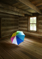
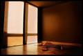
| 06/05/2006 01:15:41 AM | Not Superstitious by rioloboComment: Second pass (not too many entries this time):
- nice choice of colors on this one; the contrast between the room tones and the colorful umbrella is the winning combination here.
- The window adds to composition, properly located for maximal viewing pleasure.
- lighting is good, the light that comes from the window is stronger than the key light from your right, which is a good thing. I wish I could not see the shaddow on the wall from the second light though.
Congratulations on a well-executed, interesting image.
bump! | | Photographer found comment helpful. |
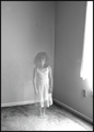
| 06/05/2006 12:59:44 AM | Left Behindby nsoroma79Comment: A similar idea we must have had. I like yours better than mine. Technicalities to follow: the curtains are (or seem to be) blown out. Your exposure of the room without a girl could have been shorter... composition: you should have positioned her so that the corner line runs through at least her shoulder or her left arm to enhance the ghost effect. Overall 8 in a first pass. |
| 06/05/2006 12:55:28 AM | | | Photographer found comment helpful. |
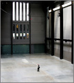
| 06/05/2006 12:54:07 AM | The Photographerby redmoonComment: Amazing shot!!! I first looked at the lines, then I saw the photographer. Amazing, again. The best so far. |
| 06/05/2006 12:31:39 AM | After Settlement...by bgableComment: Out of focus and too small to view properly. Please read the tutorial on how to resize image for submitting to DPC. | | Photographer found comment helpful. |
| 06/05/2006 12:10:18 AM | Help!! Only One Left!by Mr_PantsComment: They said: Bring only one thing in the room with you, so don't complain now. ROFL!!! I hope this does well (haven't seen all of them yet, but this one cracked me up!) | | Photographer found comment helpful. |
|
Showing 331 - 340 of ~1004 |
Home -
Challenges -
Community -
League -
Photos -
Cameras -
Lenses -
Learn -
Help -
Terms of Use -
Privacy -
Top ^
DPChallenge, and website content and design, Copyright © 2001-2026 Challenging Technologies, LLC.
All digital photo copyrights belong to the photographers and may not be used without permission.
Current Server Time: 07/18/2026 08:41:37 AM EDT.
|