| Image |
Comment |
| 05/01/2009 03:42:20 PM |
Danielle 4 by LVicariComment: Originally posted by digifotojo:
Very nice. She has a Barbra Streisand look about her. |
Hello Dolly ;) |
 Photographer found comment helpful. Photographer found comment helpful. |
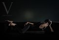
| 05/01/2009 03:41:50 PM |
Danielle 3 by LVicariComment: My fave of the bunch. Really classy tones and lighting. Your photog/friend model did a great job too. I agree with Haneck about the little bright spot on the wall. No biggie to clone out I'm sure. |
| Photographer found comment helpful. |
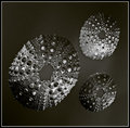
| 04/15/2009 11:13:39 AM |
Alien Textureby artvetComment: Excellent! glad with we both made it over a 6. It was so elusive during this challenge. |
| Photographer found comment helpful. |
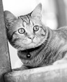
| 04/15/2009 11:11:22 AM |
Prey in Sightby CindyGComment: A cute orange? tabby :) I do agree with the other posters that this does work really well in b/w. Splendid job with the conversion. The tones look great. It also looks a bit high key but not over the top. I like that.
|
| Photographer found comment helpful. |
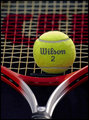
| 04/15/2009 10:24:14 AM |
Wilson 2by BudyaComment: Top team Poland scorer this week :)
Go Anna! Wtg on the top15 finish. |
| Photographer found comment helpful. |
| 04/15/2009 10:22:23 AM |
Skin Sculpture by LydiaComment: Most excellent! Congrutulations :)
Very well deserved. Good call to go with Fitness. Thanks for the fun write up on the shot. I can totally relate about the white background being small enough ;) |
| Photographer found comment helpful. |
| 04/15/2009 10:19:16 AM |
Blue Steel by LalliSigComment: Looks great! No retouching needed. Perfect. Congratulations on the blue, with Blue Steel 8)
p.s.
Had a big hunch this was yours. A nice after challenge surprise to finally find out. |
| Photographer found comment helpful. |
| 04/15/2009 09:44:03 AM |
It's all about my nose!by maggiedddComment: Most awesome eyes :)
Only don't think it needed the fancier frame. If any, just a thin black border would've been perfect. |
| Photographer found comment helpful. |
| 04/15/2009 09:42:28 AM |
The Carpenterby DrAchooComment: The kind of shot I wished to see and/or take. I really like it.
The finger placement looks a bit odd, especially for those viewers who might have to scroll the shot a bit to see it in whole. But a minor nit for me. On the technical side, the background isn't completely black from top to bottom, there's some slight texture up top, above the hammer, top left. Again that different monitor issue comes to play *sigh*. Overall, great job. Congratulations on the top20 finish :) Message edited by author 2009-04-15 09:42:48. |
| Photographer found comment helpful. |
| 04/08/2009 09:59:51 AM |
|
| Photographer found comment helpful. |
Home -
Challenges -
Community -
League -
Photos -
Cameras -
Lenses -
Learn -
Help -
Terms of Use -
Privacy -
Top ^
DPChallenge, and website content and design, Copyright © 2001-2026 Challenging Technologies, LLC.
All digital photo copyrights belong to the photographers and may not be used without permission.
Current Server Time: 06/17/2026 11:27:58 PM EDT.