| Image |
Comment |
| 01/16/2008 02:45:38 PM |
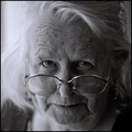
Mother of Mineby MAKComment: Great team, MAK family :)
Her eyes are the center of attention and rightfully so. She has a wonderful gaze. Still a young lady at heart is she? |
 Photographer found comment helpful. Photographer found comment helpful. |
| 01/16/2008 02:41:51 PM |
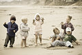
Different agendas.jpgby mpetersComment: Great capture of the kids at play all in one frame. I too really like the PP, the subdued tones and low saturation do give it a great mood. |
| Photographer found comment helpful. |
| 01/16/2008 02:39:44 PM |
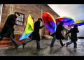
Stage Leftby mpetersComment: Cool shot m8. I like it more with every view. Congratulations on the HM :) |
| Photographer found comment helpful. |
| 01/16/2008 10:57:53 AM |
|
| Photographer found comment helpful. |
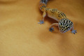
| 01/16/2008 10:53:47 AM |
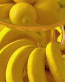
Scaly Yellowby golfercaz85Comment: This has lots more potential with some extra PP work as the shot appears a bit flat. You have the nice composition , interesting fabric texture and shadows. |
| 01/16/2008 10:50:33 AM |
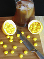
Taste the Lemonby beckydiComment: Cute idea. Shot is overexposed though. If you used a lamp, a piece of paper works as a nice diffuser. |
| 01/16/2008 10:48:50 AM |
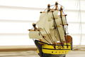
"Victory" on the Windowsillby chawley8889Comment: Nicely done. I like the natural soft light. Seems a little too tight on the crop though. Especially on the bottom. If you didn't want to show the sill... Maybe some crumpled light brown packing paper for the material underneath the boat to give off a wavy ocean effect. |
| Photographer found comment helpful. |
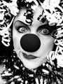
| 01/16/2008 09:44:44 AM |
Happy The Clownby TransitComment: The eyes, chin, forehead...Great job with the makeup! Message edited by author 2008-01-19 11:57:32. |
| Photographer found comment helpful. |
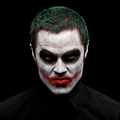
| 01/16/2008 09:42:22 AM |
The Jokerby LalliSigComment: Very wicked shot m8! (meant in a good way). Was my pick for the top3. My favorite of the moody or creepy clown shots. A real excellent twist on those. I like that the eyes are not illuminated. On my screen the shirt does not blend in with the background and looks fine. The bottom part with the shirt looks a little off balanced, one side being a lot darker, pitch black, compared to the other side but you did what you could in basic but it's a mysterious effect. Congrats on the top10! Message edited by author 2008-01-16 09:43:12. |
| Photographer found comment helpful. |
| 01/16/2008 09:34:24 AM |
Sourpuss by loveComment: Was easily my favorite from the challenge. So glad you ribboned! :) |
| Photographer found comment helpful. |
Home -
Challenges -
Community -
League -
Photos -
Cameras -
Lenses -
Learn -
Help -
Terms of Use -
Privacy -
Top ^
DPChallenge, and website content and design, Copyright © 2001-2026 Challenging Technologies, LLC.
All digital photo copyrights belong to the photographers and may not be used without permission.
Current Server Time: 06/23/2026 11:30:14 AM EDT.