| Image |
Comment |
| 07/10/2005 02:13:38 PM |
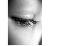
Lashesby sbridgwaterComment: I don't like this border at all. It looks more like the site isn't displaying the full image than a border. It's completely distracting and detracts from what might otherwise have been a good image. |
 Photographer found comment helpful. Photographer found comment helpful. |
| 07/10/2005 02:11:13 PM |
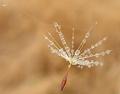
Fairy Wandby EvaanComment: Nice composition, but somehow the seed(?) looks really flat. I'm not sure if it's the lighting or what, but something feels off. |
| Photographer found comment helpful. |
| 05/01/2005 10:41:14 PM |
MAMBAby aznymComment: Text is very dark...difficult to read. Good composition though. |
| Photographer found comment helpful. |
| 05/01/2005 03:17:56 PM |
We take trade-ins....by ralphComment: Ring looks nice, but I don't think connotations of divorce are the way to go when advertising wedding rings, even if you do take trade ins. |
| 05/01/2005 03:17:06 PM |
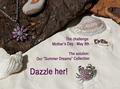
Defining Beautyby arnitComment: Concept is ok, but I think it would work better if you focused on one piece of jewelry. There's a little too much going on here. |
| 05/01/2005 03:16:06 PM |
|
| Photographer found comment helpful. |
| 05/01/2005 03:11:35 PM |
|
| Photographer found comment helpful. |
| 05/01/2005 02:58:57 PM |
|
| Photographer found comment helpful. |
| 05/01/2005 02:58:06 PM |
|
| Photographer found comment helpful. |
| 05/01/2005 02:57:03 PM |
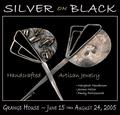
Southwesternby vtruanComment: The color of the text makes it more difficult to read an already complex font. |
| Photographer found comment helpful. |
Home -
Challenges -
Community -
League -
Photos -
Cameras -
Lenses -
Learn -
Help -
Terms of Use -
Privacy -
Top ^
DPChallenge, and website content and design, Copyright © 2001-2026 Challenging Technologies, LLC.
All digital photo copyrights belong to the photographers and may not be used without permission.
Current Server Time: 07/16/2026 10:47:59 PM EDT.