| Image |
Comment |
| 05/09/2005 02:30:33 PM |
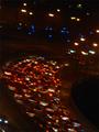
Highway Traffic Lightsby mrezaComment: I like the tilt, it gives your image a dynamic touch and emphasises the curve. Unfortunately, the quality of your image is poor. It's blurry and there is a lot of noise. 6. |
| 05/09/2005 01:20:28 AM |
Happyby heidaComment: Hm...I prefer your moodier shots. 'Happy' and 'heida' next to each other don't seem get along to well. Cute girl though. Congrats on the top 10 finish. |
 Photographer found comment helpful. Photographer found comment helpful. |
| 05/09/2005 01:14:36 AM |
Anger Unleashed by Joey LawrenceComment: I congratulate you Joey. You proved that a young creative mind can get an incredibly strong image out of a crappy (sorry) camera. You sure deserve this ribbon! (Is it possible that you're the youngest ever blue-ribbon winner? You should do some research!) |
| Photographer found comment helpful. |
| 05/08/2005 06:16:05 AM |
The Streetsby doddsyComment: Interesting approach to the challenge. If you want to enhance the quality of your shot, you should use levels or contrast to make the black parts darker. They looks a bit washed out. 5. |
| 05/08/2005 06:14:48 AM |
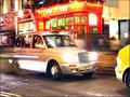
The Republic of Texasby PhantomEWOComment: That's a nice place to be. I like the people, some of them stand out clearly, others are blurred. Nice mixture.
Your picture came out a bit too bright. Use levels to get rid of the washed-out colours. You also have a tilt in your image. If it was intentional, then I don't really see how it adds to the image. If not, just rotate it in your graphics software. 6. |
| Photographer found comment helpful. |
| 05/08/2005 06:11:48 AM |
Secrets At Midnightby rubytuesdaiComment: You have a focus problem here. Let your camera focus as long as your subject is well lit, with a flashlight for example, then switch your light source off and shoot. Some more text in the diary would have been nice. Showing a person writing in the diary would have been even better. 4. |
| Photographer found comment helpful. |
| 05/08/2005 06:09:25 AM |
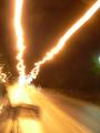
Sorry, busyby mimidComment: Lovely. You did well with the lighting conditions, the car is neat and sharp and still has that nice motion blur and the light trails. Looks a bt overexposed in some areas, your picture could be darker overall. 9. |
| Photographer found comment helpful. |
| 05/08/2005 06:06:53 AM |
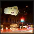
As Time Goes Byby instepsComment: Hey, that face really pops out! I like the colours and the movement in your shot. There seems to be a problem with the focus on the trafiic lights. That's strange, because the spikes actually suggest that you used a high aperture.
I don't like the small glowing tower-thing in the upper right hand corner. It's not connected to the rest of the image and distracts from the interesting areas. 7. |
| Photographer found comment helpful. |
| 05/08/2005 06:04:03 AM |
Subsidenceby ktlovehugsComment: I'd have included a bit more of the ground and less of the sky. Looks interesting, I like the houses in the background. 6. |
| Photographer found comment helpful. |
| 05/04/2005 09:50:05 AM |
Bad Aphidsby GringoComment: This is too funny. I think the composition would have been even stronger if the bug was in the upper right hand corner: it would have put emphasis on the bug running out of the frame. Should be easy to do outside of the rules, since your bug is isolated.
Good shot, and congrats on your top 20 scoring! |
| Photographer found comment helpful. |
Home -
Challenges -
Community -
League -
Photos -
Cameras -
Lenses -
Learn -
Help -
Terms of Use -
Privacy -
Top ^
DPChallenge, and website content and design, Copyright © 2001-2026 Challenging Technologies, LLC.
All digital photo copyrights belong to the photographers and may not be used without permission.
Current Server Time: 07/19/2026 10:04:15 AM EDT.