| Image |
Comment |
| 01/25/2006 04:55:26 PM |
Freedomby TerramarComment: Wooha! Makes me wanna try that too :) If there was more light on the face it would be perfect. A 10, nonetheless. |
| 01/25/2006 04:53:42 PM |
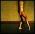
Sheby bucketComment: This is a creative way of framing/cropping your image. I like the pose of the legs, but the arms seem much too static, they don't fir the grace of the rest of the image.
I think this would have been much better as a B/W image. (That would also have removed the colour noise on the legs.) 9. |
 Photographer found comment helpful. Photographer found comment helpful. |
| 01/25/2006 04:51:17 PM |
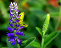
Hiding Hopperby wavelengthComment: I think the title doesn't fit at all. Fortuately the picture works on it's own. Nice colours. The yellow seems a bit blown out. 6. |
| Photographer found comment helpful. |
| 01/25/2006 04:49:49 PM |
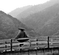
Man at Kintai Bridgeby typologicComment: It looks as if you used dodge&burne a bit too much. That's the only think I don't like about this image. The grain works very well here. Congrats on an excellent photograph. 10. |
| Photographer found comment helpful. |
| 01/25/2006 04:48:21 PM |
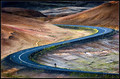
On my ownby AmasonComment: Excellent composition and use of guiding lines. Lovely textures and colour tones. 10. |
| Photographer found comment helpful. |
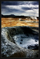
| 01/18/2006 01:21:16 PM |
Darklandsby jonasvalComment: Cool. This looks extra-terrestrian. Isn't it wonderful how diverse our own planet is? You've captured great tonalities and rusty colours here. 10. |
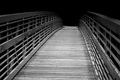
| 01/18/2006 01:20:00 PM |
Pathway To Nowhereby jeroweComment: The lighting looks surreal. I'd be very disappointed if this was post-processing. The leading lines don't use their full potential here. You should have moved more to either side of the bridge. More to the right, I'd say. 7. |
| Photographer found comment helpful. |
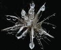
| 01/18/2006 01:18:42 PM |
SpaceBugby EvaanComment: Aaaah, invasion! Cool title :) The crop is too tight on the image. Since it's an isolated object, I feel it needs some space to 'breathe' around. 6. |
| Photographer found comment helpful. |
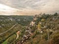
| 01/18/2006 01:17:38 PM |
Straight out of the middle agesby esaintpiComment: This reminds me very much of France...Franche Compté or whatever it's called. Good composition. The colours look very rich and I like how the red subtly contrasts the surrounding green. It might have been darker, overall - mainly in the sky. 8. |
| Photographer found comment helpful. |
| 01/18/2006 01:15:37 PM |
Mommy & Meby lawreeComment: Poor composition. The sideview looks weird. The lighting is too flat, the crop is too tight. 3. |
Home -
Challenges -
Community -
League -
Photos -
Cameras -
Lenses -
Learn -
Help -
Terms of Use -
Privacy -
Top ^
DPChallenge, and website content and design, Copyright © 2001-2026 Challenging Technologies, LLC.
All digital photo copyrights belong to the photographers and may not be used without permission.
Current Server Time: 07/17/2026 04:08:22 PM EDT.