| Image |
Comment |
| 04/29/2006 06:35:42 AM |
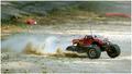
Toys for Big Boysby SDWComment: This is cool, in the thumbnail it looked as if this was a real big monster tuck. Maybe I wouldn't even have noticed with a deeper DFO and without the antenna. The turbulent sand gives your image a nice action touch. |
 Photographer found comment helpful. Photographer found comment helpful. |
| 04/29/2006 06:33:45 AM |
Negative Roseby SDWComment: That's a cool approach to flower photography. Maybe your image would have profited - like the common rose photographs - from a softer focus? The violet border doesn't seem to work here: the colours in the rose are not strong enough to support the use of a coloured border. |
| Photographer found comment helpful. |
| 04/29/2006 06:31:51 AM |
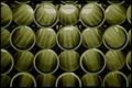
Stackedby SDWComment: A nice variation of a common theme. I like the use of reflections here, also the texture inside the pipes are nice to look at. It's also interesting to see how some elements stand out a bit more than others and form a pattern inside the pattern. The 'sepia' gives your image the final touch. |
| Photographer found comment helpful. |
| 04/29/2006 06:29:57 AM |
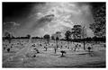
Rays of Loveby SDWComment: This truly is an impressive capture, to say the least. The vastenss of the sky is incredible. The perspective suggests that the people buried here went straight "up" to heaven, into that magnificient relam of patterns and shapes, which you revealed in your excellent B&W conversion. I also like how you managed to use the elements present to create a kind of natural vignette around the scene, framing the elements and keeping the composition together. |
| Photographer found comment helpful. |
| 04/29/2006 06:22:59 AM |
Close Quartersby kdkaboomComment: That's an interesting approach to the challenge. You captured the idea of being tightly squeezed together - even in the afterlife. I would have preferred a B&W version of this shot though, the shapes and tones would have looked much better. |
| Photographer found comment helpful. |
| 04/29/2006 06:19:17 AM |
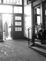
Running in the Hallby kdkaboomComment: This is a cool capture. The slight motion blur convey a clear notion of movement. The leading lines of the corridor support this aspect, they also lead your eye straight to the subject of the photograph. With some grunge post processing you can make this really spooky :) |
| Photographer found comment helpful. |
| 04/29/2006 05:24:58 AM |
Just Duckyby sir_bazzComment: Great lighting here! The spot of light really makes the yellow ducky pop out from the background. Its look is really cute, it seems slightly intimidated but also curious enough to dare to look what's going on behind it. The reflection in the floor adds a nice touch. |
| Photographer found comment helpful. |
| 04/29/2006 05:23:22 AM |
Ring of Blue Waterby sir_bazzComment: The thing I really like about this image is its oxymoron. The ring of water looks like a gas flame! That's pretty cool and was only possible because you chose a long shutter time. The composition seems a bit boring because its centered and sits at the bottom, but I admit I don't know how to improve it. |
| Photographer found comment helpful. |
| 04/29/2006 05:19:17 AM |
He Waited.by moniepennyComment: An excellent idea for this challenge. The setting is quite cool for this shot, it looks like a down-to-earth (pun) appartment, but the lighting gives it that heavenly shine. I think the woman's pose is bad though. Maybe it's just her dress, but she seems somewhat bulky and bored. |
| Photographer found comment helpful. |
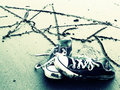
| 04/29/2006 05:16:22 AM |
Chuckby moniepennyComment: Your post processing echoes the mood of the image very well. I get a sense of independence, rejection of limitation from the abandoned shoes and the writing in the sand. I almost mistook the star for a pentagramm though :) |
| Photographer found comment helpful. |
Home -
Challenges -
Community -
League -
Photos -
Cameras -
Lenses -
Learn -
Help -
Terms of Use -
Privacy -
Top ^
DPChallenge, and website content and design, Copyright © 2001-2026 Challenging Technologies, LLC.
All digital photo copyrights belong to the photographers and may not be used without permission.
Current Server Time: 07/17/2026 02:59:33 AM EDT.