| Image |
Comment |
| 12/30/2004 06:16:29 AM |
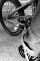
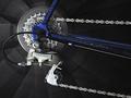
Engineered for Funby L1Comment: I like the contarst in this picture. I'd have preferred a different point of view, showing more of the wheel or of the gears. It was a good idea to have someone sitting on the bike! 6. |
 Photographer found comment helpful. Photographer found comment helpful. |
| 12/30/2004 06:15:06 AM |
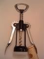
Protectionby chomaeeComment: You should have shown the corkscrew in action, it would have been more interesting. The picture looks to flat, there's nothing really interesting in it. You had a good idea with setting the cork and the screw up in a way that one's protecting the other, but it doesn't add to the challenge theme. 3. |
| Photographer found comment helpful. |
| 12/30/2004 06:13:18 AM |
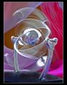
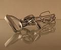
Mechanic mobile... in perpetuumby alithenakeComment: This oicture looks really cool. I forgive you the ratzher weak link to the challenge :)
I like the movement, how did you get it like that? Did you use a flash and set a long exposure?
The colous in the background a appealing, not too contrasting, the fabric really adds a nice aspect to the metallic mobile. 8. |
| Photographer found comment helpful. |
| 12/30/2004 06:10:28 AM |
Spring Loadedby StagoleeComment: A bit too shallow in the background, I'd have liked a larger DOF. Nice macro, I like the many details and the dirt. Fits the challenge very well. It would have done better as b&w though. 6. |
| Photographer found comment helpful. |
| 12/30/2004 06:08:57 AM |
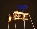
Critterby anirenoComment: A nice mechanism. I like the shiny golden surface. I think you should have chosen a brighter background, the blue part doesn't come out good enough against it. I'd probably have chosen a much tighter crop without any of the background, just the gears showing. 7. |
| Photographer found comment helpful. |
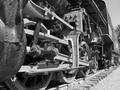
| 12/30/2004 06:05:56 AM |
Wheels of steamby DaRkYeComment: The perspective is abit confusing, the many lines don't go well with the cast shadows. I'd have preferred straight up shot. 6. |
| Photographer found comment helpful. |
| 12/29/2004 05:03:05 AM |
|
| Photographer found comment helpful. |
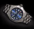
| 12/29/2004 04:59:48 AM |
Swimming with the Fishesby snackwellsComment: Nice title. You admit that you chose a common theme, however your watch picture doesn't show any mechanics of the watch! Thus, it doesn't really meet the challenge. 4. |
| Photographer found comment helpful. |
| 12/29/2004 04:58:19 AM |
|
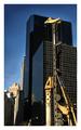
| 12/29/2004 04:56:53 AM |
Building a cityby nico_blueComment: I don't like the border, it's way too big. But I love the contrast between the modern building and the older, rusty machine. 7. |
| Photographer found comment helpful. |
Home -
Challenges -
Community -
League -
Photos -
Cameras -
Lenses -
Learn -
Help -
Terms of Use -
Privacy -
Top ^
DPChallenge, and website content and design, Copyright © 2001-2026 Challenging Technologies, LLC.
All digital photo copyrights belong to the photographers and may not be used without permission.
Current Server Time: 07/18/2026 11:38:25 AM EDT.