| Image |
Comment |
| 01/03/2005 04:35:02 PM |
solitary sunsetby wkmenComment: This one's not to my liking. I think the dark parts should be black and not gray, or at least show some more details. The sunset is not red enough to have a strong effect. You might either try to push the saturation, or turn the whole picture b&w.
The picture is quite noisy, too. I think you could run it through NeatImage without losing too much overall quality. |
 Photographer found comment helpful. Photographer found comment helpful. |
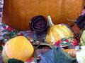
| 01/03/2005 04:31:30 PM |
summer is doneby wkmenComment: Cool picture, it's mainly the powerful colours which draw my attention. You might have chosen a different crop, the limit between the pumpkin and the rest of the table is too close to the horizontal center of the image. Apply some rules of thirds to make the picture more harmonic. The two things (pumpkins?) at the lower-right are out of focus. They are distracting from the rest of the image.
Edit: I appreciate the choice of the title. Much better than 'autumn' :) Message edited by author 2005-01-03 16:32:10. |
| Photographer found comment helpful. |
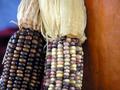
| 01/03/2005 04:28:39 PM |
a touch of autumnby wkmenComment: This one's really cool. I love the random pattern on the corns, I like how the dark one is in contrast to the bright one, and how they blend at the top because of their similar leafs. I also like how the blue background at the left opposes the orange pumpkin (?) at the right.
The only thing I see that could be improved on is that the blue background at the left doesn't go all the way down. |
| Photographer found comment helpful. |
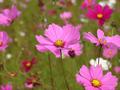
| 01/03/2005 04:25:21 PM |
Roadside Wildflowerby wkmenComment: I don't like this one as much as the others. The pink and the green don't go together for me. I also think that the many small petals in the background are distracting. I don't know what to focus on.
I have to admit though that the shallow DOF is well chosen. It blurs the distracting background and diminishes it's effect. Yet, three flowers in focus are two too many.
You made a good use of the USM, I like the crispness of the central flower's petal. |
| Photographer found comment helpful. |
| 01/03/2005 04:21:41 PM |
At the Car Showby wkmenComment: I like the sharpness of this one. The details on the car come out well. The reflection on the left side is a bit distracting. I don't know what you could do about it, maybe change the hue on specific areas to blend the red better?
The reflections in the chrome on the car's front however look really cool. They show you something that actually has been cropped away. That's a nice effect.
The thing I like most is the out-of-focus-flower in the foreground. It adds a lot to the picture, introduces some new colours and fills the empty space in the upper-left corner.
I'd have liked to see all of the car's right front though. I understand why you had to crop it away, but it's a pity you had to cut the car 'to pieces'. |
| Photographer found comment helpful. |
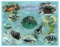
| 01/03/2005 04:17:28 PM |
Undersea Montage #2.jpgby wkmenComment: Nice artwork. It would do well as desktop wallpaper, although it's a bit too distracting for that. I like the blue cast, it gives the pictures the right 'underwater' feeling.
As you said, the picture is too circular. Try to move them around a little bit, make their place in the image look random.
You might also want to use a softer eraser. The gradient between the background an the single fishes with their respective background is too harsh.
Oh, and those pictures are awesome. I like how colourful they are. |
| Photographer found comment helpful. |
| 01/03/2005 09:31:56 AM |
Mother Nature's Angerby Joey LawrenceComment: Congratulations on your best picture so far. I'm a bit disappointed, though, because the face wasn't really on the leaf. But hey, photography is about illusion just as well as recreating reality. It is a great picture. |
| Photographer found comment helpful. |
| 01/03/2005 09:28:42 AM |
Sunny Blue Eyesby spaque99Comment: A great shot. I like how there is still somesnow on some surfaces. I'd like a version which didn't run through NeatImage, it really killed some important details in the brick wall. |
| Photographer found comment helpful. |
| 01/02/2005 06:07:37 AM |
Just Swingin' on My Hingesby ArtanComment: I can't see what' mechanical in this. I'll return after voting's over to have a look at your comments. For now, I give you a 4. |
| Photographer found comment helpful. |
| 01/02/2005 06:06:48 AM |
Overshot - Whig Roseby outlandComment: I don't know what this is, but it doesn't look mechanical. It isn't sharp either, and in the middle there are large blown out areas. 1. |
| Photographer found comment helpful. |
Home -
Challenges -
Community -
League -
Photos -
Cameras -
Lenses -
Learn -
Help -
Terms of Use -
Privacy -
Top ^
DPChallenge, and website content and design, Copyright © 2001-2026 Challenging Technologies, LLC.
All digital photo copyrights belong to the photographers and may not be used without permission.
Current Server Time: 07/18/2026 11:38:31 AM EDT.