|
|
|
Showing 2901 - 2910 of ~4090 |
| Image |
Comment |
| 01/12/2004 12:24:23 PM | |  Photographer found comment helpful. Photographer found comment helpful. |
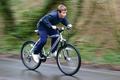
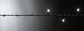
| 01/12/2004 10:57:10 AM | Slow Sync Shotby andygoughComment: Critique Club:
Hi. First of all this photo fits the challenge, so there's no problems there. The panning technique is one of the hardest to master and it's very difficult to get decent results. I think you've done a good job here. I think the main reason that you didnt get a higher score is that even though the boy is sharp as far as the panning goes, he still looks a little soft. I think this is due to the post processing not the photo-taking. When you scale down a photo to fit DPC sizes, they always become soft. I've found the best way to fix this is to afterwards use Unsharp Mask with these variables:
Amount: 170 %
Radius: 0.4 pixels
Threshold: 0 levels
I tried this on your photo and it sharpens the boy a lot, improving the photo no-end.
I think a slightly different crop would also make it a bit better. Perhaps moving the boy more towards the left of the frame. This would increase the space on the right of him, to make it look like he is riding into the photo. This is a technique used a lot for action, and also for portraits. Looking into the frame is often better than looking out of the frame.
Overall this is a great attempt at the technique, and would look even better with just a little more basic post-processing. |
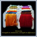
| 01/07/2004 11:00:45 AM | Diversity - Strength in similarities, strength in differencesby wetlandComment: Critique Club
Hi. I think this picture shows a great array of colours, with an interesting repeating pattern. The focus and sharpness seems good in the photo, but where you have cut it out from the background you used a feathered tool. This ruins the sharpness in my opinion. It also makes it look more obviously photoshopped. Using an anti-aliased tool instead of feathered would help keep it looking sharp.
The centered composition isnt normally used in photography, but for posters I think it works okay, and is a good choice here.
I don't think the connection between the photo and the text is as strong as some others, but there is a link there. Personally, I don't like the font and colour that you used though. I think the main word, Diversity, should be bigger than the rest, because this is the main message you are trying to give. The font also looks a bit 'cliché' if you know what I mean? Is it Lucida Handwriting or something like that? I think a stronger font, or something a bit different to the norm, would have worked better. Also, Red or orange (as these are the prominent colours in the photo) may have worked better than yellow, or even a neutral colour such as white or grey.
Finally, I don't really like the choice of border. I dont think that you needed anything extra around the black, and if you had to have something, I would have thought a simple one colour border would have worked well, with a 1px keyline in another colour to separate it. | | Photographer found comment helpful. |
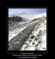
| 01/07/2004 10:50:11 AM | Determinationby agwrightComment: Critique Club
I really liked this shot. What makes it good for me is the sense of scale. The really tiny figure is placed near the edge where he is almost lost in the great landscape, but you've used leading lines to great affect so that people don't miss him (or her!). The composition works very well overall.
I do think that the photo itself looks a bit washed out, especially against the heavy black border. I think you should have maybe decreased the brightness a tiny bit, and increased the contrast, to get the whites whiter too. Other than that I can't fault the photo.
The quote fits the photo very well but I think it's placement makes the bottom of the frame look too crowded. I think it would have helped to have an equal gap between the quote and the photo, and the quote and the bottom. To make more room, moving the photo up to have the top of the frame smaller wouldn't have hurt. In fact, the bottom of borders are quite commonly bigger than the top. I think A light grey would have worked better than white too, so that so much attention wasnt brought away from the great photo. | | Photographer found comment helpful. |
| 01/05/2004 02:49:07 PM | | | Photographer found comment helpful. |
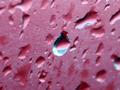
| 01/04/2004 11:36:26 AM | Porous Materialby channeledComment: Critique Club:
You have a good eye. The blue reflecting in these very red drips looks quite nice, and could make for a really nice photo. The main problem here has already been pointed out in your other comments. The focus seems off. You used a shallow DoF for focus people's attention on the blue drops, which is good, but it still doesnt look sharp enough in that area. Is this a full size crop from the original? If so, then that would explain it. You could try resizing the photo down a little and adding a border so it doesn't look too small. Then you could use USM to make it sharper.
The composition is very centered. I think placing the blue drop on one of the Third lines would improve it a little.
The photo also looks a little bit noisy, which can be easily sorted out with NeatImage.
Overall, I think with a little more post-processing, this would make a very nice photo. |
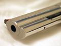
| 01/04/2004 11:29:56 AM | Too Close For Comfortby PhotoGnomeComment: Critique Club:
This is definatly a case of getting a lower than deserved score due to content rather than quality. I know a lot of people rate down photos with a gun in.
I think you coped with this shot quite well. I can imagine it being difficult with all the reflective surfaces pointing in different directions, and I think the lighting job was done well. I think maybe pushing +1 exposure compensation would have made it a bit brighter and slightly more appealing. There don't seem to be many white whites in there at the moment.
Composition wise, I think this way works, but I think getting lower down and including more of the other end of the gun in the distance would have improved this slightly, making it more "up close and personal". Widening the DoF to enable the writing on the gun to be readable would have helped too I think.
One last thing that I think would help the shot is to flatten out the t-shirt. It all seems a bit wavey, which creates a nice pattern in the background, but in the forground it is quite distracting. Also, did you think about using a black shirt instead? I would have made the gun stand out more. | | Photographer found comment helpful. |
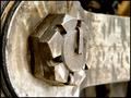
| 01/04/2004 10:32:42 AM | Massive Nutby dirtkahunaComment: Critique Club:
Hi, first of all I'd like to say that I like this photo a lot. The textures show up well, and the DoF looks good. If anything, I would have made it even shallower, so that only the main nut was in focus, not the foreground, because there isnt much interest in the forground. I also think a slightly different crop or composition would have improved it too. Moving the bolt more to the left would have cut out some of the plain foreground, and put it on a third line too.
Post-processing wise, I think a couple of things could have been done. Firstly, I think a subtle 0.4 radius 120 strength USM would bring out some more texture. I also think a small adjustment using brightness/contrast, maybe -10/+10, would have added a more dynamic feel to the photo, adding more contrast.
I hope this CC helps, if you want to discuss anything feel free to contact me. | | Photographer found comment helpful. |
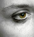
| 01/04/2004 10:13:34 AM | Holiday Bluesby SeanachaiComment: Critique Club:
I really liked this shot for a number of reasons. The high contrast works very well to create an emotional response, and the colour in the eye draws my attention to that area, which is good. I like the way the eye is an unusual colour, because it makes it seem a bit surreal, which I like to see sometimes. I've seen a lot of plain boring eye shots but the colouring is what makes this one unique to me.
I feel that the final score of 5.4 was a bit lower than what this shot deserved, but I can also see why it got that score.
The whole shot, to me, seems ever so slightly out of focus. Personally, I think this adds to the emotion, but generally people on DPC see it as a bad thing, and vote lower because of it.
I think the tear is another good element that adds emotion, but it seems a bit flat to me. Since you added it in PS, perhaps you could have moved the highlight more into the centre, and made it appear more rounded. It's just a little thing but I think it would have helped. Since the eye seems to have a lot of makeup on, perhaps some streaks of it running down the face would enhance the crying effect and the emotion. Of course I hate to encourage the use of photoshop to this extent, but I think it would look good anyway. :)
I hope this critique has been useful, it's my first one since Jan 2003, lol. | | Photographer found comment helpful. |
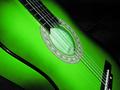
| 01/02/2004 10:57:47 AM | Play A Chord...by WILDBLUEComment: I think this has been a bit too over-sharpened during editing, as all the edges look jaggy. | | Photographer found comment helpful. |
|
Showing 2901 - 2910 of ~4090 |
Home -
Challenges -
Community -
League -
Photos -
Cameras -
Lenses -
Learn -
Help -
Terms of Use -
Privacy -
Top ^
DPChallenge, and website content and design, Copyright © 2001-2026 Challenging Technologies, LLC.
All digital photo copyrights belong to the photographers and may not be used without permission.
Current Server Time: 07/25/2026 01:40:51 PM EDT.
|