| Image |
Comment |
| 01/14/2004 12:03:58 PM |
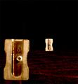
Who's bigger?by AndyTComment: Nice effect. It looks like it was taken on Mars or something, with red sand and stars. |
 Photographer found comment helpful. Photographer found comment helpful. |
| 01/14/2004 12:03:32 PM |
|
| Photographer found comment helpful. |
| 01/14/2004 12:02:59 PM |
|
| 01/14/2004 12:02:38 PM |
|
| 01/14/2004 12:02:11 PM |
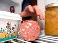
From the refrigeratorby madichComment: Unusual point of view, definatly fits the challenge :) The top of the butter tub looks a bit oversharpened tho, u can see the jaggies. |
| Photographer found comment helpful. |
| 01/14/2004 12:01:36 PM |
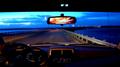
It's overby pcodyComment: Very nice and crisp, and great colours. I really like this. 8 |
| Photographer found comment helpful. |
| 01/14/2004 11:59:24 AM |
To The Sky...by Reza1968Comment: Looks like it could be a good shot, but I think the fading white border really detracts. |
| Photographer found comment helpful. |
| 01/14/2004 11:40:34 AM |
|
| 01/14/2004 11:02:14 AM |
Sunday Morning Scrumby jonpinkComment: Critique Club
Ahh, good old dirty English scrums... can't say I miss not being in them anymore though. My head got squashed flatter than a pancake when I was on the rugby team.
Anyway, to the photo. The exposure, composition, and colour saturation all look perfect to me, except a slightly blown-out area on number 5's shorts. The DoF is very good, blurring the background enough for it not to distract, but keeping it in focus enough for us to be able to see the posts.
I think in post-processing, a light USM would have helped your score a little bit, because people on DPC like crisp, sharp images. I think the slight softness looks good though, because it adds to the dirty atmosphere of a proper game of ruggers. My only other suggestions would be a grey keyline to separate the border from the image, as one of the guy's socks blends into the border. |
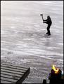
| 01/14/2004 10:53:56 AM |
Action On Iceby MonaComment: Critique Club:
This is a really nice shot. The composition is very good, using the rule of thirds well. I really like the almost black and white feel, with the burst of orange flames in the corner. The fire definatly adds a little something. I don't know if it would look better without the elements in the bottom, as justine suggested in her comment. I think it would be worth trying tho, as it would make the person seem more isolated and give more effect to the negative space. I think the main reason that you didn't get a higher score is that the action isn't as blatently obvious as some of the other entries. If you use a higher f-number you could have left the shutter open for longer and perhaps got some motion blur on the axe which might have helped.
In post processing I feel that you did a very good job, but a little USM wouldn't have gone a-miss.
Overall, a very nice photo, but not quite right for this particular challenge I feel. |
| Photographer found comment helpful. |
Home -
Challenges -
Community -
League -
Photos -
Cameras -
Lenses -
Learn -
Help -
Terms of Use -
Privacy -
Top ^
DPChallenge, and website content and design, Copyright © 2001-2026 Challenging Technologies, LLC.
All digital photo copyrights belong to the photographers and may not be used without permission.
Current Server Time: 07/25/2026 11:31:58 PM EDT.