| Author | Thread |
Comments Made During the Challenge  |
|
|
01/20/2004 07:21:31 PM |
|
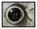
hmmm...I wonder why you had to validate this photo! Nice angles and lines....great perspective, and I like the softness around the edges. |
|
 Photographer found comment helpful. Photographer found comment helpful. |
|
|
01/20/2004 01:23:06 PM |
|
cool pic nice border and i like the lights too. |
|
| Photographer found comment helpful. |
|
|
01/19/2004 02:20:51 PM |
|
Nice effect! Good perspective! |
|
| Photographer found comment helpful. |
|
|
01/18/2004 08:26:31 AM |
|
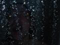
Whoa... this is wierd, it looks like it's been drawn rather than photographed! I think the border is a bit overpowering as well, but it's definitely an interesting point of view of the subject, and if it weren't for the "drawing" appearance of the pic it would do really well. |
|
| Photographer found comment helpful. |
|
|
01/18/2004 06:07:30 AM |
|
Great effect here and very interesting looking image. I would have preferred not to see the small circle so centrally placed in the format, but rather inside the bigger circle, which would have necessitated a different POV, if it was possible. |
|
| Photographer found comment helpful. |
|
|
01/16/2004 11:48:12 PM |
|
interesting image. don't think the blurred edges add to the shot though. |
|
| Photographer found comment helpful. |
|
|
01/16/2004 12:12:42 PM |
|
Okay, but the vignette surrounding the shot is really distratcting. |
|
| Photographer found comment helpful. |
|
|
01/16/2004 02:15:44 AM |
|
I almost rather like the framing on this but the vignette is really killing the overall image for me. Like the design, shapes and patterns, at leas the part I can see clearly.... |
|
| Photographer found comment helpful. |
|
|
01/15/2004 12:03:06 PM |
|
why oh why have your runied this image by using that white fade? |
|
| Photographer found comment helpful. |
|
|
01/14/2004 11:10:20 PM |
|
This is neat...I like all the different lines and the abstract look of it...good job... |
|
| Photographer found comment helpful. |
|
|
01/14/2004 10:18:21 PM |
|
personally I'm very against this fading affect although alot of online photographers seem to be partial to it |
|
| Photographer found comment helpful. |
|
|
01/14/2004 08:43:13 PM |
|
I probably would have scored it higher without the effects... |
|
| Photographer found comment helpful. |
|
|
01/14/2004 04:05:30 PM |
|
| Photographer found comment helpful. |
|
|
01/14/2004 03:05:26 PM |
|
Good POV. I'm not sure if I like the vignetteing though. I like the placement of the two circle, not the regular alignment. |
|
| Photographer found comment helpful. |
|
|
01/14/2004 02:51:29 PM |
|
| Photographer found comment helpful. |
|
|
01/14/2004 11:59:24 AM |
|
Looks like it could be a good shot, but I think the fading white border really detracts. |
|
| Photographer found comment helpful. |
Home -
Challenges -
Community -
League -
Photos -
Cameras -
Lenses -
Learn -
Help -
Terms of Use -
Privacy -
Top ^
DPChallenge, and website content and design, Copyright © 2001-2026 Challenging Technologies, LLC.
All digital photo copyrights belong to the photographers and may not be used without permission.
Current Server Time: 06/29/2026 12:38:27 AM EDT.