| Image |
Comment |
| 09/02/2006 08:28:10 AM |
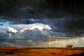
Desolationby angela_packardComment: Composition: 8 - The negative space works very well and the house is in a good spot.
Technical: 7 - I really like the high contrast except for the slight blown out part on the clouds, and the softness works well too. I'm not really a fan of the texture either. I'll vote as if it's legal, but I'm not sure that it is if you overlayed another photo.
Creativity: 6 - A nice interesting shot considering the flat landscape.
Appeal: 7 - Interesting to look at and has drama, I like it :)
Overall Calculated Average Score: 7 |
 Photographer found comment helpful. Photographer found comment helpful. |
| 09/02/2006 08:25:23 AM |
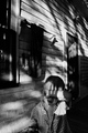
Fairy Giftby gurlwithapenComment: Composition: 4 - The centered composition doesnt really work here for me.
Technical: 3 - Its very soft, it could really do with a sharpen. Also, the colours being muted could work, but in this case I think it just makes it a bit less interesting.
Creativity: 5 - A creative idea for portrait, but the angle etc aren't that creative.
Appeal: 3
Overall Calculated Average Score: 4 |
| Photographer found comment helpful. |
| 09/02/2006 08:22:28 AM |
Nuanceby CalliopeKelComment: Composition: 9 - Nicely done. The negative space on the right works very well. I find the elbow being cut off a little distracting, but keeping it tight worked well overall.
Technical: 8 - Really nice lighting giving a nice variety in background shade as well as emphasizing the shape of the model's body. The B&W is also a good choice here. The only thing is that the left arm seems a lot brighter than the rest which leads the eye there (which happens to be the weak point in the crop imo)
Creativity: 7 - The choice of clothing, lighting, and just seeing the back make this quite a creative portrait, as well as the pose. It looks like she's doing her hair and you've caught her in between shots, which I really like the feeling of.
Appeal: 10 - Very nice black and white work, classy shot, and not being pervy or anything, but a very nice subject too! :)
Overall Calculated Average Score: 9 (bumped) :) |
| Photographer found comment helpful. |
| 09/02/2006 08:08:55 AM |
I Can Block the Sun with my Handby xianartComment: Composition: 7 - Its breaking out of the rules, and in this case I like it. I still think it could lose a tiny bit off the top, but it works!
Technical: 6 - I'd give this a lower score for technical if I didn't think you meant it to look like this. As above, it doesnt follow the rules, but for this photo I feel it works well.
Creativity: 6 - A unique photo which offers an insight and poses some interesting questions about the situation.
Appeal: 5 - While not the most appealing thing to look at, it's interestingness keeps me hooked for quite a while.
Overall Calculated Average Score: 6 |
| Photographer found comment helpful. |
| 09/02/2006 08:03:45 AM |
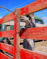
Gone Fishin'by tuffyComment: Composition: 5 - The rule of thirds is used well to show us what we're meant to be looking at, but over it's a bit busy.
Technical: 4 - The colours and nice and vibrant, but I think a fill flash would have helped to reduce the shadow on the cat, since it's obscured despite being the subject of the photo.
Creativity: 6 - A nice idea, which just isnt taken to its full potential.
Appeal: 3 - Overall the frame is just too busy for me, with a lot of contrasting colours, intersecting lines, and other things which take away from the original idea.
Overall Calculated Average Score: 4 |
| Photographer found comment helpful. |
| 09/02/2006 07:56:19 AM |
Fireworksby AzrifelComment: Composition: 8 - Very good with the black space on the left balanced by including the ferris wheel and buildings. Nice job.
Technical: 7 - Very nice firework shot. Lots of detail, lots of interest, just maybe slightly too bright in the bottom white firework, distracting attention away from the others.
Creativity: 6 - The composition and inclusion of the water and background buildings do make this better than the average firework shot.
Appeal: 6 - Nice interesting shot to look at :)
Overall Calculated Average Score: 6 |
| Photographer found comment helpful. |
| 09/02/2006 07:53:55 AM |
Down Underby BosborneComment: Composition: 5 - The centering works here, it kind of resembles a hue shifted Macedonian flag!
Technical: 3 - The bottom part seems over exposed, and the rest seems a bit dull, contrast-wise. The also leads to teh colours not having the impact they could. Also, I think you could have easily used the 720 pixels available for this challenge.
Creativity: 3 - Its an unusual crop of a flower, and from underneath, but other than that it doesn't have a lot of creativity.
Appeal: 3
Overall Calculated Average Score: 3 |
| 09/01/2006 05:07:48 PM |
The Captainby FalcComment: Composition: 8 - Tad too much space at the top imo, but otherwise, great.
Technical: 7 - The muted colours work really well, and the photo shows a lot of emotion, however I think it looks a bit oversharpened. Also, the shadows under the cap seem like a washed-out grey, as if you've dodged them a lot in PS. Adding a little more contrast just around the eyes would sort out that problem.
Creativity: 7 - A unique portrait since it shows so much character.
Appeal: 7 - The fine details give this photo its appeal.
Overall Calculated Average Score: 7 |
| Photographer found comment helpful. |
| 09/01/2006 05:04:01 PM |
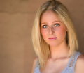
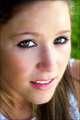
The Soft Light of Yestermornby CutterComment: Composition: 10 - Spot on :)
Technical: 9 - Wonderful soft lighting, matched well with a great shallow DoF and soft processing technique. The only thing that bothers me a little is the white dot in the right pupil. Catchlights are good but in this case it makes her eye just look a bit strange.
Creativity: 5 - The location and the pose aren't that creative here but I won't rate that too strongly in the overall average since the photo is a whole is so good.
Appeal: 9 - Beautiful model and beautiful photography.
Overall Calculated Average Score: 9 |
| Photographer found comment helpful. |
| 09/01/2006 04:58:32 PM |
Piercing Eyesby ChiquiComment: Composition: 8 - Very nice composition, puts the focus firmly on the eyes . The only thing I'd change is to crop a little lower at the top so that the top of the frame wasnt the same point at which the hairline is.
Technical: 7 - Lovely soft DoF, and great focus on the eyes. Fantastic colours! The skin tones seem a bit blotchy though, maybe I would have tried to even them up a little in post processing.
Creativity: 7 - Different from other portraits simply due to the variety of strong colours in the eyes and the kind glancing look, which makes it seem spontanious and even better :)
Appeal: 7
Overall Calculated Average Score: 7 |
| Photographer found comment helpful. |
Home -
Challenges -
Community -
League -
Photos -
Cameras -
Lenses -
Learn -
Help -
Terms of Use -
Privacy -
Top ^
DPChallenge, and website content and design, Copyright © 2001-2026 Challenging Technologies, LLC.
All digital photo copyrights belong to the photographers and may not be used without permission.
Current Server Time: 07/16/2026 02:48:31 PM EDT.