| Image |
Comment |
| 10/01/2004 06:52:49 AM |
Granite Totemsby rcrawfordComment: I think this should would be much better in B&W or sepia with a closer crop on the rocks to really show off the detail. As it is, the colours aren't really that interesting and nor is teh composition. A closer crop and B&W would really add some interest and 'feel' to the photo. 5 |
 Photographer found comment helpful. Photographer found comment helpful. |
| 10/01/2004 06:49:10 AM |
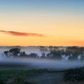
Awakeningby kirbicComment: This photo just begs for a contrast boost in post-processing in my opinion. It's a great shot but I feel it just needs some proper blacks in there, not the dark greys which are there currently. I think some of the sky should be cropped out too, probably all of the blue bit down to just above the dark cloud. 6 |
| Photographer found comment helpful. |
| 10/01/2004 06:46:18 AM |
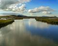
Bear River Marshesby dsidwellComment: This is a very nice photo of a nice looking location, but there is too much empty space in my opinion. The bottom and the right of the shot don't really add anything. I would have taken a square crop from the top-left, as thats where it's all happening, with the clouds, mountains, and grass converging. That would have had much more impact I think. 6 |
| Photographer found comment helpful. |
| 10/01/2004 06:44:48 AM |
Film Noir Gun Girlby magnetic9999Comment: This is a great shot and definately have the film noir feel to it. The way she is looking off screen is very effective, and the soft focus, although slightly excessive in my opinion, works really well. I think the whites of the eyes should be slightly lightened too. 8 |
| Photographer found comment helpful. |
| 10/01/2004 06:43:45 AM |
Curves n' Linesby dinnComment: This photo is too busy for my taste. I think there is too much going on and no real focal point. I do think it would make a good abstract though, with some funky duotone colouring and a closer crop. 4 |
| Photographer found comment helpful. |
| 10/01/2004 06:42:49 AM |
Golden Lightby JPRComment: This photo is absolutely perfect. I think the grey border spoils it and should be black or not there at all, but I can't take any marks off for that. If this was my shot I would be tempted to just make it B&W straight away but I'm so glad you left it in colour as it works really well after looking at it for a while. 10 |
| Photographer found comment helpful. |
| 10/01/2004 06:39:23 AM |
Essenceby ShiiizzzamComment: I like this shot but I think it is let down in post-processing. I really feel it should have some soft focus applied to it, not only to make it more dreamy, but to increase the tonal contrast in the skin to stop it looking so flat. Also, a warmer sepia might be nicer than B&W. 5 |
| 10/01/2004 06:35:12 AM |
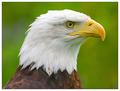
A Proud Birdby mariomelComment: This is a nice shot, but it seems slightly flat. You could try bumping up the contrast a little or dodge/burn it. Also, I think it would be much better in B&W or duotone, because the green in the background doesn't suit the type of bird this is. 6 |
| Photographer found comment helpful. |
| 10/01/2004 06:33:56 AM |
|
| Photographer found comment helpful. |
| 10/01/2004 06:33:20 AM |
Graceful Departureby connieComment: This is a spectacular sunset, but in my opinion it needs some kind of object in the foreground, just to add something else to the photo. At the moment it looks a bit plain to me. 6 |
Home -
Challenges -
Community -
League -
Photos -
Cameras -
Lenses -
Learn -
Help -
Terms of Use -
Privacy -
Top ^
DPChallenge, and website content and design, Copyright © 2001-2026 Challenging Technologies, LLC.
All digital photo copyrights belong to the photographers and may not be used without permission.
Current Server Time: 07/28/2026 03:09:42 AM EDT.