| Image |
Comment |
| 12/30/2005 08:55:35 PM |
Kennyby kennytComment: cute kenny - but. What makes this an intersting photo? Well the out of focus background does. But the composition isnt very compelling. The doll is dead center, he isn't doing anything very intriguing. There isn't anything to make me want to look at the image longer than a quick glance. With the speed voting on DPC, that doesnt make a voter linger and appreciate what you have tried to do. |
 Photographer found comment helpful. Photographer found comment helpful. |
| 12/30/2005 08:19:32 PM |
Stare At The Sunby space amoebaComment: I love the part that has the light on the spiral but maybe there is so much space that the visually interesting parts get lost? The image makes me want to zoom in. |
| Photographer found comment helpful. |
| 12/30/2005 08:16:48 PM |
stare_at_the_sunby philupComment: The sun spot is dead center - Perhaps a better compositiion would have put it in one of the rule of thirds positions? |
| Photographer found comment helpful. |
| 12/30/2005 08:14:56 PM |
japanwindow by librodoComment: Lovely, lovely - the plastsic look of ther face and eyes is oh so like the japanese doll look. You colors are wonderful. I like how the red/orange forms a triangle composition. |
| Photographer found comment helpful. |
| 12/30/2005 06:34:14 PM |
"GreenEggs" and "I Enjoy Ham"by kteachComment: Looks a bit like homer simpson. The lighting here is harsh and the colors are unappealing - as you meant them to be. Although the plate is centered in the image, there are other design elements that work very well here to capture the viewers attention. Your leading lines (fork and knife) lead straight into the image and your subject has three focal spots arranged in a triangle which keep the veiwer looking at the image. This is important in a contest like this where the voting is done quickly. The longer the look, the more your photo is appreciated. I still find it unappealing, but I did look at it for a long time. |
| Photographer found comment helpful. |
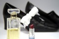
| 12/30/2005 06:29:00 PM |
prettyshoes1by lkn4truthComment: The idea here us just lovley and the photo is almost lovely too. I find the big white bow distracting and the lack of a clear focus point to be a flaw. I love the washed out look of the colors and the shoes being out of focus. I love the lipstick and the perfume - they tell a optimistic story of a pretty woman and a romantic night out on the town (coming up? or is it just over?). |
| Photographer found comment helpful. |
| 12/26/2005 02:05:14 PM |
TooCoolby samanwarComment: or too cute - I wish she was glancing towards the camera, but excellent none the less. |
| Photographer found comment helpful. |
| 12/26/2005 01:59:15 PM |
Tranquilby MAKComment: Here's a border that works perfectly to enhance the image. |
| Photographer found comment helpful. |
| 12/26/2005 01:58:07 PM |
dreamstateby L1Comment: i think that border is too heavy for the theme. you will find that DPC dislikes all but the subtlest borders. |
| Photographer found comment helpful. |
| 12/26/2005 01:45:58 PM |
|
| Photographer found comment helpful. |
Home -
Challenges -
Community -
League -
Photos -
Cameras -
Lenses -
Learn -
Help -
Terms of Use -
Privacy -
Top ^
DPChallenge, and website content and design, Copyright © 2001-2026 Challenging Technologies, LLC.
All digital photo copyrights belong to the photographers and may not be used without permission.
Current Server Time: 07/19/2026 02:26:06 AM EDT.