|
|
|
Showing 2141 - 2150 of ~2515 |
| Image |
Comment |
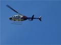
| 12/17/2002 01:59:03 PM | Chopperby MiekaComment: This is a techically perfect picture. Perfect cloudless blue sky. Perfectly focused moving helicopter. Two contrasting motions. The larger blade caught at one rotation speed and the tail blade caught at another. Composition uses the rule of thirds and diagonal leading lines. the helicoter is traveling off the view to the left and the diagonal line of the stopped motion blade leads the viewers eye back into the picture. The red diagonal stripes on the chopper go in the opposite direction from that main diagonala blade.
The colors are nice. All red, white and blue. Dark against the blue sky. Is it a hair underexposed? Maybe. I like the glint of sunlight on the driver.
But overall it leaves me wondering WHY? Why am I supposed to look at this picture? Does it tell a story? Is it just supposed to be pretty? Is it a guy thing that I don't get the same way I don't know every make and model of cars? It just seems boring to me, though exceptionally well done. I gave it a five and so did everyone else, apparently it wasn't just me.
From the critique club - just one amateurs opinion. |  Photographer found comment helpful. Photographer found comment helpful. |
| 12/17/2002 12:19:48 PM | Truckingby LobsterClawsComment: Aw rats - I thought this was oneof the best pictures of the week. How did it get down here? I gave it a 9 and I didn't give any tens this week. |
| 12/16/2002 03:09:28 PM | Planetby janfriesComment: Belated greetings from the critique club-
I don't know what I can add to the other comments on your picture, though they were a bit contradictory (crop closer, crop wider). I think this is a Could Have Been Better picture and I suppose that is what frustrated the viewers.
It is a great image, very bizzare looking and very much looking like a dynamic electric earth (which I see it was). It does look like a planet beseiged by storms, the veins of lightnening at the core seem to move even. The separation of green pn one end, blue on the other woth all the variations between sets up a nice contrast. I especially like that it seems to have a diagonal axis and you have tilted it towards the center of the picture along that axis. Makes a nice composition. I can't decide which I like better regarding the cropping. I think the close up crop makes the planet look more alive and swirly, where more of the black expanse of the universe around the planet might have made it look more like a planet out in space. Did you try it both ways.
Obviously you lost points for focus, out of focus seems to be an unforgivable sin here. How do you focus on a round object? It looks to me like you have focused on the lightening which is actually inside, right? So the surface is out of focus. But when I look at it as a planet I think the lightening is also on the surface and I find the out of focus mountains and edges disturbing. Could a deeper DOF have helped? I know you were outside at night and may have been limited to a wider aperature but maybe a narrow one and a longer exposure would have helped the focus......no wait....you needed the fast shutter speed for the crisp lightening. Obviously I know less than you do.
Overall I thought it was an interesting picture, thought provoking (is OUR plantet about to explode?) and I gave it a six (fell into the out of focus trap myself). | | Photographer found comment helpful. |
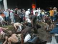
| 12/16/2002 01:04:15 PM | MUD SLIDEby SunChildComment: PS - the review was from the critique club - only the opinion of one amateur |
| 12/16/2002 01:02:51 PM | MUD SLIDEby SunChildComment: Hmmm- I liked this picture better than most people did because I see I gave it a six. Yep there is a lot of motion. Did one commenter actually say there was a lack of motion? ANd did another say there should be some still and some motion. I see both. Also the YOUTH of the picture is a strong point - everyone is young.
This is a perfect case of a "not quite" picture. It could have been much better but then it is a candid shot and you can't exactly ask the guy on the right in the blue coat to move over. It is out of focus, which seems to be an unforgivable sin here. The composition is very very interesting but has a few distracting elements. The action is great, The tangle mess of kids, shoes, arms in the middle of the mud forms compact ball from which one guy is beginning to untangle. I like that the one girl is offset a bit. So you have the center messy ball and then a rather tidy semi circle of up right onlookers who are all clean. There are little bits of interesting people, like the rasta hat or the guy in the muscleshirt and the wild hair behind him. so that the viewers eye travels around the semicircle looking at each onlooker individually. This is really a nice composition, probably textbook.
On the negative side there are a few things that just stick out as distractions. The guy in the white shirt and hat in the middle, and that orange blob, whatever it is. I actually like the lower corners being filed with stuff, it closes up the circular composition. You lost all your points for the focus, was it dark as well as active? There isn't really a way to fix up the photo. I can't see any better way to crop it. I like it messy and out of focus and disorganized - like the moment was. | | Photographer found comment helpful. |
| 12/13/2002 10:15:11 PM | Yellow & Green Make Blueby taylorbehneComment: I like this image. I like all the post processing and the saturated colors. I gave it a 7 originally.
Compositionally it is perfectly balanced- The three colored papers, red, yellow, blue are mirrored by a different red, yellow blue, separated by the grey and brought back together by the screwdriver. All the diagonal lines make interesting patterns and lead the viewers eye around and around the picture. There aren't too many lines leading out of the picture because just as many lead back in. Without doing the reule of thirds thing you have balanced three compositon items in a pleasing upper right to lower left diagonal. Really, it is a textbook composition masterpiece.
I also love the textures in the picture. The colored things could be paper or felt or even sand paper. They are rough or soft, I can't decide which. The grey is definatlely slippery smooth and the screwdriver handle is round and ridged. The roundness of the screwdriver contrasts with the straight lines of the paper stuff. Oh, it is all so balanced. Sorry to repeat myself.
Want some more balance/contrast ideas? How about transparent vs opaque- nicely done. ANd the only one shadow under the screwdriver? Interesting that the transparent object is the only one to cast a shadow.
Al I said, I like the "over" processed look that others disagreed with. I suppose I can see the point about the green speckles in the upper right and now that the challenge rules are off you can go clone those away. While you are at it, take out the few speckles on the grey in the middle. But please leave all the other color variations. Like on the maroon, I like that the shadow is greenish. And I like the yellow speckles on the red.
So why did I give it such a poor score? Where is the blade of the screwdriver? It just disappears like an Escher drawing and that bugs me. I like to know what I'm looking at. But that's just me. And maybe I thought "Why the screwdriver anyways?" Also the title confuses me. I keep looking at those terrific colors and wondering where I'm supposed to be seeing Blue from green and yellow.
This picture should really have done much better than it did. I hope you fix it up and keep it in your portfolio.
From the critique club - just one amateurs opinion. |
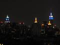
| 12/12/2002 10:21:31 AM | From downtown to midtown - New York is Blueby tomzinhoComment: Well in DPC lingo, I thought this picture was a WOW and I gave it an 8. I don't see why it ended up down here at dead center. I'm not sure I'm qualified to review the technical aspects of this picture, I have only just begun working on night shots. This is a beautiful city night shot and from my perspective it is perfect. I notice that some people wanted it lighter and some darker. I suspect that reflects their monitors and not your picture. From what I can see there is plenty of detail in the foregroud buildings while not making the background too light. Is it really 4:15 in the morning?
The blue lights, yellow lights and the red lights are lovely. The emphasis is clearly on the decorative tops of the buildings. I think this picture would have benefited from the new DPC rules about dimensions. While I personally like the grey buildings in the foreground, I miss something more in the middle to focus on. There is basicly nothing in the center of the picture, and nothing at any of the "rule of thirds" points. The blue towers are the eyecatchers but they seem too widely spaced to be comfortable to my eyes. I jump back and forth from one to the other, makes me feel wall eyed. With the restrictions off, a bit more could be included on each side to balance out the wide space in the middle.
I find NYC skylines to be emotionally powerful. This is a gorgeous sky line. I like the combination of older and newer buildings. I like that the older ones are more ornate and have more interesting lights on top. The newer buildings are either unlit or have the red headlight look. The windows on the left are so clear I feel like clicking zoom to see if I can see any one inside. You do give the impression of a city that never sleeps.
Would the trade center towers have been in this picture? Oh wait...maybe that is why there is nothing in the middle. Have I just been incredibly stupid?
One last thing the bugs me, a personal peeve. It doesn't seem quite straight. Is it? To me it all seems to lean a hair to the right.
From Critique Club | | Photographer found comment helpful. |
| 12/09/2002 02:30:03 PM | Savannahby GekkerComment: And then what happened? I have one of these also (my fourth) who likes to play bowling pins with people. |
| 12/09/2002 01:03:48 PM | |
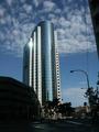
| 12/09/2002 12:52:16 PM | TD bankby awmk1981Comment: Oh, I'm glad I got assigned to review this picture. As it loaded SLOWLY on my dial up connection I thought "Yep, here's the winner!" But then it kept loading all that extra street scene and I was disappointed. I don't think I can add much to what everyine else has said. This is almost a stunning picture and I hope you will recrop it and post it somewhere where we can see it again.
The clouds, the towering bank, the glint of sunshine are visially beautiful and the make such a statement. It looks like a church doesn't it? The modern day icon of what we worship, powerful and imposing and even kissed by the sun. Like a stack of coins propped up an each side by dollars, or whatever bills are used to prop up banks in Bahrain. What a statement for our times.
So take out the scissors and cut it right along that wire thing on the right and take away ALL the street scene, it is too dark anyways. Then clone out the streetlight (yes it's cheating but the challenge is over and you get to make it perfect now). Perhaps t could be brightened up a bit without losing the beautiful blue sky? maybe not. ANd then send it to Fortune Magazine to use as a cover!
This is one great shot and it really deserves to be fixed up a bit! Other than the cropping, the camera angle and the focus and the light, all the photographic decisions were well made. It's all there to make it perfect.
from the Critique Club Message edited by author 2002-12-10 08:14:29. |
|
Showing 2141 - 2150 of ~2515 |
Home -
Challenges -
Community -
League -
Photos -
Cameras -
Lenses -
Learn -
Help -
Terms of Use -
Privacy -
Top ^
DPChallenge, and website content and design, Copyright © 2001-2026 Challenging Technologies, LLC.
All digital photo copyrights belong to the photographers and may not be used without permission.
Current Server Time: 07/18/2026 05:36:15 AM EDT.
|