| Image |
Comment |
| 05/30/2003 02:01:07 PM |
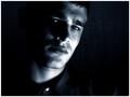
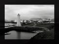
Pensiveby AaronComment: I think this is oddly cropped to place too much emphasis on the chin and neck. The eyes are what is compelling and they need to be in a better place. Also the negative space on the left and right are too balanced. What about a tight crop on the right, leaving all the black on the left and then crop the bottom some. at least above the button. 8 |
| 05/30/2003 12:07:28 PM |
|
 Photographer found comment helpful. Photographer found comment helpful. |
| 05/30/2003 12:01:13 PM |
|
| Photographer found comment helpful. |
| 05/30/2003 11:57:43 AM |
|
| 05/30/2003 11:32:45 AM |
|
| Photographer found comment helpful. |
| 05/30/2003 11:20:42 AM |
|
| 05/30/2003 11:20:07 AM |
|
| Photographer found comment helpful. |
| 05/30/2003 11:19:12 AM |
My old sweet home by pikytoComment: Now here is a border that works - want to write us a tutorial on balancing the border with the photo (which is also great) - 8 |
| Photographer found comment helpful. |
| 05/30/2003 11:17:20 AM |
My home sweet homeby eikidigiComment: The border is too heavy - Let the photo speak for itself - It's a great photo but the border makes it feel crowded and too dark. |
| 05/29/2003 11:16:30 AM |
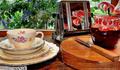
Comfortby clues56Comment: busy - too many things going on. Take away the jam and the knife and the cutting board. Then everything would relate to flowers and the refection in the toaster would stand out more. |
| Photographer found comment helpful. |
Home -
Challenges -
Community -
League -
Photos -
Cameras -
Lenses -
Learn -
Help -
Terms of Use -
Privacy -
Top ^
DPChallenge, and website content and design, Copyright © 2001-2026 Challenging Technologies, LLC.
All digital photo copyrights belong to the photographers and may not be used without permission.
Current Server Time: 07/22/2026 03:34:46 PM EDT.