| Image |
Comment |
| 06/26/2006 03:01:34 PM |
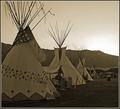
1865 Rendezvouxby rjksteschComment: I would have liked this a lot more if there were more contrast in the foreground. However, I understand that since this was a basic editing challenge, increasing the contrast of the entire image may have blown out the sky too much. |
 Photographer found comment helpful. Photographer found comment helpful. |
| 06/26/2006 02:59:35 PM |
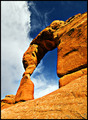
Desert Paradise Callingby rjksteschComment: Great shot Becky. This is perhaps my favorite shot of yours from the GTG. The strong colors and point of view are excellent. |
| Photographer found comment helpful. |
| 06/26/2006 02:54:14 PM |
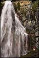
Grandeurby rjksteschComment: This shot is great Becky. I like the muted tones and the fact that you included a figure for scale. However, I feel that the composition is a bit awkward with so much of the waterfall being cut off at the left. |
| Photographer found comment helpful. |
| 06/26/2006 02:33:06 PM |
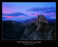
half dome at sunsetby RikkiComment: This is beautiful! I love the contrast created by the strong blues and purples in the sky with the muted tones in the foreground. Very powerful composition as well. |
| Photographer found comment helpful. |
| 06/24/2006 07:17:17 PM |
yosemite fallsby RikkiComment: Beautiful. I only have one suggestion - I would like it a bit better if the sky was darker. Maybe add a black-to-transparent gradient up there in overlay mode and mask off everything but the sky? |
| Photographer found comment helpful. |
| 06/23/2006 11:30:33 PM |
|
| Photographer found comment helpful. |
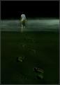
| 06/23/2006 10:56:33 PM |
Foot Stepsby elsapoComment: Very moody photo. I love the composition and processing - this is the perfect example of a successful low-key photo. |
| Photographer found comment helpful. |
| 06/23/2006 10:51:51 PM |
|
| Photographer found comment helpful. |
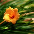
| 06/23/2006 10:28:48 PM |
Apricotby SJCarterComment: Great color and DOF. However, the composition seems a bit off to me. The top looks like it could be cut off, right above the sharp blades, for a much more dynamic composition. |
| Photographer found comment helpful. |
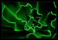
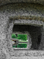
| 06/23/2006 12:58:06 AM |
Garden Portalby cpanaiotiComment: I like the idea for this, I just think that you should have included more "framed" area and less frame. As it is now, the frame is too overpowering and dominates the composition a bit too much. I also don't like the bits of orange/brown in the "frame" (granite?) |
| Photographer found comment helpful. |
Home -
Challenges -
Community -
League -
Photos -
Cameras -
Lenses -
Learn -
Help -
Terms of Use -
Privacy -
Top ^
DPChallenge, and website content and design, Copyright © 2001-2026 Challenging Technologies, LLC.
All digital photo copyrights belong to the photographers and may not be used without permission.
Current Server Time: 07/22/2026 07:45:18 AM EDT.