| Author | Thread |
|
|
07/06/2006 12:04:07 AM |
|
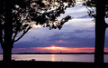
Great idea. I think you could have benefited from having more green in the photo, and I think this is one case where dead center\straight-ahead would have looked really nice. Just some constructive criticism, I like the photo quite a bit =] |
|
 Photographer found comment helpful. Photographer found comment helpful. |
|
|
06/23/2006 12:58:06 AM |
|
I like the idea for this, I just think that you should have included more "framed" area and less frame. As it is now, the frame is too overpowering and dominates the composition a bit too much. I also don't like the bits of orange/brown in the "frame" (granite?) |
|
| Photographer found comment helpful. |
Comments Made During the Challenge  |
|
|
06/20/2006 10:05:59 AM |
|
too much out of focus , too much frame |
|
| Photographer found comment helpful. |
|
|
06/20/2006 07:27:08 AM |
i really like the idea, however i feel there is too much space above the hole, maybe you could have centered it more
nice idea, like the colours |
|
| Photographer found comment helpful. |
|
|
06/19/2006 10:17:16 AM |
|
| Photographer found comment helpful. |
|
|
06/15/2006 09:22:32 PM |
|
great shot. nice clarity. the "tunnel" leads the eye nicely to the bridge. I think this would've scored even BETTER in the new Bokeh challenge! |
|
| Photographer found comment helpful. |
|
|
06/15/2006 07:37:30 PM |
|
wish i could see place without the frame, looks vivid and wonderful. also very much like the angle- breaks from the norm and gives us a bit less to look at but does it with more appeal i think- addition by subtraction |
|
| Photographer found comment helpful. |
|
|
06/15/2006 06:21:10 PM |
|
Possibly would look better with less "frame" |
|
| Photographer found comment helpful. |
|
|
06/15/2006 03:20:56 PM |
|
Interesting idea.. I wish the inside was sharper or bigger perhaps. |
|
| Photographer found comment helpful. |
|
|
06/14/2006 09:48:21 PM |
|
| Photographer found comment helpful. |
|
|
06/14/2006 03:32:45 PM |
|
| Photographer found comment helpful. |
|
|
06/14/2006 03:31:36 PM |
|
| Photographer found comment helpful. |
|
|
06/14/2006 07:19:52 AM |
|
| Photographer found comment helpful. |
|
|
06/14/2006 05:30:19 AM |
|
There's something special about the way this portal draws you in. A tremendous feeling of depth. Wish the view revealed more... |
|
| Photographer found comment helpful. |
Home -
Challenges -
Community -
League -
Photos -
Cameras -
Lenses -
Learn -
Help -
Terms of Use -
Privacy -
Top ^
DPChallenge, and website content and design, Copyright © 2001-2026 Challenging Technologies, LLC.
All digital photo copyrights belong to the photographers and may not be used without permission.
Current Server Time: 06/30/2026 02:46:58 AM EDT.