| Image |
Comment |
| 03/18/2007 06:49:28 AM |
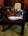
Come, rock with meby snafflesComment: Hi, Greetings from the Critique Club:
Composition: Oh, this one I just had to work with. It is so inviting and just plain adorable. I love the colours and the compositon. The set up is great...but that Teddy...steals the show.
Technical: I only had your small image to work with so please overlook the harsher details...but this is just to give you an idea of what I am talking about. I gave it a shot of Shadow/Highlight and then played with the Brightness/Contrast as well as the Hue/Saturation. I then added a new layer and gave it a 50% grey fill turned to Overlay Blend mode. Then using my black and white paint I painted with varying opacities to highlight certain areas as well as darken the edges. It is a great method to play around with.
Overall: I think this is a beautiful image that has loads of potential. Keep up the great work.
 |
 Photographer found comment helpful. Photographer found comment helpful. |
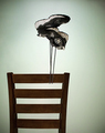
| 03/18/2007 06:39:20 AM |
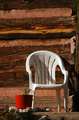
Evening Shadowsby pmichaudComment: Hi, Greetings from the Critique Club:
Composition: The good old plastic chair. It is something that everyone can relate to. But that red pot is distracting, especially against that background. It makes the image too busy. I like the off centre composition. You did well there.
Technical: The chair seems soft. I can see that the camera has focused on the beam of wood at the bottom behind the chair. Try and focus on the chair and then recompose to get the composition. I would like to see some Shadow/Highlight to bring out the beautiful texture details of the wood.
Overall: I think you chose a great image for the challenge but with a few minor corrections this could have scored much better. |
| Photographer found comment helpful. |
| 03/18/2007 06:34:53 AM |
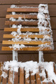
Ough it is cold outsideby lastefComment: Hi, Greetings from the Critique Club:
Composition:You obviously live in an area that is prevalent for snow. What you need to do is take into account that there are members that don't experience it. So you have to show a little bit more in your image. With that I mean, the chair...doesn't really stand out as a chair. It is lost in the background, which is of the same material. The viewer doesn't really understand the story...there is no surrounds to explain the situation. Maybe include another item to relate to the snow season or show a bit more of the surroundings.
Technical: Your settings, focus and lighting were correct for this image. But as I said before, the composition let you down. Maybe try and being a little more creative....maybe in your PP add a little punch to the wood textures to separate them a bit more.
Overall: This image has lots of room for improvement...and that is good. As once you get perfection you may as well give up....as there is no longer a challenge. |
| 03/18/2007 06:17:17 AM |
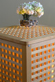
I See an Ikea Ideaby jgriecoComment: Hi, Greetings from the Critique Club:
Composition:Love the idea and the combination of the hard lines and angles against the softness and delicacy of the petals and pastels.
Technical:I feel the main let down is the crooked lines due to the lens perspective problems. This can be corrected in PS. The partially greyed background is also an issue...it seems to swallow up the flowers. I feel maybe a lighter background to allow the flowers to control a larger area.
Overall: I feel you are on the right track and I know that next time you will pay a little more attention to the finer detail of the image. Keep up the great work and I look forward to seeing more of your work. |
| Photographer found comment helpful. |
| 03/18/2007 06:12:09 AM |
High Chairby LoreneComment: Hi, Greetings from the Critique Club:
Composition: Okay...I love the simplicity, the vivid colour and the way you have angled this image. Top marks for all of that.
Technical: The only area that I feel could do with improvement is the noise. I see you used a low ISO but the noise is really showing up...try running it through Neat Image to rid the image of that let down.
Overall: I think you are definitely on the right track to fulfilling the DPC image cliche. Keep up the great work. |
| Photographer found comment helpful. |
| 03/18/2007 06:08:27 AM |
New Balanceby freakin_hilariousComment: Hi, Greetings from the Critique Club:
Composition:This is great. I love the idea and the execution of the image. I like how you have put it off centre...but am getting lost in the vacant space on the right. Maybe if you could have put a bookshelf or something there upside down...so when you flipped it, it would have looked even more convincing and also fill up the space.
Technical: You have the settings, lighting and focus right...but I would like to see some Shadow/Highlight used to bring out some of the shoe details and show some richness in the wood. I feel the green is very off putting and would like to see that changed to a different hue.
Overall:I think this is a fantastic effort....and with a little more detail concentration you can really pull off a winner with it next time. |
| Photographer found comment helpful. |
| 03/18/2007 05:07:46 AM |
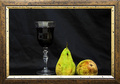
Furnishings complements--3D paintingby Rino63Comment: Hi, Greetings from the Critique Club:
Composition:Oh dear....why did I have to get this one. I liked this one when I first saw it in the challenge. Oh well...okay let's give it a go. I feel there are a few basic errors in your composition. I just love the frame and the whole idea...but the placement of the subjects needs work. As you can see in the version I uploaded below, I have moved the wine glass away from the pears. I also shortened the amount of space from the subjects to the edge of the frame. I would prefer to see the bottom of the subjects too...just like in a real painting. Maybe you could have put some books under the fabric to raise the subjects up.
Technical: You did pretty well here. You were dealing with glass, fruit, black on black and the frame. I selected the fabric in PS and adjusted the levels to remove the obvious signs of the light on the fabric. I also gave the glass a hit of Shadow/Highlight. I didn't touch the pears, but I did give a touch of Hue & Saturation and Brightness & Contrast on the Frame.
Overall: I think you are onto a great series here...just play with it a little more and you will get the details to where you want. Keep up the great work.
 |
| Photographer found comment helpful. |
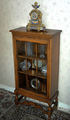
| 03/18/2007 04:42:59 AM |
Mum's old Glass Cabinet, and Clockby GrandadComment: Hi, Greetings from the Critique Club:
Composition:Hmmm...right. We need to start from scratch. The angle of the photo is just not doing the cabinet justice. You obviously wanted to show this cabinet off...so do so. But not from this angle. It is a beautiful cabinet. Try getting down on the ground and looking up...show its grandness to the world. Also...whilst you may see a beautiful piece of furniture, others may look at it and say 'So What! What is so special about it?' So you need to add more to the story...maybe open the door and have some of the contents laid out in front...as if they are lining up trying to get into the cabinet. Or maybe a beautiful narrow rug leading up to the door. Basically you need something that draws the viewers eye straight at the cabinet. Make it obvious what you want to show. Also that floor and wall are just not helping...maybe hang a white cloth behind it for the photo...take away the unnecessary distractions.
Technical: The camera was hand held. The settings possibly on Automatic. Start to learn your settings. The flash has almost blown out one side of the image. That does not help. Try using something sturdy to balance the camera on (if you have no tripod) and play with your settings. It is a still life...so you can play with long shutter speeds and no flash. You can even paint with light during the no flash image and highlight specific areas.
Overall: I feel this should be reshot taking into account everything I have said here...and I think you may be surprised with the outcome. Don't give up...keep learning. I look forward to seeing your future images. |
| Photographer found comment helpful. |
| 03/18/2007 04:31:45 AM |
Practiceby BrinComment: Hi, Greetings from the Critique Club:
Composition:You stumped me. Whenever I have grabbed an image to Critique I can usually see straight away where the needed improvements are. But yours....well...I really had to look. I even read your about...but didn't see anything that would indicate your aim or your feelings on your result. I see you placed high...but not at the top.
Okay...the only things I can see that would help you here are maybe an added colour to the image to help control where the viewer looks first. As it is...my eyes seem to wander, looking for the main focus. I feel a different coloured table top would look great. Also maybe a little pot of flowers or something similiar...but not on the table top...maybe balanced on the floor also. That little bit of detail can make a big difference.
Technical: I think you have nailed this one. The focus, lighting and settings work beautifully for this image.
Overall: A few minor alterations and I can't see why this couldn't have ribboned. Keep up the great work and I look forward to critiquing your next image. |
| Photographer found comment helpful. |
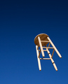
| 03/18/2007 01:07:52 AM |
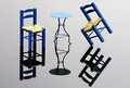
Chair Pairby riversongComment: Hi, Greetings from the Critique Club:
Composition:This image is showing a different angle then most of the entries. I like the idea. The lines, curves and lighting are just fantastic. I would, however, remove the lower horizontal bar as it is out of focus.
Technical: Now this is where you were let down. For starters your image is out of perspective. Look at the right side. It is straight, but the left side is crooked. I have uploaded my version of your image to show you what I am talking about. And I will tell you what I did. I was working with your small version so it would probably have been much better if I started with the large version.
I started by using the crop tool and clicking perspective and lined up the two sides of the crop tool to the sides of your image. That then straightened the overall image and removed the initial borders. I also removed the lower bar. I then used Highlight/Shadow to bring up the beautiful detail in the wood. I then played with the Hue & Saturation and the Brightness & Contrast to get the punch in the wood. A run through with Neat Image and then I added a 1 pixel grey border followed by the 30 pixes white border.
Overall:This image has so much potential. I can seriously see this hanging in an office building in a large city. Run with it and don't give up your fantastic eye for detail. But please...apply that detail to the finishing areas of your work.
 |
| Photographer found comment helpful. |
Home -
Challenges -
Community -
League -
Photos -
Cameras -
Lenses -
Learn -
Help -
Terms of Use -
Privacy -
Top ^
DPChallenge, and website content and design, Copyright © 2001-2026 Challenging Technologies, LLC.
All digital photo copyrights belong to the photographers and may not be used without permission.
Current Server Time: 05/10/2026 01:11:17 AM EDT.