|
|
| Image |
Comment |
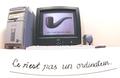
| 05/25/2003 09:49:43 PM | This is not a computer.by michaeldeyComment: Et ceci n'est pas Marcel Duchamps. I like the idea here to use the surrealists to convey the Matrix concept - a lot more original than all those sunglasses and blue and red pills. However, i find the execution of your creative idea lacking. You didn't bother to rearrange your computer set up for this pose and it sets there, a bit clumsily for the picture, probably exactly as you always use it. The cardboard with the Ce n'est pas un ordinateur also sits there slightly awkwardly. I don't mean to come down so hard on you but the idea was excellent and you took the time to do the cardboard and approximate the font but then, unfortunately, you didn't take the time to do the real shot. 6 |  Photographer found comment helpful. Photographer found comment helpful. |
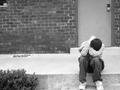
| 05/25/2003 02:27:27 PM | The Hardest Timesby DavidLevinComment: David, don't let that crappy score bother you. That was the result of this submission being totally out of that week's challenge and people here are very picky about that. Even more so, since you submitted this B&W to a color challenge! :) I do like the emotional power of this shot and therefore would like to encourage you to continue shooting by any means. If you come up with something you care about but it doesn't fit the challenge, you could always submit it in a forum for critique and feedback. Some technical things: how about some rotation to level the steps, bit unfortunate that you just cut off his shoe, the more so since the person is the main subject of your picture. I like how you left the doorknob inside the picture there at the edge. It underscores the sense of being closed off, shut off from the rest of the world. I do like the emotion that the person conveys here; doesn't look staged or fake at all. Good job! | | Photographer found comment helpful. |
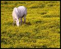
| 05/25/2003 02:15:26 PM | Free Rangeby crabappl3Comment: Man, this is beautiful.
It's because of pictures like this, that i hate myself at times. During voting had only given it a 7. I spent a lot of time on voting and commenting, and each week there are a couple that i just miss and don't give them the time of day they deserve (that's my biggest qualm of having to vote on 300+ pictures a week on a slow modem). | | Photographer found comment helpful. |
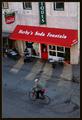
| 05/25/2003 02:10:31 PM | Simpler Timesby crabappl3Comment: Crabappl3, i like pictures like these a lot. To me, there's something 'classic' about them; i call them Vittorio de Sica Bicycle Thieves type of pictures (that's an old movie from the 50s and if you have never seen it, recommend watching it if you ever have a chance). My suggestion would be to simplify this further and cropping it out somewhere near the top of the red awning. That would get rid of the clutter of the coca cola sign, and the awkward partial Ques (antiques?). Would also crop off the edge of the building to the right. Then, you end up with a much stronger picture that emphasizes the expressive asphalt. Moreimportantly, it also emphasizes the relationship between the bicyclist, the reader, and the legs of the advertising model. What fascinates me about this picture actually is the NON-relationship between these three: even though they are all operating in the same picture plane and small space, they are all entirely uninvolved with one another. It's a great indictment of the human condition in modern society.
Just want to say that i like your pictures in general a lot. Often, i may not comment on them but they are good scores from me. Also like your range in photographic subjects and moods, ranging from the highly creative to the very sensitive. | | Photographer found comment helpful. |
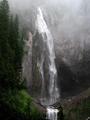
| 05/25/2003 12:04:02 PM | Comet Fallsby paganiniComment: Beautiful capture of nature. The mist really does it for me. I might prefer the duotone rendition of this if you had used THIS crop for it as my eye loves that water on the bottom spilling over the edge and misses that in the duotone version. Although i like the mystery in the duotone version it seems indeed just a tad too flat. I would have liked either version of this but now that you have shown both, i can't quite settle on either one. As is, i prefer this color rendition. | | Photographer found comment helpful. |
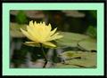
| 05/25/2003 11:46:48 AM | Rise Aboveby paganiniComment: Beautiful. Like how the leaves border between the representational and the abstract. With this flower, being very formal and symmetric, i agree with your perfect flower theory. But not with all flowers! This image is tough to see though because of the green mat. If you're open to suggestions, you might play for the mat with something like a9a6aa, mauvish grey, or 888986, darker grey. (Yup, i looked at it in PS7 but then deleted the file as normally i do not steal other people's stuff). Q: why do you end up with such small file sizes; noticed that on the orange flower as well? | | Photographer found comment helpful. |
| 05/23/2003 01:18:43 PM | |
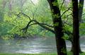
| 05/22/2003 12:47:54 AM | Rainy Day Greensby ruthiekComment: Hmmm, yes, i see what you said about the rain there :) I liked the composition and the mood it gave (it's nice to see rainy pictures while being comfy behind the computer indoors). Good variety of greens with the ones in the main branches being pleasantly and mildly intense and then nicely muted in the background. Is this image soft? Don't know,maybe just a tad but that helps the mood and if you're standing in the rain it's tough to really take the time and check and re-check. What i don't like about this image is that the bottom of the foreground tree is cut off. It therefore comes across as more of a big pole and it doesn't have the nice expressiveness of the other tree. You got a 7 from me during voting. |
| 05/21/2003 04:42:09 PM | Impressionist canvasby GordonComment: Paganini, it is perfectly acceptable that you don't like this shot or any shot. You don't like the shallow dof, fine. Half your comment though was about the flower being imperfect and hence, according to your thinking, an undesirable model. I like to see nature 'as is' and yes, i realize that once you reduce it to 640px by something px it isn't any longer nature as is because you have already taken it out of its natural context. I just don't like that everything needs to be anti-septically perfect. I see great beauty, and symbolism, in wilted flowers and they used to be one of my favorite subjects.
What i dislike about your comment, and in so many others of dpc voters, is that dwelling on the negative. With this picture i sensed, right or wrong, that someone was looking for a personal vision, beyond shooting things as usual. That, to me, is much more important than a flaw here or there. I detected the same with your Loyal Worker, which is still my all time favorite shot but if you want me to, i can point out a couple of flaws there as well :)
Best of luck finding your Heidi Klum, be it in the flesh or in a flower :) | | Photographer found comment helpful. |
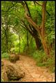
| 05/21/2003 02:18:04 PM | Path Through the Greensby paganiniComment: Left you a comment under Gordon's picture.
Odd that you make allowances for the shortcomings in your own pictures (your yesterday's PM) but are unwilling to do so for those of others.
My appraisal of dpc comments in general (and i stress the 'in general') is that they say a great deal more about the personality of the commenter than about the picture that they are allegedly giving feedback on. |
Home -
Challenges -
Community -
League -
Photos -
Cameras -
Lenses -
Learn -
Help -
Terms of Use -
Privacy -
Top ^
DPChallenge, and website content and design, Copyright © 2001-2026 Challenging Technologies, LLC.
All digital photo copyrights belong to the photographers and may not be used without permission.
Current Server Time: 07/27/2026 05:18:23 AM EDT.
|