| Image |
Comment |
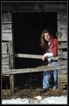
| 02/02/2003 08:19:35 PM |
Little Sisterby karmatComment: I like the old barn wood, and the fact that the background behind her is completely black. Gives the shot a nice crisp feel. |
 Photographer found comment helpful. Photographer found comment helpful. |
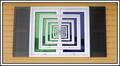
| 02/02/2003 08:17:37 PM |
Window to Infinityby JackoComment: Very cool work! I would have preferred that the left side be as dark as the right side - I like the contrast and impact of the darker side better. |
| Photographer found comment helpful. |
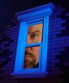
| 02/02/2003 08:14:41 PM |
Blue Window Dreamby MajorChaosComment: Love the whole surreal look of this shot. I like the nice warm skin tones against the cold blue of the window frame. Probably my favorite thing about the shot is that it fades to black negative space at the top and the bottom, I really like that, and it seems to blend right into the missing puzzle pieces of the brick wall. |
| Photographer found comment helpful. |
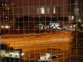
| 02/02/2003 08:12:00 PM |
Office Windowsby jab119Comment: VERY interesting shot! Love the windows, and the fact that there is so much to look at. I had to import this into PS so I could really check it out. To be honest, I can't tell what is manipulated, and what isn't ! Love the nice warm tones with the bits of bright white interspersed throughout, and the repetition of the windows. This is cool. |
| 02/02/2003 08:06:15 PM |
Windows of Opportunityby CreativeFlyPhotoComment: Gotta be honest- I'm not much on this "alternative" interpretation. That aside; I like the sepia tone, and really like the blur, so that your circled areas really stand out. I would have preferred to see newspaper throughout the photo - the area above the folded edge of the paper looks like it is not part of the paper, and I find it a little distracting. I like the way you composed the paper in the frame (at an angle like it's laying on a table), I think a lot of people would have been tempted to take a straight-on shot (holding the paper up in front of the camera). |
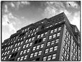
| 02/02/2003 07:53:18 PM |
New York Windowsby dimitriiComment: I like the b & w, the border, and the repetitive pattern of the windows, the cool architectural stuff at the top of the building, and the odd angle of your composition doesn't even bother me too much. |
| Photographer found comment helpful. |
| 01/31/2003 10:29:36 PM |
|
| Photographer found comment helpful. |
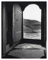
| 01/31/2003 10:27:38 PM |
Welcomeby greenem2Comment: I really love this shot except for one thing: I would have liked to have seen more contrast. Except for the top part of the doorway, it seems to have the same tone overall, reducing the impact that I think it could have had. |
| Photographer found comment helpful. |
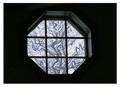
| 01/31/2003 10:25:34 PM |
Room With A Viewby GekkerComment: While I would have loved to have been able to see more of the window frame, I still like the shot a lot. Even the manipulation of the trees in the window work for me, giving it kind of a semi-abstract look that fits the shot. |
| Photographer found comment helpful. |
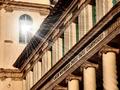
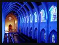
| 01/31/2003 10:23:58 PM |
The Sanctuary by RackatComment: Wow, this is incredible! The repeating patterns and shapes are just awesome. The shot really conveys the imposing magnificence of the space. I'm not at all certain if the color is for real, or if all that blue is a manipulation, but whatever it is, it is inspired. |
Home -
Challenges -
Community -
League -
Photos -
Cameras -
Lenses -
Learn -
Help -
Terms of Use -
Privacy -
Top ^
DPChallenge, and website content and design, Copyright © 2001-2026 Challenging Technologies, LLC.
All digital photo copyrights belong to the photographers and may not be used without permission.
Current Server Time: 07/24/2026 03:50:10 PM EDT.