| Image |
Comment |
| 06/22/2016 06:21:33 AM |
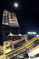
Ad Lunamby riotComment: Hello from the critique club
An interesting image that contributes well to the extended free study
I can understand why you went for this particular composition, yes, it does work well. I particularly like the moon shot with its hazy halo, your blending has worked well, in fact the end result is very convincingly looking like one in-camera shot. Perhaps this may be why the shot hasn't hit the audience in the way you would have liked, though I don't subscribe to the view that the extended rules have to be used in an obvious way.
Anyway regardless, this is still a worthy addition to your Gursky/Ballard portfolio, thank you for your entry Eugene. |
 Photographer found comment helpful. Photographer found comment helpful. |
| 06/22/2016 06:12:44 AM |
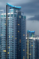
Reach For The Skiesby sfaliceComment: Hello from the critique club
An interesting image that contributes well to the extended free study
Street level skyscraper shots are nearly always effective to show us the world around us in a dramatic imposing way and this is no exception in that respect. However, the mirroring here is both its strength and its weakness. I like the symmetry, the stitched duplication works well for the building itself but not the clouds, such symmetry is spoiling the overall effect, this is certainly the case for the two side panels. I realise that you have deliberately exploited the extended rules with these side panels but for me this and the overexposed sky which forms such a large part of the image spoils the overall end result.
Thanks for your entry Alice. |
| Photographer found comment helpful. |
| 06/22/2016 05:57:29 AM |
Emotional Manby LydiaComment: Hello from the critique club
An interesting image that contributes well to the extended free study
Although your image may not appeal to me personally, I have to acknowledge your proficiency in blending the three images together to make a truly unique portrait(s). In fact the level of expertise reveals that this is more than three chance images blended together it shows that you were pursuing a visual goal with each individual image and its contribution to the whole. Yes, certain areas show the difficulties you must have had in producing the end result but you have to be commended for the end result.
Thank you for your unusual entry and the contribution it has made to the challenge, well done Lydia. |
| Photographer found comment helpful. |
| 06/17/2016 01:36:17 PM |
Cacophanyby RyanWComment: Hello from the critique club
A mediocre image that meets the challenge at a basic level
This is really quite a confusing image that does not have a strong focal point. The main characters are the two women in the foreground who both have their backs towards us, neither of whom have been caught at a very flattering moment for them especially the lady on the right. The only person whose face we do get to see in full profile is the lady in red who is actively distracted, probably, by her mobile device, she is not engaged with her surroundings. The most dominant element is the gent in the background in the strongly coloured red jumper, your eyes are constantly drawn to him but again he is not of this scene in any constructive way. In the meantime all of this has a dominant foreground white and gold post that does nothing positive to the overall construct.
I rather feel that you have taken too literally the ‘snapshot’ part of the description as opposed to anything that Manet would have been likely to paint. I’m sorry Ryan but I can’t see anything in this he would have been inspired to commit to canvas. |
| Photographer found comment helpful. |
| 06/15/2016 04:27:12 PM |
Cool guys, cool colorsby RyanWComment: Hello from the critique club
An unappealing image that does not meet the challenge
Well, here you have a street scene of an interrupted image in the taking but we don’t know what has caused the interruption which is often ok because it introduces intrigue but I’m just not feeling that sense of intrigue. The image feels too much like a snapshot, there just doesn’t seem to have been any real thought gone into it. I think the composition may be the reason why, I am just put off by the dominance of that street post that dissects the whole image in two and the sign by it. In what is a predominantly lower key background this high key post just takes over the whole image. As for the challenge itself there is no single strong focal point or key element that reflects the challenge brief effectively enough especially with that post.
Sorry Ryan but I’m afraid this didn’t work for me this time. |
| Photographer found comment helpful. |
| 06/15/2016 04:06:10 PM |
Highrise: Gold Flecksby riotComment: Hello from the critique club
An appealing image that meets the challenge
Even before reading your excellent accompanying notes, thank you, the Gursky influence felt evident in your superb image. The detail is stunning, I can see why you are waxing lyrical about this lovely lens, you have persuaded me to search for one for my own use! I like that you have so patiently and carefully paid such crucial attention to the tiny but important detail that has enabled you to achieve the result in-camera with minimal post processing, this entirely mirrors my own attitude. I just wonder why you had to shoot at such a high ISO? My interpretation from your notes is that you were using a tripod? In which case why not ISO 100 or a much lower one than the chosen one? The subject is static and lends itself fully to a long shutter speed.
Thank you Eugene for a great entry and write-up |
| Photographer found comment helpful. |
| 06/13/2016 09:18:17 AM |
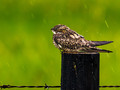
Wetby PhocalComment: Hello from the critique club
An appealing image that partially meets the challenge.
This is a gorgeous nature study that leaves you feeling sorry for the poor bird looking wet and bedraggled in the pouring rain. So, as for surreal and dreamy I don’t think it really works that well, there is however, a hint of dreaminess in that his eye is partially closed which goes a little way towards fulfilling the challenge brief. What I think destroys any dreaminess is the inclusion of the barbed wire, I would have excluded it completely and just left the post I think this may have improved it but it still would struggle to fully meet the challenge.
Thank you for a lovely entry Ronnie. |
| Photographer found comment helpful. |
| 06/13/2016 08:57:47 AM |
Dream sunset by GudjonottoComment: Hello from the critique club
An interesting image that meets the challenge.
Congratulations on your red ribbon for this sunset with a difference! There is certainly a wow factor here, you’ve captured the moment well Otto. Apart from the lovely mists and shades what really appeals to me are the long shadows from the buildings they are so beautiful. The shadows and highlights are all very effective they make for an excellent end result, well done |
| Photographer found comment helpful. |
| 06/13/2016 08:49:52 AM |
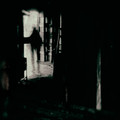
Final exitby snafflesComment: Hello from the critique club
An interesting image that meets the challenge.
Your image is sombre yet quite intriguing, with its low key dark and brooding dominance but with a suggestion that there is light at the end of the tunnel which by the sound of it was not entirely your intention for the viewer. It’s quite difficult to determine exactly what I’m looking at which is good because it intrigues, the shadow would suggest the silhouette of a person walking away but its effect it somewhat nullified by the connecting shape joining it from the left. I suppose you have to accept that this type of image is not going to appeal to all but at least the ones were outweighed by four of your voters who obviously greatly appreciated it.
I hope you are now feeling much more positive and happy than at the time of your submission Susan. Thanks for your entry. |
| Photographer found comment helpful. |
| 06/08/2016 03:09:07 PM |
Sydney Headlandsby dewdodesignComment: Hello from the Critique club
An appealing image that contributes to the open challenge
The interesting cloudscape adds atmosphere to the overall result. There are a few things I would like to suggest to improve it, the first of which is the sun-hole, this overexposed circle and equivalent reflection would be best omitted completely with a crop close to the suns edge. There is a slight tilt to the sea,this is always a compete no-no for any seascape it just needs tweaking with the levelling tool. I think as part of your crop you could also exclude the foreground completely so you just have sea and sky this will have more impact. The whites of the clouds would benefit from being whitened more you can do this selectively without affecting the other tones within the image.
Thank you Christopher for your entry |
Home -
Challenges -
Community -
League -
Photos -
Cameras -
Lenses -
Learn -
Help -
Terms of Use -
Privacy -
Top ^
DPChallenge, and website content and design, Copyright © 2001-2026 Challenging Technologies, LLC.
All digital photo copyrights belong to the photographers and may not be used without permission.
Current Server Time: 05/06/2026 11:33:37 PM EDT.