| Image |
Comment |
| 04/27/2005 12:40:57 PM |
|
 Photographer found comment helpful. Photographer found comment helpful. |
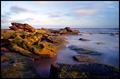
| 04/27/2005 12:40:38 PM |
Cascading by samtrundleComment: congrats on the blue! it was only a matter of time before you got it and im predicting many more in your future :-) |
| Photographer found comment helpful. |
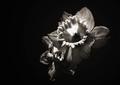
| 04/27/2005 02:34:31 AM |
Age of Innocenceby superdave_909Comment: beautiful portrait - to improve i would suggest sharpening around the eyes a little more. but really beautiful! |
| Photographer found comment helpful. |
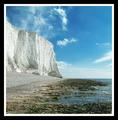
| 04/27/2005 02:31:22 AM |
Nature's Studioby dartompkinsComment: This is all my opinion...
While your photo does contain a rock thats not the focus of the photo... so just repeating that over differently - while it does meet the challenge, the challenge really isnt the focus of your photo.
That being said, ignoring your final score and looking at the vote distribution more than 1/3 of the people gave you a 5. meaning there isnt really anything wrong with your photo but it doesnt really have anything special about it in relation to the challenge. The next marks are 4s,6s,3s and 7s. And this just accounts for different peoples average vote given + whether they liked it a little or disliked it a little. A few people really liked it and a few people really disliked it... so thats how you ended up at a 4.8 Message edited by author 2005-04-27 02:32:26. |
| Photographer found comment helpful. |
| 04/27/2005 02:20:08 AM |
Beginning To Get In Shapeby RolandBComment: Originally posted by RolandB:
Originally posted by nico_blue:
If you answer yes to any of the following questions then dont enter for the sake of your average.
- is it blurry?
- is the image low quality?
- is there an unidentifiable subject?
- is it a family shot and you like the picture because you care for the person?
- do you have blown out highlights?
- is it an artistic abstract?
thats all i could think of so far... if you didnt answer yes to any of the above you should be guaranteed at least above a 5. |
Ah, if it were that easy! I've learned there are NO guarantees. I thought I had a pretty good(not anywhere great, but I liked it) entry for "In The Beginning." It passed the litmus test you give, and it scored miserably. But you know what, I still like it, and I'm glad I entered it.
So, in answer to the question, if I feel it meets the challenge, AND I LIKE IT, it gets entered.
I haven't been here long, and I'll admit, when I first started I was constantly tracking the scores on the hour, and letting them affect my mood. Hopefully, I'm getting better at handling the scores. Now, I still keep pretty close tabs on the score, but it doesn't seem to bother me as much (or so I tell myself!)
And Marjo, I too was disappointed in how the Cemetery challenge went. Thought I had a really good one there, and it just didn't go. But I still really like that one too.
Just wish I'd get more comments! |
In reply to this thread...
While this does pass the 'litmus' test (not sure about that family member part though :-) ) it gets negative marks from the average 5 for several reasons -
- the biggest one is that the concept is really weak... especially in this challenge. Look at the conceptual strenghts of the top 10 finishers and you will find some 'deeper' meanings in them. This is straight forward and not particularly interesting.
- the red sweater and the purple weight... I dont think I need to say more...
- the composition isnt very strong... you have a lot of negative space thats not particularly well handled with the slight shadows and gradients on the white. Usually when dealing with one color backgrounds a good rule to follow is that its either completely clean i.e. no shadows, reflections etc. or whatever is visible should be deliberate... for example shadows should be dark and strong and give the sense that they were planned rather than they just happened.
I have a photo with a similar subject matter. Its not the greatest shot in the world but please take a look, compare it with yours and then tell me what you think.
//dpchallenge.com/image.php?IMAGE_ID=132210
Hope my critic is helpful. |
| Photographer found comment helpful. |
| 04/25/2005 11:06:32 PM |
Prisonersby irikaComment: imo, apply a slight unsharpmask to make the image stronger...
Prisoners... hmmm, its a good idea, makes me think, but the relationship to prinsons isnt very strong imo. But i still like the photo :-) |
| 04/25/2005 05:45:15 PM |
|
| 04/25/2005 05:44:11 PM |
|
| Photographer found comment helpful. |
| 04/25/2005 05:43:00 PM |
|
| Photographer found comment helpful. |
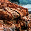
| 04/25/2005 05:41:55 PM |
Tortured Developmentby grahampComment: lovely textures and colors. i really like the redish brown against the blue. works really well. 8 |
| Photographer found comment helpful. |
Home -
Challenges -
Community -
League -
Photos -
Cameras -
Lenses -
Learn -
Help -
Terms of Use -
Privacy -
Top ^
DPChallenge, and website content and design, Copyright © 2001-2026 Challenging Technologies, LLC.
All digital photo copyrights belong to the photographers and may not be used without permission.
Current Server Time: 07/23/2026 10:53:39 AM EDT.