| Image |
Comment |
| 05/10/2006 07:51:16 AM |
|
 Photographer found comment helpful. Photographer found comment helpful. |
| 05/03/2006 12:35:06 PM |
Naturallly Complementedby ericwooComment: [[Trading Post]]
My first impression is "Great Color!" My second is "Neat Image? Maybe a hair too much, maybe none at all???" A sheet of white paper stuck down on the right side to blank out that background area would have probably given you a full point in the score (my opinion). Excellent composition; the yellows are a BIT oppressive, but not terribly so. |
| Photographer found comment helpful. |
| 05/03/2006 12:32:14 PM |
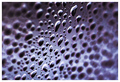
...rorrim ,rorriMby timfythetooComment: [[Trading Post]]
In general, it looks like it served you pretty well. The image doesn't really appeal to me that much, but it is a clever technique, and I probably would have given you a 6 or 7. While I like blue skies, blue images just don't appeal to me for some reason, and there's a lot of blue here. Excellent idea, and well done. |
| Photographer found comment helpful. |
| 05/03/2006 12:28:40 PM |
Missing Man Formationby MelethiaComment: [[Trading Post]]
Wow. This is an absolutely gorgeous example of the negative image technique, and I'm surprised you didn't fare even better than you did. I can't offer a doggone bit of advice as to improving; it would have been a definite 10 if I had voted on this challenge. Congrats on a great score :) |
| Photographer found comment helpful. |
| 05/03/2006 12:09:21 PM |
|
| Photographer found comment helpful. |
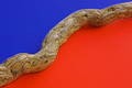
| 05/03/2006 07:48:35 AM |
Divisionby nards656Comment: It's supposed to be blue and orange; apparently the monitor issue really got me. Karma and I both thought that it wasn't orange enough so I hue shifted a bit, and several people thought it too red. I really appreciate all the feedback on that, because I have a nearly "impossible to calibrate" cheap flatscreen, and I need to know all I can about what others see. Thanks. |
| 05/03/2006 07:36:12 AM |
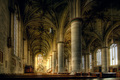
spookyby DanSigComment: [[Trading Post]]
This is indeed spooky, with an excellent composition, and it would work very well as the promotional / tribute shot it was intended to be. As an entry at DPC, I can see it being voted down for being too centered and too dark. The background doesn't have a lot of interest; it's kind of flat and plain, and a little "spot lighting" might have really given this a boost. Of course, for it to work, it would have to be done in reverse during shooting, "spot darkening". Not sure how to accomplish that!
|
| Photographer found comment helpful. |
| 05/03/2006 07:24:28 AM |
Event Horizonby LouisComment: [[Trading Post]]
This has a really neat abstract feel to it. It might have a little more "interest" if there was something behind the window in the center that was really bright and colorful but still "abstract". Nice technical work, as far as focus and exposure. |
| Photographer found comment helpful. |
| 05/03/2006 07:22:48 AM |
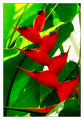
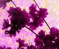
Profiles of Purpleby KelliComment: [[Trading Post]]
I think I see what you were trying to do here, but the yellows just didn't do a good job of complimenting your purples. Stupid yellow :) It seems that in a photo where the shape and details of an object are intentionally hidden, the colors have to be really perfect to make up for it. The purple is rather dominant here, almost a color cast, and the yellows just aren't working. Composition is tough to judge, because it looks a little bit "random", but the stems cause me a little confusion. I wish I could offer better advice on how to make this kind of thing really kick, but that's about the best I can do :) |
| Photographer found comment helpful. |
| 05/03/2006 07:17:25 AM |
Hot and Cool Complementary Peppersby chaliceComment: [[Trading Post]]
Wow, this is really clean and focused exceptionally well. The DOF is perfect, because I only see one spot of softness (upper left corner). The colors, though, somehow come across a little dull. I like the fact that there's no glare, but it might have been a good trick to "wax" them and eliminate some "flatness". The composition is good; I'm not sure I would have had the nerve to "cut" them with the edges of the frame, but it works well here and I'm going to learn from that. I did not vote on this particular image, but I probably would have given this a 6, maybe a 7. Message edited by author 2006-05-03 07:18:16. |
| Photographer found comment helpful. |
Home -
Challenges -
Community -
League -
Photos -
Cameras -
Lenses -
Learn -
Help -
Terms of Use -
Privacy -
Top ^
DPChallenge, and website content and design, Copyright © 2001-2026 Challenging Technologies, LLC.
All digital photo copyrights belong to the photographers and may not be used without permission.
Current Server Time: 07/23/2026 10:53:39 AM EDT.