|
|
|
Showing 4051 - 4060 of ~6399 |
| Image |
Comment |
| 03/03/2005 06:02:51 AM | Go Wild at the Dallas Zoo! Visit "The Wilds of Africa" Today!by L1Comment: ok, i am voting this challenge in 2 passes. in this pass, you will get a partial comment and a score. then i will come back to comment again. if you have any problem whatsoever with this comment, pm me and let me know. otherwise, take it with a grain of salt...i'm not trying to be a know-it-all, i'm just explaining where i'm coming from in voting this challenge. and, if this comment is NOT helpful (of if you think i'm full of $#!+), don't mark it helpful.
billboards are a science unto themselves. a lot of research has gone into determining just how much information a person can digest and retain in specific time spans. they use this information to develop formulas for determining the number of words and letters to use on billboards, as well as their sizes. they also determine the size and number of visual elements to include.
the graphics/photograph on a billboard are designed to get the point across in a moment. on the road, a driver will have less time with a billboard than a voter will give your image. this is a key element in the challenge: composing a shot that will get its point across quickly and succintly. along those lines, a strong composition will probably have few details and make strong use of negative space.
------------------
great idea, and very nice capture! to work as a billboard, it needs to be a lot less centered, to leave ample space for your verbiage. love the colors. hope this does well for you. good luck! |  Photographer found comment helpful. Photographer found comment helpful. |
| 03/03/2005 05:57:50 AM | Welcome To Cape Codby DArcy10Comment: ok, i am voting this challenge in 2 passes. in this pass, you will get a partial comment and a score. then i will come back to comment again. if you have any problem whatsoever with this comment, pm me and let me know. otherwise, take it with a grain of salt...i'm not trying to be a know-it-all, i'm just explaining where i'm coming from in voting this challenge. and, if this comment is NOT helpful (of if you think i'm full of $#!+), don't mark it helpful.
billboards are a science unto themselves. a lot of research has gone into determining just how much information a person can digest and retain in specific time spans. they use this information to develop formulas for determining the number of words and letters to use on billboards, as well as their sizes. they also determine the size and number of visual elements to include.
the graphics/photograph on a billboard are designed to get the point across in a moment. on the road, a driver will have less time with a billboard than a voter will give your image. this is a key element in the challenge: composing a shot that will get its point across quickly and succintly. along those lines, a strong composition will probably have few details and make strong use of negative space.
---------------------
this is a nice idea for a billboard, and i think it would get the message across. compositionally, it probably would work better if the sun were more to the left, leading the reader left to right into the verbiage. all the same, you have a simple, succint image. good work, and good luck! |
| 03/03/2005 05:53:26 AM | Nokia N-Gageby KonadorComment: oouuu, i'm telling! it looks like you put TEXT on your entry. i'm deducting one point for each letter! you're just lucky that your dimensions are exactly the recommended 640x320; otherwise i would deduct a point for each pixel off. so, let's see, your score is 10 - 5 points for each letter, a 5!
--- ok, following is two more comments, a general one, then a specific one ------
ok, i am voting this challenge in 2 passes. in this pass, you will get a partial comment and a score. then i will come back to comment again. if you have any problem whatsoever with this comment, pm me and let me know. otherwise, take it with a grain of salt...i'm not trying to be a know-it-all, i'm just explaining where i'm coming from in voting this challenge. and, if this comment is NOT helpful (of if you think i'm full of $#!+), don't mark it helpful.
billboards are a science unto themselves. a lot of research has gone into determining just how much information a person can digest and retain in specific time spans. they use this information to develop formulas for determining the number of words and letters to use on billboards, as well as their sizes. they also determine the size and number of visual elements to include.
the graphics/photograph on a billboard are designed to get the point across in a moment. on the road, a driver will have less time with a billboard than a voter will give your image. this is a key element in the challenge: composing a shot that will get its point across quickly and succintly. along those lines, a strong composition will probably have few details and make strong use of negative space.
----------------------
nice billboard! i think it would come across stronger from a slightly higher perspective. as is, it looks great up close, but i don't think it comes across that well from a distance (this is one of the few challenges where you have to look at the thumbnails as well as the large image, at least if you want to get an idea of what how the image would come across while driving by. it's either look at the thumb, or put the pc out in the yard and run back and forth in front of it...). all the same, good, solid effort that gets the message across. hope this does well for you, despite your clever use of text. good luck!
[as an aside, this is the first image 'with text' that doesn't have the validated tag on it...should i recommend it for a dq, just to be fair to all the other text-bearing sufferers? ;-) ] | | Photographer found comment helpful. |
| 03/03/2005 05:44:22 AM | It's 9 o'clock. Do you know where your children are?by DamianComment: ok, i am voting this challenge in 2 passes. in this pass, you will get a partial comment and a score. then i will come back to comment again. if you have any problem whatsoever with this comment, pm me and let me know. otherwise, take it with a grain of salt...i'm not trying to be a know-it-all, i'm just explaining where i'm coming from in voting this challenge. and, if this comment is NOT helpful (of if you think i'm full of $#!+), don't mark it helpful.
billboards are a science unto themselves. a lot of research has gone into determining just how much information a person can digest and retain in specific time spans. they use this information to develop formulas for determining the number of words and letters to use on billboards, as well as their sizes. they also determine the size and number of visual elements to include.
the graphics/photograph on a billboard are designed to get the point across in a moment. on the road, a driver will have less time with a billboard than a voter will give your image. this is a key element in the challenge: composing a shot that will get its point across quickly and succintly. along those lines, a strong composition will probably have few details and make strong use of negative space.
------------------
excellent work! you have certainly gotten your message across. i would definitely have reason to pause and consider this, even if blasting by 80 mph. i will be absolutely shocked not to find this on the front page! good luck! | | Photographer found comment helpful. |
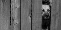
| 03/03/2005 05:41:58 AM | Report Animal Abuse and Neglect 1-800-SAVE-A-PETby ElemmennopeComment: ok, i am voting this challenge in 2 passes. in this pass, you will get a partial comment and a score. then i will come back to comment again. if you have any problem whatsoever with this comment, pm me and let me know. otherwise, take it with a grain of salt...i'm not trying to be a know-it-all, i'm just explaining where i'm coming from in voting this challenge. and, if this comment is NOT helpful (of if you think i'm full of $#!+), don't mark it helpful.
billboards are a science unto themselves. a lot of research has gone into determining just how much information a person can digest and retain in specific time spans. they use this information to develop formulas for determining the number of words and letters to use on billboards, as well as their sizes. they also determine the size and number of visual elements to include.
the graphics/photograph on a billboard are designed to get the point across in a moment. on the road, a driver will have less time with a billboard than a voter will give your image. this is a key element in the challenge: composing a shot that will get its point across quickly and succintly. along those lines, a strong composition will probably have few details and make strong use of negative space.
---------------------
i love your idea, your composition, and your image. up close, the dog's face really helps to bring your point across. however, as a billboard, i'm not sure how well it works. even though the challenge only called for the image, it needs to be rendered in such a way as to allow for the message. here, i think it would take a bit more work. [as an aside, another one of the 'billboard design rules' is that they are typically laid out from left to right, with the graphical part on the left.] anyways, i hope this does well for you. good luck! | | Photographer found comment helpful. |
| 03/03/2005 05:33:01 AM | Fatherhood - Be there.by sixmacsComment: ok, i am voting this challenge in 2 passes. in this pass, you will get a partial comment and a score. then i will come back to comment again. if you have any problem whatsoever with this comment, pm me and let me know. otherwise, take it with a grain of salt...i'm not trying to be a know-it-all, i'm just explaining where i'm coming from in voting this challenge. and, if this comment is NOT helpful (of if you think i'm full of $#!+), don't mark it helpful.
billboards are a science unto themselves. a lot of research has gone into determining just how much information a person can digest and retain in specific time spans. they use this information to develop formulas for determining the number of words and letters to use on billboards, as well as their sizes. they also determine the size and number of visual elements to include.
the graphics/photograph on a billboard are designed to get the point across in a moment. on the road, a driver will have less time with a billboard than a voter will give your image. this is a key element in the challenge: composing a shot that will get its point across quickly and succintly. along those lines, a strong composition will probably have few details and make strong use of negative space.
-------------------------
excellent work! simple, succint, and a very strong message. this is one of the few challenges where you also need to look at the thumbnail to get an idea of how this would look driving by at a distance (unless you were to move your pc out into the yard and run back in forth in front of it). here, the image looks like it would work well even at 65 mph. really hope this does well for you! good luck! | | Photographer found comment helpful. |
| 03/03/2005 05:29:53 AM | Now Playing: Frankie Avalon in Grease!by NeilComment: ok, i am voting this challenge in 2 passes. in this pass, you will get a partial comment and a score. then i will come back to comment again. if you have any problem whatsoever with this comment, pm me and let me know. otherwise, take it with a grain of salt...i'm not trying to be a know-it-all, i'm just explaining where i'm coming from in voting this challenge. and, if this comment is NOT helpful (of if you think i'm full of $#!+), don't mark it helpful.
billboards are a science unto themselves. a lot of research has gone into determining just how much information a person can digest and retain in specific time spans. they use this information to develop formulas for determining the number of words and letters to use on billboards, as well as their sizes. they also determine the size and number of visual elements to include.
the graphics/photograph on a billboard are designed to get the point across in a moment. on the road, a driver will have less time with a billboard than a voter will give your image. this is a key element in the challenge: composing a shot that will get its point across quickly and succintly. along those lines, a strong composition will probably have few details and make strong use of negative space.
-------------------
excellent shot! i've seen many billboards just like this leaving philadelphia, promoting atlantic city. it might take a little work cropping and such, but all the same, you got the idea. i am, however, curious as to how you got this shot (don't they discourage cameras, and even threaten confiscation?)...anyways, i hope this does well for you. good luck! | | Photographer found comment helpful. |
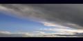
| 03/03/2005 05:26:46 AM | HDTV.net Big Sky / Montanaby tfarrell23Comment: ok, i am voting this challenge in 2 passes. in this pass, you will get a partial comment and a score. then i will come back to comment again. if you have any problem whatsoever with this comment, pm me and let me know. otherwise, take it with a grain of salt...i'm not trying to be a know-it-all, i'm just explaining where i'm coming from in voting this challenge. and, if this comment is NOT helpful (of if you think i'm full of $#!+), don't mark it helpful.
billboards are a science unto themselves. a lot of research has gone into determining just how much information a person can digest and retain in specific time spans. they use this information to develop formulas for determining the number of words and letters to use on billboards, as well as their sizes. they also determine the size and number of visual elements to include.
the graphics/photograph on a billboard are designed to get the point across in a moment. on the road, a driver will have less time with a billboard than a voter will give your image. this is a key element in the challenge: composing a shot that will get its point across quickly and succintly. along those lines, a strong composition will probably have few details and make strong use of negative space.
-------------------
while i love your image, i'm not quite sure i get what you are promoting? are you promoting a website, a TV, or a place? i think this would work nice for promoting visiting big sky country (though it may be stronger with a hint of ground in the background). good luck! | | Photographer found comment helpful. |
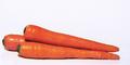
| 03/03/2005 05:20:22 AM | The Ultimate Eye Candyby GeneralEComment: ok, i am voting this challenge in 2 passes. in this pass, you will get a partial comment and a score. then i will come back to comment again. if you have any problem whatsoever with this comment, pm me and let me know. otherwise, take it with a grain of salt...i'm not trying to be a know-it-all, i'm just explaining where i'm coming from in voting this challenge. and, if this comment is NOT helpful (of if you think i'm full of $#!+), don't mark it helpful.
billboards are a science unto themselves. a lot of research has gone into determining just how much information a person can digest and retain in specific time spans. they use this information to develop formulas for determining the number of words and letters to use on billboards, as well as their sizes. they also determine the size and number of visual elements to include.
the graphics/photograph on a billboard are designed to get the point across in a moment. on the road, a driver will have less time with a billboard than a voter will give your image. this is a key element in the challenge: composing a shot that will get its point across quickly and succintly. along those lines, a strong composition will probably have few details and make strong use of negative space.
-----------------
if love your idea, and the colors. this is a great job, and i only have a couple nits. this is one challenge where you really do have to look at the thumbnail to get an idea of how the image would come across as a billboard (unless one where to move their pc out into the yard and run back and forth in front of it...). looking at it large, you get the full impact of the image. looking at it small, it's almost hard to determine what it is. the one thing that could have made, IMHO, a huge difference, would have been to have shot carrots with their greens still on. anyways, i really hope this does well for you. good luck! | | Photographer found comment helpful. |
| 03/03/2005 05:15:51 AM | Bring your PJ's to Kenya this Summerby BradComment: ok, i am voting this challenge in 2 passes. in this pass, you will get a partial comment and a score. then i will come back to comment again. if you have any problem whatsoever with this comment, pm me and let me know. otherwise, take it with a grain of salt...i'm not trying to be a know-it-all, i'm just explaining where i'm coming from in voting this challenge. and, if this comment is NOT helpful (of if you think i'm full of $#!+), don't mark it helpful.
billboards are a science unto themselves. a lot of research has gone into determining just how much information a person can digest and retain in specific time spans. they use this information to develop formulas for determining the number of words and letters to use on billboards, as well as their sizes. they also determine the size and number of visual elements to include.
the graphics/photograph on a billboard are designed to get the point across in a moment. on the road, a driver will have less time with a billboard than a voter will give your image. this is a key element in the challenge: composing a shot that will get its point across quickly and succintly. along those lines, a strong composition will probably have few details and make strong use of negative space.
-----------------------
excellent idea, nicely conveyed and perfectly organized. this would work even at 80 mph! you absolutely don't need the border, but i won't deduct for that. really hope to see this on the front page. good luck! | | Photographer found comment helpful. |
|
Showing 4051 - 4060 of ~6399 |
Home -
Challenges -
Community -
League -
Photos -
Cameras -
Lenses -
Learn -
Help -
Terms of Use -
Privacy -
Top ^
DPChallenge, and website content and design, Copyright © 2001-2026 Challenging Technologies, LLC.
All digital photo copyrights belong to the photographers and may not be used without permission.
Current Server Time: 07/16/2026 06:43:56 PM EDT.
|