| Author | Thread |
|
|
03/05/2005 01:10:56 AM |
|
gorgeous colors and composition, Brad. i think the title is a hoot! congrats on top 20! |
|
 Photographer found comment helpful. Photographer found comment helpful. |
Comments Made During the Challenge  |
|
|
03/04/2005 10:39:34 PM |
|
This is an amzing image and could be an excellent billboard but I find the title is weak. |
|
| Photographer found comment helpful. |
|
|
03/04/2005 10:23:37 PM |
|
| Photographer found comment helpful. |
|
|
03/04/2005 09:20:12 PM |
|
beauty. One of my favorites. |
|
| Photographer found comment helpful. |
|
|
03/04/2005 08:31:14 PM |
|
Great pic, hits the competition, well done. 10 |
|
| Photographer found comment helpful. |
|
|
03/04/2005 07:54:48 PM |
|
One of my favorites in the challenge. The only "animal" one that truly impressed me as a billboard. 10. |
|
| Photographer found comment helpful. |
|
|
03/04/2005 07:35:30 PM |
|
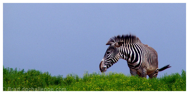
Returning for comment: This is just a superb shot in all respects. One minor issue is the noise in the sky. But it's otherwise wonderfully composed and presented. I hope you don't get dinged by others for the border, which would not be found on a billboard. And a title like "See the Wildlife at..." might have worked better with voters, allowing interpretations as a billboard for a zoo, for example. Anyway, I'm just rambling, and I really just wanted to tell you how much I liked this! Bumping way up! |
|
| Photographer found comment helpful. |
|
|
03/03/2005 05:15:51 AM |
ok, i am voting this challenge in 2 passes. in this pass, you will get a partial comment and a score. then i will come back to comment again. if you have any problem whatsoever with this comment, pm me and let me know. otherwise, take it with a grain of salt...i'm not trying to be a know-it-all, i'm just explaining where i'm coming from in voting this challenge. and, if this comment is NOT helpful (of if you think i'm full of $#!+), don't mark it helpful.
billboards are a science unto themselves. a lot of research has gone into determining just how much information a person can digest and retain in specific time spans. they use this information to develop formulas for determining the number of words and letters to use on billboards, as well as their sizes. they also determine the size and number of visual elements to include.
the graphics/photograph on a billboard are designed to get the point across in a moment. on the road, a driver will have less time with a billboard than a voter will give your image. this is a key element in the challenge: composing a shot that will get its point across quickly and succintly. along those lines, a strong composition will probably have few details and make strong use of negative space.
-----------------------
excellent idea, nicely conveyed and perfectly organized. this would work even at 80 mph! you absolutely don't need the border, but i won't deduct for that. really hope to see this on the front page. good luck! |
|
| Photographer found comment helpful. |
|
|
03/02/2005 05:33:04 PM |
My evaluation method of this challenge is as follows:
1. Did you catch my eye while I was driving by? Yes.
2. If I didn't catch the text while I was driving, did you intrigue me enough to look for this billboard again? Probably.
3. Did you sell your stuff to me? Yes.
4. Extra thoughts: Beautiful image. Very clean and eye catching.
The somewhat dark colors don't really look like Kenya at a glance, but they sure do make me wanna go.
For me this means you did a good job with your billboard (7) |
|
| Photographer found comment helpful. |
|
|
02/28/2005 07:10:20 PM |
|
Nice composition and color. Sky seems a tad grainy - you might try Neat Image. |
|
| Photographer found comment helpful. |
|
|
02/28/2005 01:47:00 PM |
|
| Photographer found comment helpful. |
|
|
02/28/2005 01:10:25 PM |
|
Great shot and title! Love this billboard. |
|
| Photographer found comment helpful. |
|
|
02/28/2005 11:34:39 AM |
|
Love the picture, not liking the caption. |
|
| Photographer found comment helpful. |
|
|
02/28/2005 11:20:37 AM |
|
Beautiful! Love the great colors and it's a great composition for a bill board. 9 |
|
| Photographer found comment helpful. |
|
|
02/28/2005 06:26:08 AM |
|
| Photographer found comment helpful. |
|
|
02/28/2005 03:37:52 AM |
|
I like this one. Clean and simple and graphic, with plenty of room for the text. |
|
| Photographer found comment helpful. |
|
|
02/28/2005 01:24:08 AM |
|
awesome shot, love the colors and composition 9 |
|
| Photographer found comment helpful. |
|
|
02/28/2005 01:05:21 AM |
|
Love the contrast and colors.....not too saturated like a lot of people would do with this. Nice job. Having trouble connecting the title to the image though. Zebra petterned PJs? Zebra looks tired? Hmmm |
|
| Photographer found comment helpful. |
Home -
Challenges -
Community -
League -
Photos -
Cameras -
Lenses -
Learn -
Help -
Terms of Use -
Privacy -
Top ^
DPChallenge, and website content and design, Copyright © 2001-2026 Challenging Technologies, LLC.
All digital photo copyrights belong to the photographers and may not be used without permission.
Current Server Time: 06/30/2026 11:27:53 AM EDT.