| Image |
Comment |
| 10/15/2002 05:15:00 PM |
Mirror times Fourby MarshaComment: Bravo! Is that a hot-pixel in the first mirror? If so that's unfortunate. The only blemish... Excellent interpetation of the challenge... Steller execution... Lovely model... I'm going to ignore the pixel in the first mirror and give you the 10 you deserve! ~MyQyl~ |
| 10/15/2002 08:56:00 PM |
Lust in a Pillby MaYzComment: I'm sure if I was up on today's pop/drug culture, I'd understand this... Interesting use of a shallow depth of field to leave the foreground tablets and the back of the capsule out of focus... Not sure if I like it on the back but the foreground works for me. Great use of color/background. ~MyQyl~ |
| 10/15/2002 03:28:00 PM |
Drugsby bojanzamurovicComment: The focus on the hypo could have been a tad sharper. But I like the soft focus on the chalk outline. |
| 10/15/2002 03:49:00 PM |
Aftermathby HBunchComment: Powerful. The kind of shot that can move people and hopefully make a differance in a life. The one small nitpick I have is the lower right corner... That dark patch kept pulling me away from the subject and lessened the impact (at least for me) ~ MyQyl ~ |
 Photographer found comment helpful. Photographer found comment helpful. |
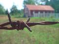
| 10/15/2002 03:41:00 PM |
Apple Skinby kosmikkreeperComment: Nice use of the negative space in the upper right. I'm not sure what the wire is all about and I'm not sure it helps the shot for me, but I can appreciate that it might work for someone. Nicely done :) |
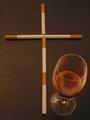
| 10/15/2002 04:40:00 PM |
cheers!by i-bagComment: The focus seems off, espcially on the wine glass, but it is an original, thoughtful interputation of the challenge. ~MyQyl~ |
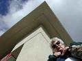
| 10/15/2002 03:53:00 PM |
Mom's Wrathby spillerComment: Ohhh! Your in Trooouubblleee! Nice shot :) One nitpick = the 'peak' (corner) of the roof is slightly off center. I think it would look better either centered or further offcenter. But that's just me and I don't win :) So take it for what it's worth :) ~MyQyl~ |
| Photographer found comment helpful. |
| 10/15/2002 08:33:00 PM |
Greedby MarkRobComment: Excellent conceptually and excellent execution! 10 ~MyQyl~ |
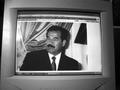
| 10/15/2002 04:36:00 PM |
Too many Sins to Countby ashandipantsComment: At first this seemed to be just a picture of someone else's photo.. Then I noticed what I think you were really going for... AOL and Microsoft! The photo of Saddam just confuses... The monitor is a tad tilted and I'm not sure the space on the right side helps any either. ~MyQyl~ |
| 10/15/2002 04:46:00 PM |
Feeling a bit Sluggish.by UberFishComment: Very nice shot... Technically very appealing. I have to admit that it doesn't really scream '7 deadly sins' to me though. I get the tie in, but it's a little shakey. ~MyQyl~ |
Home -
Challenges -
Community -
League -
Photos -
Cameras -
Lenses -
Learn -
Help -
Terms of Use -
Privacy -
Top ^
DPChallenge, and website content and design, Copyright © 2001-2026 Challenging Technologies, LLC.
All digital photo copyrights belong to the photographers and may not be used without permission.
Current Server Time: 06/22/2026 10:42:20 PM EDT.