| Image |
Comment |
| 01/02/2005 08:41:09 PM |
|
 Photographer found comment helpful. Photographer found comment helpful. |
| 01/02/2005 08:39:51 PM |
To organise my photos betterby WobbleComment: First off, it appears that you nailed the focus on this one. The disorganized busy appearance in this composition is fitting given your message. Couple of observations: it appears to be underexposed a hair or two. White balance is skewed to the warm side. Overall, a credible entry but one that just does not have broad appeal from an artistic viewpoint. |
| Photographer found comment helpful. |
| 12/29/2004 03:04:57 PM |
The Ballby TheDistortedPoetComment: Couple of things here which is not working...the shear distortion introduced into this image probably as a result of deliberate post processing does not add to this image in a meaningful way (aside from being a purely artistic decision). The second is the size of this entry. It's thumbnail sized and makes judging it quite difficult. Try submitting an image that is 600+ pixels on the long edge. |
| Photographer found comment helpful. |
| 12/29/2004 03:00:36 PM |
Blue Steelby jessfrolioComment: I like the toning and overall composition. Background shadow is also pleasing and creates a nice platform on which you presented the subject. Lots of contrast here which is also distinctive and pleasing. |
| Photographer found comment helpful. |
| 12/29/2004 02:58:56 PM |
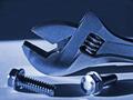
3 Gearsby Prof_FateComment: I'm not so sure if the strong side lighting and resulting shadows add to the aesthestics of the image. DOF is too shallow and the foremost gear struggles to be in focus. The negative space is a nice touch, and your border is subtle yet effective. Overall a nice enough entry which I think suffers from choice of lighting and depth of field.
|
| Photographer found comment helpful. |
| 12/29/2004 02:02:23 AM |
The mechanics of creating life...a machine-like process.by rmtm333Comment: I'd have to disagree here. It's more of a chemical process, which fuels a charge potential to drive energy related reactions that 'drives' the process of life.
The birthing process on the other hand is a mechanical process in a loose sense (i.e. the fetus is propelled through the birth canal by rhythmic contractions). I'll assume this is what you were referring to.
Your border is nice, but I suspect some will disagree here...probably could have played it safer and used a more conventional one. The desaturation works well given the backlighting. I think this is straight B&W and while it is perfectly effective, I recommend toning with your choice of color...say steel blue or sepia, to give the image more character.
The ring is a nice touch and the gradient backdrop adds subtle, pleasing contrast to the figure. |
| Photographer found comment helpful. |
| 12/29/2004 01:46:23 AM |
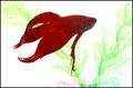
Feed me!by snackwellsComment: Thanks for your comments. I guess the interaction that fish have with their owners, mostly feeding them, didn't quite pan out. Ha! |
| 12/28/2004 12:35:21 PM |
Ebenezer CorkScrooge by scalvertComment: Remarkably sharp and clear. I think the lighting is excellent and the magenta and green give nice definition to Ebenezer. My pick for top three. |
| Photographer found comment helpful. |
| 12/27/2004 03:56:02 PM |
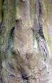
Elephantby SteveJComment: I can see the elephant. Looks like it has its snout raised up. I think this would also work if it was flipped vertically. Good, creative entry. |
| Photographer found comment helpful. |
| 12/27/2004 03:54:14 PM |
Sunny Blue Eyesby spaque99Comment: Good composition-like the way you cropped this. Fine detail lost with aggressive noise reduction and results in an overall plasticky appearance. |
| Photographer found comment helpful. |
Home -
Challenges -
Community -
League -
Photos -
Cameras -
Lenses -
Learn -
Help -
Terms of Use -
Privacy -
Top ^
DPChallenge, and website content and design, Copyright © 2001-2026 Challenging Technologies, LLC.
All digital photo copyrights belong to the photographers and may not be used without permission.
Current Server Time: 07/22/2026 09:18:05 AM EDT.