| Image |
Comment |
| 08/24/2002 10:18:00 PM |
Stubbyby npageComment: Nice photo. The green background color works well with this set-up. I does seem that the lighting is a little harsh and creates some extremely dark shadows. The whole thing appears to have a grainy overcast. I don't know what the cure for these things are, hopefully someone else will be more fully able to assist with their critique. |
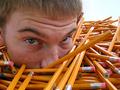
| 08/25/2002 08:29:00 AM |
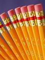
Office Boyby drewmediaComment: You could hold a contest of "Guess the number of Pencils." How many are there exactly? It looks as if he is up to his eyes in pencils, about to be buried. This is another example of the innovative ideas I've seen in this challenge. |
 Photographer found comment helpful. Photographer found comment helpful. |
| 08/21/2002 02:36:00 PM |
Bloomingby puppet10Comment: interesting perspective - I think you were going for that soft blur-distorted abstract look with a sharp focus at the lower left ROT but, my experience here is that abstract is not readily understood here. I hope you are scoring better than I think you might be.... I'm not sure if I would hang this up anywhere, I think it might lose something in a larger size and become too grainy. It is a good representation of the challenge.... =7 syamjonimi ;'-D |
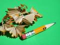
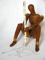
| 08/19/2002 02:03:00 PM |
Tools of the Tradeby tee tahComment: Very good!! Nice set-up. A little harsh in the lighting but, bright sun does that. I think you should do well with this shot. Cute little red pencil looks like he/she is among good friends..... |
| 08/20/2002 01:19:00 AM |
Self-portrait with pencilby GinaRothfelsComment: I thought this week would be interesting...but, for this photograph interesting is just NOT powerful enough. Nothing wrong here that I can see! =10 syamjonimi ;-D |
| Photographer found comment helpful. |
| 08/19/2002 02:08:00 PM |
|
| 08/19/2002 09:09:00 PM |
Fandangoby myqylComment: Cool!!! I love the use of color on color and the abstract fan effect from two directions. Good lighting with minimal reflection. =9 syamjonimi |
| Photographer found comment helpful. |
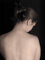
| 08/20/2002 10:14:00 PM |
Utilitarianby indigo997Comment: Somehow the pencil get lost in the beauty.......Wonder why? The photo quality is good but, this is a nice portrait shot. I would have liked more focus on the pencil, for this challenge, anyway. In an appropriate challenge I would go as high as 8 but since the challenge is about photographing a pencil I thik the pencil should be the heart of the picture. =6 syamjonimi ;'-) |
| Photographer found comment helpful. |
| 08/21/2002 02:16:00 PM |
I'm positive it's #2 officer!by dpatteeComment: Great use of humor. Great title. The most original idea of this challenge. I like the reflection of the two left most pencils but, personally I would like to see reflection from all the pencils. The lighting seems ok but the entires photo could be a little brighter. I would definitely hang this in my office if I were an officer. It would make a great gift if you have a family member or friend who is a peace officer..... =7 syamjonimi |
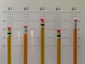
| 08/20/2002 10:04:00 PM |
Just Pencilsby jkiolbasaComment: The fan effect works well here. I'm not sure about the focus. It really doesn't detract from the photo in my opinion. What other comments have you gotten in this regard? Good choice for a background color. Ther seems to be a little bit of excessive glare on the pencil tops, was that your intent? =7 syamjonimi ;'-D |
Home -
Challenges -
Community -
League -
Photos -
Cameras -
Lenses -
Learn -
Help -
Terms of Use -
Privacy -
Top ^
DPChallenge, and website content and design, Copyright © 2001-2026 Challenging Technologies, LLC.
All digital photo copyrights belong to the photographers and may not be used without permission.
Current Server Time: 07/16/2026 07:22:24 AM EDT.