| Image |
Comment |
| 12/20/2004 12:13:21 AM |
27 Yearsby ahazeComment: I really like the simplicity of this.. It would be nicer if the background were consistent, instead of darkening at the top.. Still a nice photo! |
 Photographer found comment helpful. Photographer found comment helpful. |
| 12/20/2004 12:10:10 AM |
Ornamentby HomunculusComment: gorgeous!!! i love it :) i would have preferred to have the starburst over to the left a little bit, more in the corner to add a sense fo balance, but it's still a beautiful picture!! 9 :) |
| 11/22/2004 02:35:04 PM |
The Artist by scalvertComment: brilliant!! never in a million years would I have guessed how you did this.. absolutely fantastic, a 110% deserved blue :) |
| Photographer found comment helpful. |
| 11/08/2004 06:11:42 PM |
Swingin'by KonadorComment: just goes to show, it's not the camera, it's the photographer :) |
| Photographer found comment helpful. |
| 08/04/2004 01:50:28 AM |
|
| Photographer found comment helpful. |
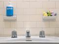
| 07/29/2004 12:47:51 PM |
Scrub 'n Six Dubsby BikeRacerComment: the faucet seems off center to me, and it's kind of throwing off my perception.. nice clean lines, but the dirt streaks in the upper left corner and really distracting.. good shot :) |
| Photographer found comment helpful. |
| 07/29/2004 12:46:36 PM |
Order of the Keysby CrAcKpOt 909Comment: focus needs a little bit of work, everything here is blurry.. try to avoid putting things in the dead center of the photo - use the rule of thirds, or at least take it from a more interesting angle. the background needs to go, too.. stick with solid colors, so they don't detract from your focal point |
| Photographer found comment helpful. |
| 07/29/2004 12:45:04 PM |
Picture Thisby LokiComment: great idea, this is really nice, but the lighting on the frame seems too harsh in the lower right corner and too dark in the upper left corner.. it makes the frame seem a little too fake against the elegance of the sunset behind it |
| Photographer found comment helpful. |
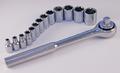
| 07/29/2004 12:43:55 PM |
Free Service & Tune Up With Rebateby browntComment: cool composition, this is a really clever idea.. I wish the background were more white than blue... After the challenge is over, I would suggest trying to tone down all the blue in this photo and make it a more cleaner, purer white, and this would a fantastic stock photo |
| Photographer found comment helpful. |
| 07/29/2004 12:41:42 PM |
|
| Photographer found comment helpful. |
Home -
Challenges -
Community -
League -
Photos -
Cameras -
Lenses -
Learn -
Help -
Terms of Use -
Privacy -
Top ^
DPChallenge, and website content and design, Copyright © 2001-2026 Challenging Technologies, LLC.
All digital photo copyrights belong to the photographers and may not be used without permission.
Current Server Time: 07/16/2026 06:23:52 PM EDT.