| Image |
Comment |
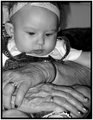
| 09/22/2005 01:14:59 AM |
Voices From Aboveby roscoComment: CRITIQUE CLUB!
i would really like to see more shots of this man and find out more about his story. as such, this photo is lacking in a few key technical details and that's probably why the score was so low.
the focus is very soft, whether that's because the camera was moved or the photo was blown up i don't know. however, i would like to see this more tack-sharp.
the midday lighting is too bright on the right side of his face and has created a few "blowouts" that distract from the rest of the picture.
everything aside, though, it's a great candid. if it were executed more adroitly, this would be a true treasure. |
| 09/22/2005 01:12:31 AM |
Ready to Rollby neophyteComment: CRITIQUE CLUB!
good crop that's tight on the face. focus is pretty good as well, and the helmet helps tell a bit of a story.
suggestions for improvement:
- the harsh midday lighting is extremely uneven and creates a wierd, bright "mask" over part of his face. taking this out of the direct sunlight would really help.
- the unusual angle doesn't really help the photo. instead of focusing on this man's face and eyes and wondering what his story is, i find myself thinking "man, he hasn't shaved and i wonder what happened to the back of his face?"
- we're looking almost straight on to this person. having him turn a bit more and then turn his head back toward the camera might be a more interesting pose.
a different pose with more diffuse lighting would help this out immensely. don't give up -- keep trying. using the polarizer definitely helped out here. |
 Photographer found comment helpful. Photographer found comment helpful. |
| 09/22/2005 01:08:10 AM |
Girl in loveby birgirComment: CRITIQUE CLUB!
I think the color and lighting in this are just outstanding and you did a really great job with the flash -- the catchlight in her eyes really makes them pop.
Some suggestions for improvement might include:
- A contrasting color for the backdrop. Right now everything seems very reddish.
- A tighter crop on the woman's face. Although the composition of this is great and the background does help tell a story, traditionally, portraits are a much tighter crop. I think this might be the single biggest reason why this did not score higher. If you had not worried about including the entire heart, it might not have left so much space at the top and put the focus more on the model herself, which is where the focus is expected to be for a portrait. |
| Photographer found comment helpful. |
| 09/15/2005 08:19:34 PM |
|
| 09/15/2005 08:18:08 PM |
|
| 09/15/2005 10:55:21 AM |
Veiledby labudsComment: i would prefer to see your take on a challenge topic instead of your version on someone else's take. |
| 09/15/2005 10:54:49 AM |
|
| Photographer found comment helpful. |
| 09/15/2005 10:54:30 AM |
|
| Photographer found comment helpful. |
| 09/15/2005 10:54:14 AM |
Selfby LadeeMComment: i'm not sure the high contrast feel here is the best way to go for this type of image. i like tht it brings the eyes out, but it crams the skintones and hair into the same visual space. |
| Photographer found comment helpful. |
| 09/15/2005 10:53:25 AM |
Opheliaby inspir8tionComment: good composition and color. face seems a bit washed out. great catchlights in the eyes. |
| Photographer found comment helpful. |
Home -
Challenges -
Community -
League -
Photos -
Cameras -
Lenses -
Learn -
Help -
Terms of Use -
Privacy -
Top ^
DPChallenge, and website content and design, Copyright © 2001-2026 Challenging Technologies, LLC.
All digital photo copyrights belong to the photographers and may not be used without permission.
Current Server Time: 07/23/2026 05:26:04 PM EDT.