| Image |
Comment |
| 12/11/2003 07:47:03 PM |
|
| 12/11/2003 07:07:25 PM |
daisyby desmondComment: There is too much stuff visible in the background, especially for the theme simplicity. |
| 12/10/2003 08:21:43 PM |
|
 Photographer found comment helpful. Photographer found comment helpful. |
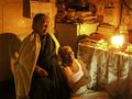
| 12/10/2003 06:54:12 PM |
Prophet Jonesby cristiano79Comment: I wonder if you could have found an angle that cut the building out of the background. The combination is too fussy to really fit in with the "Simplicity" theme. |
| Photographer found comment helpful. |
| 12/07/2003 06:17:40 PM |
|
| Photographer found comment helpful. |
| 12/05/2003 05:43:16 PM |
|
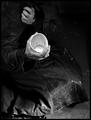
| 12/03/2003 08:03:31 PM |
pennilessby peeceeComment: The background is really distracting. You should have placed your model in front of a plain wall. |
| Photographer found comment helpful. |
| 12/03/2003 08:02:16 PM |
|
| Photographer found comment helpful. |
| 12/03/2003 07:18:42 PM |
Spare Change?by adineComment: I like the idea but think it might have been better to crop down to the hands. |
| Photographer found comment helpful. |
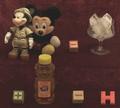
| 12/03/2003 06:46:46 PM |
Rebusby jvanderauComment: Clever idea, but it could use a bit of brightening up by adjusting the levels or brightness and contrast. |
| Photographer found comment helpful. |
Home -
Challenges -
Community -
League -
Photos -
Cameras -
Lenses -
Learn -
Help -
Terms of Use -
Privacy -
Top ^
DPChallenge, and website content and design, Copyright © 2001-2026 Challenging Technologies, LLC.
All digital photo copyrights belong to the photographers and may not be used without permission.
Current Server Time: 06/19/2026 05:16:14 AM EDT.