| Image |
Comment |
| 01/03/2005 10:58:12 PM |
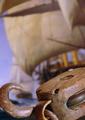
Yo Ho Hoby joebokComment: This is a very nice idea. I like the lighting, and good detail on the block. Fits the challenge very well, and yet is creative also. I don't like how the block is cut off though, perhaps if you showed all the hook and a tad bit more of the bottom. |
 Photographer found comment helpful. Photographer found comment helpful. |
| 01/03/2005 10:54:37 PM |
|
| Photographer found comment helpful. |
| 01/02/2005 11:19:27 PM |
|
| Photographer found comment helpful. |
| 01/02/2005 11:18:12 PM |
|
| Photographer found comment helpful. |
| 01/02/2005 11:14:38 PM |
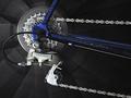
Geared for the Roadby JEFFJSBComment: Good composition. Nice selective desat, however in this case I think it draws attention to the frame and away from the main subject, the gears. |
| 01/02/2005 11:12:03 PM |
|
| Photographer found comment helpful. |
| 01/02/2005 11:10:02 PM |
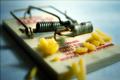
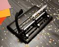
Just an old puncher...by LevTComment: Beautiful composition. Great lighting, nice detail. I love all the little punch outs. I can't decide if the papers at the top left add to or distract from the shot, anyway no mark down from me for it. Good job. |
| Photographer found comment helpful. |
| 01/02/2005 11:06:20 PM |
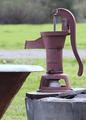
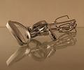
The Old Fashioned Wayby RefocusedComment: Great concept. Good subject. I love the reflection. Lighting looks a little bit flat though... and I'm wondering if a more extreme diagonal might work a little bit better? |
| Photographer found comment helpful. |
| 01/02/2005 11:04:27 PM |
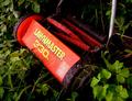
RETIRED MECHANICAL MARVELby kiwinickComment: Retired??? That's the kind of mower I have !!! Nice composition though. :-) Good lines and I really like the red nestled in all the green foliage. |
| Photographer found comment helpful. |
| 01/02/2005 11:01:48 PM |
Mechanical Pencilby aeh3591Comment: I think you have a potentially good subject here. It fits the challenge well. Your focus definitely needs to be sharper. Perhaps you're trying to get too close, especially if you don't have manual focus or a macro setting. Lighting seems kind of harsh, possibly due to using built in flash? Try diffusing it or use other light sources(there are lots of cheap, homemade, or makeshift possibilities). Also it appears kind of weak compositionally. Try different perspectives or angles, using compositional guides such as diagonals, leading lines or the rule of thirds (there are tutorials on the site about these type of things). This background may work well with these other points touched upon, it looks like there is some nice texture to the wood grain, or you could try a black cloth or other simple, plain contrasting things. |
Home -
Challenges -
Community -
League -
Photos -
Cameras -
Lenses -
Learn -
Help -
Terms of Use -
Privacy -
Top ^
DPChallenge, and website content and design, Copyright © 2001-2026 Challenging Technologies, LLC.
All digital photo copyrights belong to the photographers and may not be used without permission.
Current Server Time: 07/22/2026 08:06:07 PM EDT.