|
|
|
Showing 1001 - 1010 of ~2507 |
| Image |
Comment |
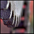
| 04/07/2006 05:48:32 AM | Gentleby macrothingComment: Nice shot here! Stong composition. Good use of dof. Great lighting. Interesting subject. Good example of a texture shot. Nice job :-) |  Photographer found comment helpful. Photographer found comment helpful. |
| 04/07/2006 05:42:30 AM | Leather & Laceby scalvertComment: Nice concept. Very creative approach to this challenge. I really like your processing of this image. Overall, it works. Good job. | | Photographer found comment helpful. |
| 04/07/2006 05:39:23 AM | Flora- Goddess of Flowers & Gardensby edmengComment: Hmmm, interesting shot here. I don't feel like it is a great choice for texture, I'm not really 'feeling' it, if you know what I mean. However, I will say this: Normally, photos of sculptures, statues and that sort don't really do much for me. Here though, I think this is probably the first shot of that sort that I actually like. Outside of this challenge, I think this is a really nice image. A very stimulating point of view. Nice job and very fitting processing. Great sky. Strong composition with the nice vertical and all. Really cool shot, just doesn't show texture that strongly to me. | | Photographer found comment helpful. |
| 04/07/2006 05:32:20 AM | Fuegoby TychoComment: Really nice job. Great lighting. Stimulating composition. Good example of a texture shot. Well done :-) | | Photographer found comment helpful. |
| 04/07/2006 05:30:40 AM | Musical textureby eliniasComment: Very creative and original idea. Nice lighting. Great detail. Really like the title too :-) | | Photographer found comment helpful. |
| 04/07/2006 05:21:47 AM | Time And The Seaby JunieMoonComment: Cool idea. Good subject. The lighting seems a bit harsh. Perhaps a different time of day for the shot could be a stronger show of texture. Also, I think this is a case where the centered composition just doesn't seem to be very stimulating. |
| 04/07/2006 03:52:56 AM | Something Differentby bs-photosComment: Greetings from the Critique Club :-)
This is your entry in the 'Water II' challenge. Definitely fits the challenge, looks like water to me :-) Good to hear you experimenting with classic type shots (water drops). Although some people are always going on about the whole 'cliche' thing, IMO, it is a great learning tool to work on these types of traditional shots. Ask a lot of the great photographers around, and I'm sure most will tell you they worked on all kinds of 'cliched' shots on the path to wear they are! Water drop shots are definitely a challenge, I believe there may be a good tutorial or two here on the site about them. Anyways, on with your shot here.
I like your idea here. A simple, yet to the point approach. You've nicely kept the scene neat and free of any distracting elements. I think the colors you got actually add a lot to this particular shot. From your description, I can't exactly say what they are from for sure. Probably a reflection of something. You'd have to take a good look at the area you shot in, look for anything of those colors that could of showed up. Maybe there is a mirror in that room? Could even be the clothes that you had on at that time. Be that as it may, the colors are good in this case :-) I think the composition is ok for what you were going for here, filling the frame, and as I said you kept it clean and uncluttered.
I think I can offer up a few suggestions here to try in the future for shots of this nature. For one thing, the focus does seem a little off, as some commenters pointed out. A few things could help here. For one, if you are not already using one, a tripod is a must. I see you took this on your table, so even a 'mini' tripod would work. Or even a box, or books, etc., any solid surface to set the camera on, and use the timer. Some people use beanbags or similar things so they can adjust the angle of the camera. Another thing, is make sure you are not too close to the subject, so close that you are beyond the camera's minimum focus distance. You can also apply sharpening in processing, all depending on what specific software you use. Of course, you still need to start with an in focus pic :-) If your program has USM (unsharp mask), this is what most folks use for sharpening. Gives a lot of control.
Next, let's talk about background. Looks like you've got there either a piece of carpet, or tablecloth of some kind? It's good that you're going for something basically neutral in color, but do you see how the texture of it shows a lot? If not contributing directly to the concept, this tends to be a distraction. And some parts of the glass start to kind of get lost. If you look at a lot of the shots of this nature, you'll see they usually have a plain black or white background. You don't have to have pro quality muslin or anything, there are a lot of readily available things that you can use. Old sheets (make sure you iron out the wrinkles), poster board, foam board. Pieces of material from those sewing places (a lot of people like velvet or similar). Just look around some, you can find lots of things. I have some pieces of white and black foam board, I got at an arts and crafts place for less than a buck a piece.
Lastly, we'll discuss lighting. Your lighting here is even, no harsh hot spots or shadows, but a little flat. Better lighting will also help get a faster shutter speed, which can also help with sharpness. Good lighting can add drama, give a more vivid and lively presentation, or help set a mood. It is good that you diffused the onboard flash, but probably a lot better off to avoid the flash altogether whenever possible. With some simple lighting, you will have a lot more control over the shoot. Onboard flash can sometimes be good for fill light, but p&s flashes are notoriously horrible normally :-) Again, a nice set of alien bees, and pro strobes and softboxes and stuff would be awesome to have, but a little resourcefulness can get positive results. Actually, a lot of people will say that natural light is the best light, if you can understand how to use it. Take advantage of windows and well lit rooms, watch what times of day affect the lighting in the room. You can also use regular lamps and such. Some people have shop lights, like you can get at any dept or hardware store. I have some clamp lights (they look like a metal reflector with a light bulb socket, about 5 bucks each). Experiment with different distances, and angles and such. Just watch your white balance. You can also use those same poster boards and foam boards and stuff as reflectors for fill light.
I think some attention to little details like this could of boosted your score considerably. I think you're on the right path. You've got some nice shots in your profile. I like your 'landscape II' shot, and the one of the old house. Oh, and I really like the quote in your bio. :-) Work on some technical stuff, I'm sure you'll have some good scores in your future. I look forward to seeing more of your stuff.
If you have any questions or comments or anything, please feel free to contact me.
Happy shooting,
taterbug :-) | | Photographer found comment helpful. |
| 04/06/2006 12:21:45 AM | Bodhisattva Will Nose You Out!by smykComment: Greetings from the Critique Club :-)
I remember seeing Labuda's original 'Bodhisattva' entry, and thinking how cool that shot was. I think you've done an awesome job here of doing a tribute/parody of that shot. Technically, it looks great! I really like the slightly humorous twist you put in it. You certainly have a great mentor there. There are no flaws that stand out to me, and no bits of advice at all that I could offer. I think you have done a very fine job on this image. Why didn't you score higher? I do not know. Although, 6.365 is certainly not bad at all. Maybe not everyone has the sense of humor for full appreciation of the photo? Perhaps people just liked some of the other entries more? I apologise for not being able to offer a better critique here, advice or suggestions or anything, but I quite like your shot. I see nothing wrong with it. It is pretty cool, and I like the subtle humorous angle, all I can say is; a job well done :-)
If you have any questions or comments or anything, please feel free to contact me.
Happy shooting,
taterbug :-) | | Photographer found comment helpful. |
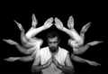
| 04/05/2006 07:03:40 AM | Wading into eternity "graphicfunk tribute"by Travis99Comment: Greetings from the Critique Club :-)
Hmmm, not sure what kind of critique I can give you on this shot. To me, it is actually a great tribute shot of the totally awesome original by graphicfunk. I think you did a very nice job on the shot. Far better than I could of done :-) , and probably far better than most folks could of done. It is most definitely very readily and quickly recognised as a tribute to 'Wading into Eternity'. The clarity of your hands and arms is great. The exposures look pretty good. Maybe just a touch hot on the top set of arms, but just minorly so. I think the image works well in b/w. I agree with the comment that Dan's original has the edge on lighting, and a slightly stronger composition. I think if you could of got a little better positioning of the arms, in relation to the body, it quite possibly could of bumped your score up. Still, 6.28 is not bad at all. A very fine tribute and great entry for this challenge. I agree with graphicfunk, this show's a great grasp of technique, come up with some concepts and show us what ya got! :-)
Sorry I couldn't muster up a better critique for you. If you have any questions or comments or anything, please feel free to contact me.
Happy shooting,
taterbug :-) |
| 04/05/2006 02:04:25 AM | Cavityby SDWComment: Hey Scott :-) Well, I'll try to give you some thoughts here to mull over. Although, looking at your ratings, it's almost like looking in a mirror at my own! , so maybe not the wisest thing to do to listen to any of my advice :-P
Your shot displays a firm grasp on the technical fundamentals to ensure it does not garner a 'low' score. Good lighting, nice control over dof, crisp and clear where it needs to be and composed and all that in a manner to get the point across. The point of view has some interest, but I think it not strong enough to really grab and hold the viewer's attention for very long. Partly, I think it was the challenge topic, Abstract Macro. I think the shot fits well enough, but, being abstract macro, perhaps the voters were looking for more of the abstract side, bright vivid colors, use of repitition of lines and patterns and such.
This is something I often find when I'm looking at photos-when it first opens, if it at least grabs my attention, it must be at least a pretty competent shot. But then, if I find it holding my attention, without even realizing it, I think the longer it keeps me engaged viewing it, my 'score' meter steadily rises with the time spent :-) There are of course exceptions, sometimes a shot opens, and you know immediately it is a 10, but we can't all be j.j. beguins :-P
Looking at your profile, you've got some good solid shots there. Some good scorers. Just keep working at your craft, keep studying, keep seeking that ever elusive 'wow' factor. Something I often have to remind myself of, this place we call home (dpc) is a tough crowd, lots of totally incredible talent here. And growing all the time. It's a pretty solid field of photographs that we compete against every week. When we occasionally pop that 6+ shot, it feels good and to me, at least, holds a lot of weight. I sometimes go look at stuff out in the 'real world', stuff that is liked, well received, makes money hehehe, and think man, that would be right in mediocreville, probably, on the site! :-)
Well, I've rambled enough. Hope maybe this at least gives you a little bit of help.
taterbug | | Photographer found comment helpful. |
|
Showing 1001 - 1010 of ~2507 |
Home -
Challenges -
Community -
League -
Photos -
Cameras -
Lenses -
Learn -
Help -
Terms of Use -
Privacy -
Top ^
DPChallenge, and website content and design, Copyright © 2001-2026 Challenging Technologies, LLC.
All digital photo copyrights belong to the photographers and may not be used without permission.
Current Server Time: 07/25/2026 07:54:41 AM EDT.
|