| Image |
Comment |
| 04/25/2005 05:56:55 PM |
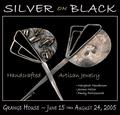
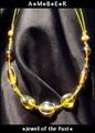
Silver on Blackby Bear_MusicComment: At first, I wanted to vote this down, as I didn't think it belonged in a magazine, then realized who said anything about a magazine only? (duh - me!)
This is a good example of an advertisement, as would be seen in a poster or similar, and is very effectively done.
|
 Photographer found comment helpful. Photographer found comment helpful. |
| 04/25/2005 05:54:41 PM |
PURE PEARLSby mkirdalComment: Nicely composed and detail here is very good.
The small specs & "stuff" could have been cloned out to clean it up a bit, but a good submission regardless.
|
| Photographer found comment helpful. |
| 04/25/2005 05:24:28 PM |
Be the light...by ShamanComment: Photographically very well done, with an exceptional control over teh lighting.
Text/font used here doesn't work well in my opinion. A simple, Italic font may have done better, but a good submission regardess. |
| Photographer found comment helpful. |
| 04/25/2005 05:22:26 PM |
Glamor girlby sissiComment: Focal point seems to be directed at her glasses more than anything else, kind of taking away from the Jewellery theme. Composition/layout is good. |
| Photographer found comment helpful. |
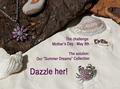
| 04/25/2005 05:20:48 PM |
Summer Dreamsby BeetleComment: A little bit "busy" in the composition overall in my opinion.
A different font and perhaps something less in the way of text like:
"Dazzle her this Mother's Day with our Summer Dreams Collection" may have faired better.
|
| Photographer found comment helpful. |
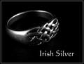
| 04/25/2005 05:18:41 PM |
Irish Silverby banmornComment: Nice use of lighting and B&W conversion to create the mood here.
Not sure about the text/font used, but still a decent submission regardless. |
| Photographer found comment helpful. |
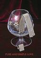
| 04/25/2005 05:17:50 PM |
Amberby DustDevilComment: Composition and background are good here. The arrangement of the folds in the cloth background are nicely done.
Text/font in the wording could be improved upon in my opinion. |
| Photographer found comment helpful. |
| 04/25/2005 05:16:10 PM |
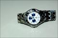
on sale 1,000by gtp1164Comment: Most watches should be in a vertical compsoition, or an angle at best. The horizontal arrangement here doesn't work too well, as the viewer feels the need to tilt their head to read the words/text on the watch face. |
| 04/25/2005 05:08:25 PM |
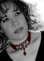
Highlighting Beautyby Travis99Comment: Composition here is good. Not sure if her eyes looking in that direction work for this shot, as there is little area/space for her to be theoretically looking at.
Backlighting on her hair is casting a harsh appearance and makes it look oversharpened in these areas.
Perhaps a different focal point for her and/or a natural smile would have given more of a sense of ease in this shot.
The jewellery is well represented here. |
| Photographer found comment helpful. |
| 04/25/2005 04:34:25 PM |
Reflecting...by LevTComment: Thought I added this one as a favorite during the challenge.
Now added, and a congrats on this one. |
| Photographer found comment helpful. |
Home -
Challenges -
Community -
League -
Photos -
Cameras -
Lenses -
Learn -
Help -
Terms of Use -
Privacy -
Top ^
DPChallenge, and website content and design, Copyright © 2001-2026 Challenging Technologies, LLC.
All digital photo copyrights belong to the photographers and may not be used without permission.
Current Server Time: 06/20/2026 01:34:22 PM EDT.