| Image |
Comment |
| 04/25/2005 08:38:03 PM |
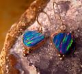
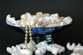
Opals afireby beafliesComment: The jewelery is well represented here, but the background (quartz/geode) seems to be fighting for attention. |
 Photographer found comment helpful. Photographer found comment helpful. |
| 04/25/2005 08:31:45 PM |
Natural Jewelryby RissaComment: Nicely put together shot here.
Perhaps a slightly tighter crop off the top (top 1/4 of shot) may have worked a little better.
Good submission regardless. |
| Photographer found comment helpful. |
| 04/25/2005 08:29:41 PM |
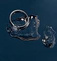
Forever Iceby MatthewComment: The ring is well shown here, but the background seems to be taking center stage trying to figure out what it is. |
| Photographer found comment helpful. |
| 04/25/2005 08:28:31 PM |
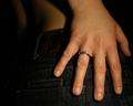
Simply elegantby PascalComment: Nice composition and take on this challenge.
I would suggest a slightly different crop to have less of the wrist showing here, placing the single focal point on the hand/jeans.
Good shot regardless. |
| Photographer found comment helpful. |
| 04/25/2005 08:27:00 PM |
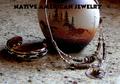
Native American jewelryby dragonladyComment: Interesting composition.
Top of frame/image is a bit on the dark side, as is the side of the egg/rock. Dual light sources would have been a big help here.
Text/font used is way too dark and almost the whole word American gets kinda' lost.
Perhaps a black horizonatl border across the top with a less bold white text in it may mave looked better in this case. |
| Photographer found comment helpful. |
| 04/25/2005 08:05:44 PM |
Pearls are imortalby NunoComment: The spelling error in the title is no biggie and to me isn't part of my vote here.
The shot is decently laid-out with a good control of the lighting.
Disregarding the title spelling for a moment, there is a clash in the text vs. image as the styrofoam packing "stuff" doesn't say immortal (well maybe if the fact it doesn't decompose) and think a different material could have been chosen.
Sill a good shot regardless. |
| 04/25/2005 08:01:37 PM |
Smithsby justinbrookComment: Very clear, simple & uncluttered submission.
Nice job on the lighting here. Only suggestion would be a different font for the main title, such as one that looks similar to the watch face. Good shot regardless. |
| Photographer found comment helpful. |
| 04/25/2005 07:59:54 PM |
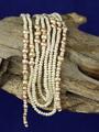
Natural pearlsby aKiwiComment: Crop / framing is at odds here with the background showing above and below the wood.
Perhaps a different crop woud have helped this, either cropping off some of the bottom or the top, so the eye doesn't get pulled in two different directions in my opinion.
|
| Photographer found comment helpful. |
| 04/25/2005 07:57:49 PM |
Beauty Jewel...by sfarrell23Comment: A lot of potential regarding the quality of the lighting used and the subject material, but the ring seems a bit too low in the frame and the upper text is way too overpowering. |
| Photographer found comment helpful. |
| 04/25/2005 07:56:05 PM |
Kid Stuffby pcodyComment: This one doesn't work for me in this challenge.
Way too busy, robust in color and without a central focal point.
Text/font isn't a great choice here. Still met the challenge though (5) |
| Photographer found comment helpful. |
Home -
Challenges -
Community -
League -
Photos -
Cameras -
Lenses -
Learn -
Help -
Terms of Use -
Privacy -
Top ^
DPChallenge, and website content and design, Copyright © 2001-2026 Challenging Technologies, LLC.
All digital photo copyrights belong to the photographers and may not be used without permission.
Current Server Time: 06/20/2026 06:12:18 AM EDT.