DPChallenge: A Digital Photography Contest You are not logged in. (log in or register
 
Browse Settings
Currently viewing:
Registered UsertheSaj

Show comments:

Per page:

Order:

Comments:


Comments Made by theSaj
Pages:   ... ... [186]
Showing 451 - 460 of ~1853
Image Comment
Without Water There Would Be No Bridges
03/28/2006 11:43:09 AM
Without Water There Would Be No Bridges
by TJ23

Comment:
skie is eh.... otherwise it's an alright shot
Fighting face
03/28/2006 11:41:41 AM
Fighting face
by AndersOstberg

Comment:
Just a tad dark and shadowed on the face or this would be great
Photographer found comment helpful.
Flood Tide & Cattails — Sunset
03/28/2006 11:41:11 AM
Flood Tide & Cattails — Sunset1st Place
by Bear_Music

Comment:
awwww....

a nice gorgeous shot with foreground, center ground, deeper ground, and background. All nicely focused. Wow...

It's NOT a waterfall, not droplets and not a splash.....I think it's a ribbon.
Photographer found comment helpful.
Water
03/28/2006 11:40:01 AM
Water
by MayaM

Comment:
a little dark....needs a subject, like someone strolling on the bridge or soemthing...

but otherwise very nice
Photographer found comment helpful.
Appalachian Spring...Disrespected
03/28/2006 11:39:09 AM
Appalachian Spring...Disrespected
by riolobo

Comment:
Interesting hue, the white bottle is a touch too exposed for my liking and the reflection in the water distracts me. But otherwise I enjoy this shot.

See, litter is good, it can be such an artistic influence. *lol* j/k

A polarizer would allow you to get a nicer, less distracting, feel on the reflection
Photographer found comment helpful.
Water Colors
03/28/2006 11:37:48 AM
Water Colors
by Bud

Comment:
Needs a little more subject and scope but I love the colors
Photographer found comment helpful.
Good to the Last Drop
03/28/2006 11:37:23 AM
Good to the Last Drop
by susanh

Comment:
Good close up... QWACK!!!
Photographer found comment helpful.
Textbook Example
03/28/2006 11:34:13 AM
Textbook Example
by darnok

Comment:
::: Critique Club ::: [The Saj]

First Impressions: My first impression was that I was going to like this photo followed by a growing lessening of my liking. Will endeavor to pin point what detracted me from liking this shot as much as I wanted to.

-------------------------------------------------------------

Composition: The composition is decent, but I think a few aspects hurt the shot. You've captured a great background in total blackness and strong white of the textbook. However, the placement of the pen, and more so it's shadow creates a minor distracting element for me. You see, the equations and diagrams are the interesting parts of the page. The shadow and pen overlay these. So that I find my eye trying out of curiousity to follow/read said diagrams only to be affronted with a shadow and totally blocked by a pen. Creating frustration to the curiosity of this viewer, namely me.

This may not be an issue to all viewers. But it will be to many. I hope I've conveyed this concept of "Obstruction to Curiosity" and how it can hurt the appreciation of a photo?

Subject: I like the choice of the book, and thing it is well chosen. The pen I am less inclined to like. The metallicness of the pen is not captured well (and is challenging to do so), and results in a feel of blurriness and loss of focus. I know that pen has fine grooved, brushed metal. But I can't see it. Once again my mind is frustrated, this time by the fact of it's knowledge of what is their and the lack of ability to see what the mind knows. Does that make any sense?

Technical (Colour, focus, and light): Focus could have really strengthened this shot. My eye is really craving a more focused pen and I think the transition of focus could fade out more toward the top.

-------------------------------------------------------------

Summary: See if you can correct some of the focus issues, perhaps try some different subjects. My final thought is that this is a fairly common shot. So, it's a very good study subject. But try to think of how you can make this shot more unique.

-------------------------------------------------------------

It is my hope that these insights are helpful, and constructive. If you have any questions regarding this critique, please feel free to PM me. Also feel free to PM me with any feedback on this critique. And please remember to mark it "Helpful" if you found it so.

- Jason "The Saj"
Photographer found comment helpful.
Thinking of his Future
03/28/2006 11:23:18 AM
Thinking of his Future
by Melly8522

Comment:
::: Critique Club ::: [The Saj]

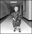
First Impressions: A touch odd and eery but at the same time kinda cute...

-------------------------------------------------------------

Composition: Composition needs some work...a couple of aspects that detract from this shot are the following:

- subject's position, overall, is fairly centered. Not always a negative, and I believe it could have been a positive with this shot however secondary compositional elements also created distractions.

- clock is in the subject's head, creating a distraction. A moment's pause to view the surrounding area and shifting the subject slightly so as to center between the EXIT sign & clock would have improved the shot.

- ceiling seems slightly unlevel. Could be corrected by minimal rotation & crop in most photo editing software, not a major point.

- the lockers on the left side create a good infinity object for background, allowing the user's eyes to trail off toward infinity. However, the right side is fairly distracting. I would suggest considering a different angle of approach so as to make the lockers on the left side the more dominant background element.

Subject: Subject is cute, and the body is well posed. The expression is somewhat lacking in emotion. Perhaps a more emotive expression could have furthered the main subject's presence in the photograph.

Technical (Colour, focus, and light): The black and white is a nice effect in this shot with good clarity on the child's garments. However, something feels very off around the face. Washed out and over-exposed. So that the facial features are diminished. This gives an almost eery quality to the shot, which doesn't quite fit with much of the surround sharp detail.

Also consider a zooming in to take this shot so the resulting background would be blurred. Though this might lose the clock/exit sign. One would have to consider the trade-off in the end result.

Creativity: Fun shot, with the play on the wrong size clothes. Though not unique to use over-sized garments, the choice and selection were good and create a fun feel.

-------------------------------------------------------------

Summary: Not a bad shot, but it has several elements (mostly composition and loss of facial features that keep it from making it's full impact.

-------------------------------------------------------------

It is my hope that these insights are helpful, and constructive. If you have any questions regarding this critique, please feel free to PM me. Also feel free to PM me with any feedback on this critique. And please remember to mark it "Helpful" if you found it so.

- Jason "The Saj"

Photographer found comment helpful.
CRW_2red663.jpg
03/28/2006 09:39:29 AM
CRW_2red663.jpg
by Ennil

Comment:
I really like this one...

BTW...where did you get the dress? when you do finally get married you should get married in punk boots and with an umbrella!
Photographer found comment helpful.
Pages:   ... ... [186]
Showing 451 - 460 of ~1853


Home - Challenges - Community - League - Photos - Cameras - Lenses - Learn - Help - Terms of Use - Privacy - Top ^
DPChallenge, and website content and design, Copyright © 2001-2025 Challenging Technologies, LLC.
All digital photo copyrights belong to the photographers and may not be used without permission.
Current Server Time: 09/09/2025 02:30:13 AM EDT.