| Author | Thread |
|
|
08/10/2006 09:35:46 PM |
LOL!!!!!!!
this cracked me up!
lol
its very nice
^_^ |
|
|
|
03/28/2006 11:23:18 AM |
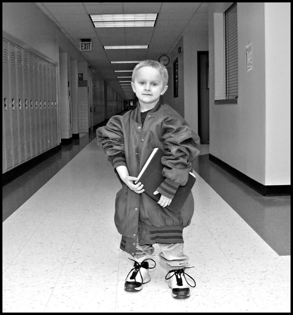
::: Critique Club ::: [The Saj]
First Impressions: A touch odd and eery but at the same time kinda cute...
-------------------------------------------------------------
Composition: Composition needs some work...a couple of aspects that detract from this shot are the following:
- subject's position, overall, is fairly centered. Not always a negative, and I believe it could have been a positive with this shot however secondary compositional elements also created distractions.
- clock is in the subject's head, creating a distraction. A moment's pause to view the surrounding area and shifting the subject slightly so as to center between the EXIT sign & clock would have improved the shot.
- ceiling seems slightly unlevel. Could be corrected by minimal rotation & crop in most photo editing software, not a major point.
- the lockers on the left side create a good infinity object for background, allowing the user's eyes to trail off toward infinity. However, the right side is fairly distracting. I would suggest considering a different angle of approach so as to make the lockers on the left side the more dominant background element.
Subject: Subject is cute, and the body is well posed. The expression is somewhat lacking in emotion. Perhaps a more emotive expression could have furthered the main subject's presence in the photograph.
Technical (Colour, focus, and light): The black and white is a nice effect in this shot with good clarity on the child's garments. However, something feels very off around the face. Washed out and over-exposed. So that the facial features are diminished. This gives an almost eery quality to the shot, which doesn't quite fit with much of the surround sharp detail.
Also consider a zooming in to take this shot so the resulting background would be blurred. Though this might lose the clock/exit sign. One would have to consider the trade-off in the end result.
Creativity: Fun shot, with the play on the wrong size clothes. Though not unique to use over-sized garments, the choice and selection were good and create a fun feel.
-------------------------------------------------------------
Summary: Not a bad shot, but it has several elements (mostly composition and loss of facial features that keep it from making it's full impact.
-------------------------------------------------------------
It is my hope that these insights are helpful, and constructive. If you have any questions regarding this critique, please feel free to PM me. Also feel free to PM me with any feedback on this critique. And please remember to mark it "Helpful" if you found it so.
- Jason "The Saj"
|
|
 Photographer found comment helpful. Photographer found comment helpful. |
Comments Made During the Challenge  |
|
|
03/20/2006 10:45:01 PM |
|
Cute image, but it does seem like there is some softness on his face, perhaps this is motion blur from a slow shutter speed? A large reflector would fill in the eyes better, provide a bit more light for the exposure, and add more diminsionality to the subject's face. |
|
| Photographer found comment helpful. |
|
|
03/20/2006 03:50:18 PM |
|
:-). Simple but effective. 8. |
|
| Photographer found comment helpful. |
|
|
03/19/2006 01:40:21 PM |
|
| Photographer found comment helpful. |
|
|
03/18/2006 07:42:53 PM |
|
The flash was too close to the subject and washes him out. It is a cute idea for a composition though. The auto focus chose to focus on the walls beside him, so he is out of focus some. I really like the idea - the clock, lockers, book and shoelaces all add to a great idea, just a little work on focus and lighting and you will be good to go! |
|
| Photographer found comment helpful. |
|
|
03/16/2006 04:09:45 PM |
|
It seems he is a bit out of focus. Might have been a bit more artsy if he wasn't dead square in the middle of the shot, and perhaps not looking at the camera. -5 |
|
| Photographer found comment helpful. |
|
|
03/15/2006 02:05:13 PM |
|
Nice pose, and oversized jacket is too cute. Unfortunately looks like backfocus, sharper focus on subject and less dead-center composition would be better. |
|
| Photographer found comment helpful. |
|
|
03/15/2006 01:18:28 PM |
|
Exposure is OK but subject matter and composition are lacking any "wow." It just looks like you stopped a kid and the hall and took a snapshot. |
|
| Photographer found comment helpful. |
|
|
03/15/2006 01:10:47 PM |
hahaha!
this is very very cute.
funny and adorable.
the expression on his face is priceless too. ;P
hehe
i love how oversized everything on him is.
nice! |
|
| Photographer found comment helpful. |
|
|
03/15/2006 12:29:47 AM |
|
aww how cute! I like this one! |
|
| Photographer found comment helpful. |
Home -
Challenges -
Community -
League -
Photos -
Cameras -
Lenses -
Learn -
Help -
Terms of Use -
Privacy -
Top ^
DPChallenge, and website content and design, Copyright © 2001-2026 Challenging Technologies, LLC.
All digital photo copyrights belong to the photographers and may not be used without permission.
Current Server Time: 06/28/2026 05:19:30 PM EDT.