| Author | Thread |
|
|
03/28/2006 11:34:13 AM |
::: Critique Club ::: [The Saj]
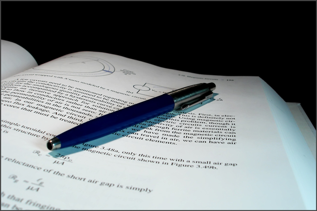
First Impressions: My first impression was that I was going to like this photo followed by a growing lessening of my liking. Will endeavor to pin point what detracted me from liking this shot as much as I wanted to.
-------------------------------------------------------------
Composition: The composition is decent, but I think a few aspects hurt the shot. You've captured a great background in total blackness and strong white of the textbook. However, the placement of the pen, and more so it's shadow creates a minor distracting element for me. You see, the equations and diagrams are the interesting parts of the page. The shadow and pen overlay these. So that I find my eye trying out of curiousity to follow/read said diagrams only to be affronted with a shadow and totally blocked by a pen. Creating frustration to the curiosity of this viewer, namely me.
This may not be an issue to all viewers. But it will be to many. I hope I've conveyed this concept of "Obstruction to Curiosity" and how it can hurt the appreciation of a photo?
Subject: I like the choice of the book, and thing it is well chosen. The pen I am less inclined to like. The metallicness of the pen is not captured well (and is challenging to do so), and results in a feel of blurriness and loss of focus. I know that pen has fine grooved, brushed metal. But I can't see it. Once again my mind is frustrated, this time by the fact of it's knowledge of what is their and the lack of ability to see what the mind knows. Does that make any sense?
Technical (Colour, focus, and light): Focus could have really strengthened this shot. My eye is really craving a more focused pen and I think the transition of focus could fade out more toward the top.
-------------------------------------------------------------
Summary: See if you can correct some of the focus issues, perhaps try some different subjects. My final thought is that this is a fairly common shot. So, it's a very good study subject. But try to think of how you can make this shot more unique.
-------------------------------------------------------------
It is my hope that these insights are helpful, and constructive. If you have any questions regarding this critique, please feel free to PM me. Also feel free to PM me with any feedback on this critique. And please remember to mark it "Helpful" if you found it so.
- Jason "The Saj"
|
|
 Photographer found comment helpful. Photographer found comment helpful. |
Comments Made During the Challenge  |
|
|
03/21/2006 10:46:20 PM |
|
Clean image. The black in the background really forces the focus and keeps our mind on what it should be. Very nice. The pen keeps the image from being dull, too. I like it :-D |
|
| Photographer found comment helpful. |
|
|
03/19/2006 05:37:32 PM |
|
Simple but elegant composition. Well done! |
|
| Photographer found comment helpful. |
|
|
03/19/2006 01:43:49 PM |
|
| Photographer found comment helpful. |
|
|
03/17/2006 10:33:57 AM |
|
o very nice. i love the color and emphasis put upon |
|
| Photographer found comment helpful. |
|
|
03/16/2006 08:35:12 PM |
|
nice macro - certainly meets the challenge - good job :) |
|
| Photographer found comment helpful. |
|
|
03/16/2006 04:48:37 PM |
I like this very much
It really gives the viewer the sense that they are there working |
|
| Photographer found comment helpful. |
|
|
03/15/2006 12:54:00 PM |
|
I'd have cropped it just a bit tighter at the top, but technically a nice job. |
|
| Photographer found comment helpful. |
|
|
03/15/2006 02:46:37 AM |
|
I like the electromagnetics reference, overall shot is very nice. |
|
| Photographer found comment helpful. |
Home -
Challenges -
Community -
League -
Photos -
Cameras -
Lenses -
Learn -
Help -
Terms of Use -
Privacy -
Top ^
DPChallenge, and website content and design, Copyright © 2001-2026 Challenging Technologies, LLC.
All digital photo copyrights belong to the photographers and may not be used without permission.
Current Server Time: 06/29/2026 03:37:25 AM EDT.